mirror of
https://github.com/QwenLM/qwen-code.git
synced 2026-01-17 06:19:13 +00:00
Compare commits
7 Commits
feat/unifi
...
docs/code-
| Author | SHA1 | Date | |
|---|---|---|---|
|
2852f48a4a | ||
|
886f914fb3 | ||
|
|
90365af2f8 | ||
|
cbef5ffd89 | ||
|
|
5e80e80387 | ||
|
|
bde056b62e | ||
|
|
97497457a8 |
3
.gitignore
vendored
3
.gitignore
vendored
@@ -63,6 +63,3 @@ patch_output.log
|
||||
docs-site/.next
|
||||
# content is a symlink to ../docs
|
||||
docs-site/content
|
||||
|
||||
*storybook.log
|
||||
storybook-static
|
||||
|
||||
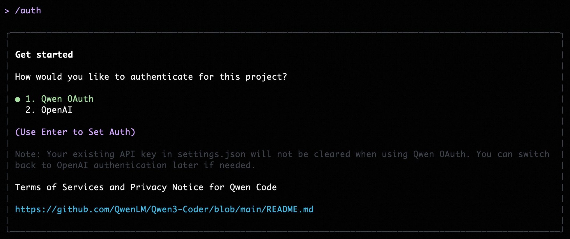
@@ -5,11 +5,13 @@ Qwen Code supports two authentication methods. Pick the one that matches how you
|
||||
- **Qwen OAuth (recommended)**: sign in with your `qwen.ai` account in a browser.
|
||||
- **OpenAI-compatible API**: use an API key (OpenAI or any OpenAI-compatible provider / endpoint).
|
||||
|
||||
|
||||
|
||||
## Option 1: Qwen OAuth (recommended & free) 👍
|
||||
|
||||
Use this if you want the simplest setup and you’re using Qwen models.
|
||||
Use this if you want the simplest setup and you're using Qwen models.
|
||||
|
||||
- **How it works**: on first start, Qwen Code opens a browser login page. After you finish, credentials are cached locally so you usually won’t need to log in again.
|
||||
- **How it works**: on first start, Qwen Code opens a browser login page. After you finish, credentials are cached locally so you usually won't need to log in again.
|
||||
- **Requirements**: a `qwen.ai` account + internet access (at least for the first login).
|
||||
- **Benefits**: no API key management, automatic credential refresh.
|
||||
- **Cost & quota**: free, with a quota of **60 requests/minute** and **2,000 requests/day**.
|
||||
@@ -24,15 +26,54 @@ qwen
|
||||
|
||||
Use this if you want to use OpenAI models or any provider that exposes an OpenAI-compatible API (e.g. OpenAI, Azure OpenAI, OpenRouter, ModelScope, Alibaba Cloud Bailian, or a self-hosted compatible endpoint).
|
||||
|
||||
### Quick start (interactive, recommended for local use)
|
||||
### Recommended: Coding Plan (subscription-based) 🚀
|
||||
|
||||
When you choose the OpenAI-compatible option in the CLI, it will prompt you for:
|
||||
Use this if you want predictable costs with higher usage quotas for the qwen3-coder-plus model.
|
||||
|
||||
- **API key**
|
||||
- **Base URL** (default: `https://api.openai.com/v1`)
|
||||
- **Model** (default: `gpt-4o`)
|
||||
> [!IMPORTANT]
|
||||
>
|
||||
> Coding Plan is only available for users in China mainland (Beijing region).
|
||||
|
||||
> **Note:** the CLI may display the key in plain text for verification. Make sure your terminal is not being recorded or shared.
|
||||
- **How it works**: subscribe to the Coding Plan with a fixed monthly fee, then configure Qwen Code to use the dedicated endpoint and your subscription API key.
|
||||
- **Requirements**: an active Coding Plan subscription from [Alibaba Cloud Bailian](https://bailian.console.aliyun.com/cn-beijing/?tab=globalset#/efm/coding_plan).
|
||||
- **Benefits**: higher usage quotas, predictable monthly costs, access to latest qwen3-coder-plus model.
|
||||
- **Cost & quota**: varies by plan (see table below).
|
||||
|
||||
#### Coding Plan Pricing & Quotas
|
||||
|
||||
| Feature | Lite Basic Plan | Pro Advanced Plan |
|
||||
| :------------------ | :-------------------- | :-------------------- |
|
||||
| **Price** | ¥40/month | ¥200/month |
|
||||
| **5-Hour Limit** | Up to 1,200 requests | Up to 6,000 requests |
|
||||
| **Weekly Limit** | Up to 9,000 requests | Up to 45,000 requests |
|
||||
| **Monthly Limit** | Up to 18,000 requests | Up to 90,000 requests |
|
||||
| **Supported Model** | qwen3-coder-plus | qwen3-coder-plus |
|
||||
|
||||
#### Quick Setup for Coding Plan
|
||||
|
||||
When you select the OpenAI-compatible option in the CLI, enter these values:
|
||||
|
||||
- **API key**: `sk-sp-xxxxx`
|
||||
- **Base URL**: `https://coding.dashscope.aliyuncs.com/v1`
|
||||
- **Model**: `qwen3-coder-plus`
|
||||
|
||||
> **Note**: Coding Plan API keys have the format `sk-sp-xxxxx`, which is different from standard Alibaba Cloud API keys.
|
||||
|
||||
#### Configure via Environment Variables
|
||||
|
||||
Set these environment variables to use Coding Plan:
|
||||
|
||||
```bash
|
||||
export OPENAI_API_KEY="your-coding-plan-api-key" # Format: sk-sp-xxxxx
|
||||
export OPENAI_BASE_URL="https://coding.dashscope.aliyuncs.com/v1"
|
||||
export OPENAI_MODEL="qwen3-coder-plus"
|
||||
```
|
||||
|
||||
For more details about Coding Plan, including subscription options and troubleshooting, see the [full Coding Plan documentation](https://bailian.console.aliyun.com/cn-beijing/?tab=doc#/doc/?type=model&url=3005961).
|
||||
|
||||
### Other OpenAI-compatible Providers
|
||||
|
||||
If you are using other providers (OpenAI, Azure, local LLMs, etc.), use the following configuration methods.
|
||||
|
||||
### Configure via command-line arguments
|
||||
|
||||
|
||||
522
eslint.config.js
522
eslint.config.js
@@ -1,6 +1,3 @@
|
||||
// For more info, see https://github.com/storybookjs/eslint-plugin-storybook#configuration-flat-config-format
|
||||
import storybook from "eslint-plugin-storybook";
|
||||
|
||||
/**
|
||||
* @license
|
||||
* Copyright 2025 Google LLC
|
||||
@@ -16,260 +13,277 @@ import importPlugin from 'eslint-plugin-import';
|
||||
import vitest from '@vitest/eslint-plugin';
|
||||
import globals from 'globals';
|
||||
|
||||
export default tseslint.config({
|
||||
// Global ignores
|
||||
ignores: [
|
||||
'node_modules/*',
|
||||
'packages/**/dist/**',
|
||||
'bundle/**',
|
||||
'package/bundle/**',
|
||||
'.integration-tests/**',
|
||||
'packages/**/.integration-test/**',
|
||||
'dist/**',
|
||||
'docs-site/.next/**',
|
||||
'docs-site/out/**',
|
||||
],
|
||||
}, eslint.configs.recommended, ...tseslint.configs.recommended, reactHooks.configs['recommended-latest'], reactPlugin.configs.flat.recommended, // Add this if you are using React 17+
|
||||
reactPlugin.configs.flat['jsx-runtime'], {
|
||||
// Settings for eslint-plugin-react
|
||||
settings: {
|
||||
react: {
|
||||
version: 'detect',
|
||||
},
|
||||
},
|
||||
}, {
|
||||
// Import specific config
|
||||
files: ['packages/cli/src/**/*.{ts,tsx}'], // Target only TS/TSX in the cli package
|
||||
plugins: {
|
||||
import: importPlugin,
|
||||
},
|
||||
settings: {
|
||||
'import/resolver': {
|
||||
node: true,
|
||||
},
|
||||
},
|
||||
rules: {
|
||||
...importPlugin.configs.recommended.rules,
|
||||
...importPlugin.configs.typescript.rules,
|
||||
'import/no-default-export': 'warn',
|
||||
'import/no-unresolved': 'off', // Disable for now, can be noisy with monorepos/paths
|
||||
},
|
||||
}, {
|
||||
// General overrides and rules for the project (TS/TSX files)
|
||||
files: ['packages/*/src/**/*.{ts,tsx}'], // Target only TS/TSX in the cli package
|
||||
plugins: {
|
||||
import: importPlugin,
|
||||
},
|
||||
settings: {
|
||||
'import/resolver': {
|
||||
node: true,
|
||||
},
|
||||
},
|
||||
languageOptions: {
|
||||
globals: {
|
||||
...globals.node,
|
||||
...globals.es2021,
|
||||
},
|
||||
},
|
||||
rules: {
|
||||
// We use TypeScript for React components; prop-types are unnecessary
|
||||
'react/prop-types': 'off',
|
||||
// General Best Practice Rules (subset adapted for flat config)
|
||||
'@typescript-eslint/array-type': ['error', { default: 'array-simple' }],
|
||||
'arrow-body-style': ['error', 'as-needed'],
|
||||
curly: ['error', 'multi-line'],
|
||||
eqeqeq: ['error', 'always', { null: 'ignore' }],
|
||||
'@typescript-eslint/consistent-type-assertions': [
|
||||
'error',
|
||||
{ assertionStyle: 'as' },
|
||||
],
|
||||
'@typescript-eslint/explicit-member-accessibility': [
|
||||
'error',
|
||||
{ accessibility: 'no-public' },
|
||||
],
|
||||
'@typescript-eslint/no-explicit-any': 'error',
|
||||
'@typescript-eslint/no-inferrable-types': [
|
||||
'error',
|
||||
{ ignoreParameters: true, ignoreProperties: true },
|
||||
],
|
||||
'@typescript-eslint/consistent-type-imports': [
|
||||
'error',
|
||||
{ disallowTypeAnnotations: false },
|
||||
],
|
||||
'@typescript-eslint/no-namespace': ['error', { allowDeclarations: true }],
|
||||
'@typescript-eslint/no-unused-vars': [
|
||||
'error',
|
||||
{
|
||||
argsIgnorePattern: '^_',
|
||||
varsIgnorePattern: '^_',
|
||||
caughtErrorsIgnorePattern: '^_',
|
||||
},
|
||||
],
|
||||
'import/no-internal-modules': [
|
||||
'error',
|
||||
{
|
||||
allow: [
|
||||
'react-dom/test-utils',
|
||||
'react-dom/client',
|
||||
'memfs/lib/volume.js',
|
||||
'yargs/**',
|
||||
'msw/node',
|
||||
'**/generated/**',
|
||||
'./styles/tailwind.css',
|
||||
'./styles/App.css',
|
||||
'./styles/style.css'
|
||||
],
|
||||
},
|
||||
],
|
||||
'import/no-relative-packages': 'error',
|
||||
'no-cond-assign': 'error',
|
||||
'no-debugger': 'error',
|
||||
'no-duplicate-case': 'error',
|
||||
'no-restricted-syntax': [
|
||||
'error',
|
||||
{
|
||||
selector: 'CallExpression[callee.name="require"]',
|
||||
message: 'Avoid using require(). Use ES6 imports instead.',
|
||||
},
|
||||
{
|
||||
selector: 'ThrowStatement > Literal:not([value=/^\\w+Error:/])',
|
||||
message:
|
||||
'Do not throw string literals or non-Error objects. Throw new Error("...") instead.',
|
||||
},
|
||||
],
|
||||
'no-unsafe-finally': 'error',
|
||||
'no-unused-expressions': 'off', // Disable base rule
|
||||
'@typescript-eslint/no-unused-expressions': [
|
||||
// Enable TS version
|
||||
'error',
|
||||
{ allowShortCircuit: true, allowTernary: true },
|
||||
],
|
||||
'no-var': 'error',
|
||||
'object-shorthand': 'error',
|
||||
'one-var': ['error', 'never'],
|
||||
'prefer-arrow-callback': 'error',
|
||||
'prefer-const': ['error', { destructuring: 'all' }],
|
||||
radix: 'error',
|
||||
'default-case': 'error',
|
||||
},
|
||||
}, {
|
||||
files: ['packages/*/src/**/*.test.{ts,tsx}', 'packages/**/test/**/*.test.{ts,tsx}'],
|
||||
plugins: {
|
||||
vitest,
|
||||
},
|
||||
rules: {
|
||||
...vitest.configs.recommended.rules,
|
||||
'vitest/expect-expect': 'off',
|
||||
'vitest/no-commented-out-tests': 'off',
|
||||
'@typescript-eslint/no-unused-vars': [
|
||||
'error',
|
||||
{
|
||||
argsIgnorePattern: '^_',
|
||||
varsIgnorePattern: '^_',
|
||||
caughtErrorsIgnorePattern: '^_',
|
||||
},
|
||||
export default tseslint.config(
|
||||
{
|
||||
// Global ignores
|
||||
ignores: [
|
||||
'node_modules/*',
|
||||
'packages/**/dist/**',
|
||||
'bundle/**',
|
||||
'package/bundle/**',
|
||||
'.integration-tests/**',
|
||||
'packages/**/.integration-test/**',
|
||||
'dist/**',
|
||||
'docs-site/.next/**',
|
||||
'docs-site/out/**',
|
||||
],
|
||||
},
|
||||
}, // extra settings for scripts that we run directly with node
|
||||
{
|
||||
files: ['./scripts/**/*.js', 'esbuild.config.js', 'packages/*/scripts/**/*.js'],
|
||||
languageOptions: {
|
||||
globals: {
|
||||
...globals.node,
|
||||
process: 'readonly',
|
||||
console: 'readonly',
|
||||
},
|
||||
},
|
||||
rules: {
|
||||
'@typescript-eslint/no-unused-vars': [
|
||||
'error',
|
||||
{
|
||||
argsIgnorePattern: '^_',
|
||||
varsIgnorePattern: '^_',
|
||||
caughtErrorsIgnorePattern: '^_',
|
||||
},
|
||||
],
|
||||
},
|
||||
}, {
|
||||
files: ['packages/vscode-ide-companion/esbuild.js'],
|
||||
languageOptions: {
|
||||
globals: {
|
||||
...globals.node,
|
||||
process: 'readonly',
|
||||
console: 'readonly',
|
||||
},
|
||||
},
|
||||
rules: {
|
||||
'no-restricted-syntax': 'off',
|
||||
'@typescript-eslint/no-require-imports': 'off',
|
||||
},
|
||||
}, // extra settings for scripts that we run directly with node
|
||||
{
|
||||
files: ['packages/vscode-ide-companion/scripts/**/*.js'],
|
||||
languageOptions: {
|
||||
globals: {
|
||||
...globals.node,
|
||||
process: 'readonly',
|
||||
console: 'readonly',
|
||||
},
|
||||
},
|
||||
rules: {
|
||||
'no-restricted-syntax': 'off',
|
||||
'@typescript-eslint/no-require-imports': 'off',
|
||||
},
|
||||
}, // extra settings for core package scripts
|
||||
{
|
||||
files: ['packages/core/scripts/**/*.js'],
|
||||
languageOptions: {
|
||||
globals: {
|
||||
...globals.node,
|
||||
process: 'readonly',
|
||||
console: 'readonly',
|
||||
},
|
||||
},
|
||||
rules: {
|
||||
'no-restricted-syntax': 'off',
|
||||
'@typescript-eslint/no-require-imports': 'off',
|
||||
},
|
||||
}, // Prettier config must be last
|
||||
prettierConfig, // extra settings for scripts that we run directly with node
|
||||
{
|
||||
files: ['./integration-tests/**/*.{js,ts,tsx}'],
|
||||
languageOptions: {
|
||||
globals: {
|
||||
...globals.node,
|
||||
process: 'readonly',
|
||||
console: 'readonly',
|
||||
},
|
||||
},
|
||||
rules: {
|
||||
'@typescript-eslint/no-unused-vars': [
|
||||
'error',
|
||||
{
|
||||
argsIgnorePattern: '^_',
|
||||
varsIgnorePattern: '^_',
|
||||
caughtErrorsIgnorePattern: '^_',
|
||||
},
|
||||
],
|
||||
},
|
||||
}, // Settings for docs-site directory
|
||||
{
|
||||
files: ['docs-site/**/*.{js,jsx}'],
|
||||
languageOptions: {
|
||||
globals: {
|
||||
...globals.browser,
|
||||
...globals.node,
|
||||
},
|
||||
parserOptions: {
|
||||
ecmaFeatures: {
|
||||
jsx: true,
|
||||
eslint.configs.recommended,
|
||||
...tseslint.configs.recommended,
|
||||
reactHooks.configs['recommended-latest'],
|
||||
reactPlugin.configs.flat.recommended,
|
||||
reactPlugin.configs.flat['jsx-runtime'], // Add this if you are using React 17+
|
||||
{
|
||||
// Settings for eslint-plugin-react
|
||||
settings: {
|
||||
react: {
|
||||
version: 'detect',
|
||||
},
|
||||
},
|
||||
},
|
||||
rules: {
|
||||
// Allow relaxed rules for documentation site
|
||||
'@typescript-eslint/no-unused-vars': 'off',
|
||||
'react/prop-types': 'off',
|
||||
'react/react-in-jsx-scope': 'off',
|
||||
{
|
||||
// Import specific config
|
||||
files: ['packages/cli/src/**/*.{ts,tsx}'], // Target only TS/TSX in the cli package
|
||||
plugins: {
|
||||
import: importPlugin,
|
||||
},
|
||||
settings: {
|
||||
'import/resolver': {
|
||||
node: true,
|
||||
},
|
||||
},
|
||||
rules: {
|
||||
...importPlugin.configs.recommended.rules,
|
||||
...importPlugin.configs.typescript.rules,
|
||||
'import/no-default-export': 'warn',
|
||||
'import/no-unresolved': 'off', // Disable for now, can be noisy with monorepos/paths
|
||||
},
|
||||
},
|
||||
}, storybook.configs["flat/recommended"]);
|
||||
{
|
||||
// General overrides and rules for the project (TS/TSX files)
|
||||
files: ['packages/*/src/**/*.{ts,tsx}'], // Target only TS/TSX in the cli package
|
||||
plugins: {
|
||||
import: importPlugin,
|
||||
},
|
||||
settings: {
|
||||
'import/resolver': {
|
||||
node: true,
|
||||
},
|
||||
},
|
||||
languageOptions: {
|
||||
globals: {
|
||||
...globals.node,
|
||||
...globals.es2021,
|
||||
},
|
||||
},
|
||||
rules: {
|
||||
// We use TypeScript for React components; prop-types are unnecessary
|
||||
'react/prop-types': 'off',
|
||||
// General Best Practice Rules (subset adapted for flat config)
|
||||
'@typescript-eslint/array-type': ['error', { default: 'array-simple' }],
|
||||
'arrow-body-style': ['error', 'as-needed'],
|
||||
curly: ['error', 'multi-line'],
|
||||
eqeqeq: ['error', 'always', { null: 'ignore' }],
|
||||
'@typescript-eslint/consistent-type-assertions': [
|
||||
'error',
|
||||
{ assertionStyle: 'as' },
|
||||
],
|
||||
'@typescript-eslint/explicit-member-accessibility': [
|
||||
'error',
|
||||
{ accessibility: 'no-public' },
|
||||
],
|
||||
'@typescript-eslint/no-explicit-any': 'error',
|
||||
'@typescript-eslint/no-inferrable-types': [
|
||||
'error',
|
||||
{ ignoreParameters: true, ignoreProperties: true },
|
||||
],
|
||||
'@typescript-eslint/consistent-type-imports': [
|
||||
'error',
|
||||
{ disallowTypeAnnotations: false },
|
||||
],
|
||||
'@typescript-eslint/no-namespace': ['error', { allowDeclarations: true }],
|
||||
'@typescript-eslint/no-unused-vars': [
|
||||
'error',
|
||||
{
|
||||
argsIgnorePattern: '^_',
|
||||
varsIgnorePattern: '^_',
|
||||
caughtErrorsIgnorePattern: '^_',
|
||||
},
|
||||
],
|
||||
'import/no-internal-modules': [
|
||||
'error',
|
||||
{
|
||||
allow: [
|
||||
'react-dom/test-utils',
|
||||
'react-dom/client',
|
||||
'memfs/lib/volume.js',
|
||||
'yargs/**',
|
||||
'msw/node',
|
||||
'**/generated/**',
|
||||
'./styles/tailwind.css',
|
||||
'./styles/App.css',
|
||||
'./styles/style.css'
|
||||
],
|
||||
},
|
||||
],
|
||||
'import/no-relative-packages': 'error',
|
||||
'no-cond-assign': 'error',
|
||||
'no-debugger': 'error',
|
||||
'no-duplicate-case': 'error',
|
||||
'no-restricted-syntax': [
|
||||
'error',
|
||||
{
|
||||
selector: 'CallExpression[callee.name="require"]',
|
||||
message: 'Avoid using require(). Use ES6 imports instead.',
|
||||
},
|
||||
{
|
||||
selector: 'ThrowStatement > Literal:not([value=/^\\w+Error:/])',
|
||||
message:
|
||||
'Do not throw string literals or non-Error objects. Throw new Error("...") instead.',
|
||||
},
|
||||
],
|
||||
'no-unsafe-finally': 'error',
|
||||
'no-unused-expressions': 'off', // Disable base rule
|
||||
'@typescript-eslint/no-unused-expressions': [
|
||||
// Enable TS version
|
||||
'error',
|
||||
{ allowShortCircuit: true, allowTernary: true },
|
||||
],
|
||||
'no-var': 'error',
|
||||
'object-shorthand': 'error',
|
||||
'one-var': ['error', 'never'],
|
||||
'prefer-arrow-callback': 'error',
|
||||
'prefer-const': ['error', { destructuring: 'all' }],
|
||||
radix: 'error',
|
||||
'default-case': 'error',
|
||||
},
|
||||
},
|
||||
{
|
||||
files: ['packages/*/src/**/*.test.{ts,tsx}', 'packages/**/test/**/*.test.{ts,tsx}'],
|
||||
plugins: {
|
||||
vitest,
|
||||
},
|
||||
rules: {
|
||||
...vitest.configs.recommended.rules,
|
||||
'vitest/expect-expect': 'off',
|
||||
'vitest/no-commented-out-tests': 'off',
|
||||
'@typescript-eslint/no-unused-vars': [
|
||||
'error',
|
||||
{
|
||||
argsIgnorePattern: '^_',
|
||||
varsIgnorePattern: '^_',
|
||||
caughtErrorsIgnorePattern: '^_',
|
||||
},
|
||||
],
|
||||
},
|
||||
},
|
||||
// extra settings for scripts that we run directly with node
|
||||
{
|
||||
files: ['./scripts/**/*.js', 'esbuild.config.js', 'packages/*/scripts/**/*.js'],
|
||||
languageOptions: {
|
||||
globals: {
|
||||
...globals.node,
|
||||
process: 'readonly',
|
||||
console: 'readonly',
|
||||
},
|
||||
},
|
||||
rules: {
|
||||
'@typescript-eslint/no-unused-vars': [
|
||||
'error',
|
||||
{
|
||||
argsIgnorePattern: '^_',
|
||||
varsIgnorePattern: '^_',
|
||||
caughtErrorsIgnorePattern: '^_',
|
||||
},
|
||||
],
|
||||
},
|
||||
},
|
||||
{
|
||||
files: ['packages/vscode-ide-companion/esbuild.js'],
|
||||
languageOptions: {
|
||||
globals: {
|
||||
...globals.node,
|
||||
process: 'readonly',
|
||||
console: 'readonly',
|
||||
},
|
||||
},
|
||||
rules: {
|
||||
'no-restricted-syntax': 'off',
|
||||
'@typescript-eslint/no-require-imports': 'off',
|
||||
},
|
||||
},
|
||||
// extra settings for scripts that we run directly with node
|
||||
{
|
||||
files: ['packages/vscode-ide-companion/scripts/**/*.js'],
|
||||
languageOptions: {
|
||||
globals: {
|
||||
...globals.node,
|
||||
process: 'readonly',
|
||||
console: 'readonly',
|
||||
},
|
||||
},
|
||||
rules: {
|
||||
'no-restricted-syntax': 'off',
|
||||
'@typescript-eslint/no-require-imports': 'off',
|
||||
},
|
||||
},
|
||||
// extra settings for core package scripts
|
||||
{
|
||||
files: ['packages/core/scripts/**/*.js'],
|
||||
languageOptions: {
|
||||
globals: {
|
||||
...globals.node,
|
||||
process: 'readonly',
|
||||
console: 'readonly',
|
||||
},
|
||||
},
|
||||
rules: {
|
||||
'no-restricted-syntax': 'off',
|
||||
'@typescript-eslint/no-require-imports': 'off',
|
||||
},
|
||||
},
|
||||
// Prettier config must be last
|
||||
prettierConfig,
|
||||
// extra settings for scripts that we run directly with node
|
||||
{
|
||||
files: ['./integration-tests/**/*.{js,ts,tsx}'],
|
||||
languageOptions: {
|
||||
globals: {
|
||||
...globals.node,
|
||||
process: 'readonly',
|
||||
console: 'readonly',
|
||||
},
|
||||
},
|
||||
rules: {
|
||||
'@typescript-eslint/no-unused-vars': [
|
||||
'error',
|
||||
{
|
||||
argsIgnorePattern: '^_',
|
||||
varsIgnorePattern: '^_',
|
||||
caughtErrorsIgnorePattern: '^_',
|
||||
},
|
||||
],
|
||||
},
|
||||
},
|
||||
// Settings for docs-site directory
|
||||
{
|
||||
files: ['docs-site/**/*.{js,jsx}'],
|
||||
languageOptions: {
|
||||
globals: {
|
||||
...globals.browser,
|
||||
...globals.node,
|
||||
},
|
||||
parserOptions: {
|
||||
ecmaFeatures: {
|
||||
jsx: true,
|
||||
},
|
||||
},
|
||||
},
|
||||
rules: {
|
||||
// Allow relaxed rules for documentation site
|
||||
'@typescript-eslint/no-unused-vars': 'off',
|
||||
'react/prop-types': 'off',
|
||||
'react/react-in-jsx-scope': 'off',
|
||||
},
|
||||
},
|
||||
);
|
||||
|
||||
2664
package-lock.json
generated
2664
package-lock.json
generated
File diff suppressed because it is too large
Load Diff
@@ -874,11 +874,10 @@ export async function loadCliConfig(
|
||||
}
|
||||
};
|
||||
|
||||
if (
|
||||
!interactive &&
|
||||
!argv.experimentalAcp &&
|
||||
inputFormat !== InputFormat.STREAM_JSON
|
||||
) {
|
||||
// ACP mode check: must include both --acp (current) and --experimental-acp (deprecated).
|
||||
// Without this check, edit, write_file, run_shell_command would be excluded in ACP mode.
|
||||
const isAcpMode = argv.acp || argv.experimentalAcp;
|
||||
if (!interactive && !isAcpMode && inputFormat !== InputFormat.STREAM_JSON) {
|
||||
switch (approvalMode) {
|
||||
case ApprovalMode.PLAN:
|
||||
case ApprovalMode.DEFAULT:
|
||||
|
||||
@@ -1,6 +1,11 @@
|
||||
# Qwen Code Companion
|
||||
|
||||
Seamlessly integrate [Qwen Code](https://github.com/QwenLM/qwen-code) into Visual Studio Code with native IDE features and an intuitive interface. This extension bundles everything you need to get started immediately.
|
||||
[](https://marketplace.visualstudio.com/items?itemName=qwenlm.qwen-code-vscode-ide-companion)
|
||||
[](https://marketplace.visualstudio.com/items?itemName=qwenlm.qwen-code-vscode-ide-companion)
|
||||
[](https://open-vsx.org/extension/qwenlm/qwen-code-vscode-ide-companion)
|
||||
[](https://marketplace.visualstudio.com/items?itemName=qwenlm.qwen-code-vscode-ide-companion)
|
||||
|
||||
Seamlessly integrate [Qwen Code](https://github.com/QwenLM/qwen-code) into Visual Studio Code with native IDE features and an intuitive chat interface. This extension bundles everything you need — no additional installation required.
|
||||
|
||||
## Demo
|
||||
|
||||
@@ -11,7 +16,7 @@ Seamlessly integrate [Qwen Code](https://github.com/QwenLM/qwen-code) into Visua
|
||||
|
||||
## Features
|
||||
|
||||
- **Native IDE experience**: Dedicated Qwen Code sidebar panel accessed via the Qwen icon
|
||||
- **Native IDE experience**: Dedicated Qwen Code Chat panel accessed via the Qwen icon in the editor title bar
|
||||
- **Native diffing**: Review, edit, and accept changes in VS Code's diff view
|
||||
- **Auto-accept edits mode**: Automatically apply Qwen's changes as they're made
|
||||
- **File management**: @-mention files or attach files and images using the system file picker
|
||||
@@ -20,73 +25,46 @@ Seamlessly integrate [Qwen Code](https://github.com/QwenLM/qwen-code) into Visua
|
||||
|
||||
## Requirements
|
||||
|
||||
- Visual Studio Code 1.85.0 or newer
|
||||
- Visual Studio Code 1.85.0 or newer (also works with Cursor, Windsurf, and other VS Code-based editors)
|
||||
|
||||
## Installation
|
||||
## Quick Start
|
||||
|
||||
1. Install from the VS Code Marketplace: https://marketplace.visualstudio.com/items?itemName=qwenlm.qwen-code-vscode-ide-companion
|
||||
1. **Install** from the [VS Code Marketplace](https://marketplace.visualstudio.com/items?itemName=qwenlm.qwen-code-vscode-ide-companion) or [Open VSX Registry](https://open-vsx.org/extension/qwenlm/qwen-code-vscode-ide-companion)
|
||||
|
||||
2. Two ways to use
|
||||
- Chat panel: Click the Qwen icon in the Activity Bar, or run `Qwen Code: Open` from the Command Palette (`Cmd+Shift+P` / `Ctrl+Shift+P`).
|
||||
- Terminal session (classic): Run `Qwen Code: Run` to launch a session in the integrated terminal (bundled CLI).
|
||||
2. **Open the Chat panel** using one of these methods:
|
||||
- Click the **Qwen icon** in the top-right corner of the editor
|
||||
- Run `Qwen Code: Open` from the Command Palette (`Cmd+Shift+P` / `Ctrl+Shift+P`)
|
||||
|
||||
## Development and Debugging
|
||||
3. **Start chatting** — Ask Qwen to help with coding tasks, explain code, fix bugs, or write new features
|
||||
|
||||
To debug and develop this extension locally:
|
||||
## Commands
|
||||
|
||||
1. **Clone the repository**
|
||||
| Command | Description |
|
||||
| -------------------------------- | ------------------------------------------------------ |
|
||||
| `Qwen Code: Open` | Open the Qwen Code Chat panel |
|
||||
| `Qwen Code: Run` | Launch a classic terminal session with the bundled CLI |
|
||||
| `Qwen Code: Accept Current Diff` | Accept the currently displayed diff |
|
||||
| `Qwen Code: Close Diff Editor` | Close/reject the current diff |
|
||||
|
||||
```bash
|
||||
git clone https://github.com/QwenLM/qwen-code.git
|
||||
cd qwen-code
|
||||
```
|
||||
## Feedback & Issues
|
||||
|
||||
2. **Install dependencies**
|
||||
- 🐛 [Report bugs](https://github.com/QwenLM/qwen-code/issues/new?template=bug_report.yml&labels=bug,vscode-ide-companion)
|
||||
- 💡 [Request features](https://github.com/QwenLM/qwen-code/issues/new?template=feature_request.yml&labels=enhancement,vscode-ide-companion)
|
||||
- 📖 [Documentation](https://qwenlm.github.io/qwen-code-docs/)
|
||||
- 📋 [Changelog](https://github.com/QwenLM/qwen-code/releases)
|
||||
|
||||
```bash
|
||||
npm install
|
||||
# or if using pnpm
|
||||
pnpm install
|
||||
```
|
||||
## Contributing
|
||||
|
||||
3. **Start debugging**
|
||||
We welcome contributions! See our [Contributing Guide](https://github.com/QwenLM/qwen-code/blob/main/CONTRIBUTING.md) for details on:
|
||||
|
||||
```bash
|
||||
code . # Open the project root in VS Code
|
||||
```
|
||||
- Open the `packages/vscode-ide-companion/src/extension.ts` file
|
||||
- Open Debug panel (`Ctrl+Shift+D` or `Cmd+Shift+D`)
|
||||
- Select **"Launch Companion VS Code Extension"** from the debug dropdown
|
||||
- Press `F5` to launch Extension Development Host
|
||||
|
||||
4. **Make changes and reload**
|
||||
- Edit the source code in the original VS Code window
|
||||
- To see your changes, reload the Extension Development Host window by:
|
||||
- Pressing `Ctrl+R` (Windows/Linux) or `Cmd+R` (macOS)
|
||||
- Or clicking the "Reload" button in the debug toolbar
|
||||
|
||||
5. **View logs and debug output**
|
||||
- Open the Debug Console in the original VS Code window to see extension logs
|
||||
- In the Extension Development Host window, open Developer Tools with `Help > Toggle Developer Tools` to see webview logs
|
||||
|
||||
## Build for Production
|
||||
|
||||
To build the extension for distribution:
|
||||
|
||||
```bash
|
||||
npm run compile
|
||||
# or
|
||||
pnpm run compile
|
||||
```
|
||||
|
||||
To package the extension as a VSIX file:
|
||||
|
||||
```bash
|
||||
npx vsce package
|
||||
# or
|
||||
pnpm vsce package
|
||||
```
|
||||
- Setting up the development environment
|
||||
- Building and debugging the extension locally
|
||||
- Submitting pull requests
|
||||
|
||||
## Terms of Service and Privacy Notice
|
||||
|
||||
By installing this extension, you agree to the [Terms of Service](https://github.com/QwenLM/qwen-code/blob/main/docs/tos-privacy.md).
|
||||
|
||||
## License
|
||||
|
||||
[Apache-2.0](https://github.com/QwenLM/qwen-code/blob/main/LICENSE)
|
||||
|
||||
@@ -5,17 +5,10 @@
|
||||
*/
|
||||
|
||||
import esbuild from 'esbuild';
|
||||
import { createRequire } from 'node:module';
|
||||
import { dirname, resolve } from 'node:path';
|
||||
import { fileURLToPath } from 'node:url';
|
||||
|
||||
const production = process.argv.includes('--production');
|
||||
const watch = process.argv.includes('--watch');
|
||||
|
||||
const __dirname = dirname(fileURLToPath(import.meta.url));
|
||||
const repoRoot = resolve(__dirname, '..', '..');
|
||||
const rootRequire = createRequire(resolve(repoRoot, 'package.json'));
|
||||
|
||||
/**
|
||||
* @type {import('esbuild').Plugin}
|
||||
*/
|
||||
@@ -38,42 +31,6 @@ const esbuildProblemMatcherPlugin = {
|
||||
},
|
||||
};
|
||||
|
||||
/**
|
||||
* Ensure a single React copy in the webview bundle by resolving from repo root.
|
||||
* Prevents mixing React 18/19 element types when nested node_modules exist.
|
||||
* @type {import('esbuild').Plugin}
|
||||
*/
|
||||
const resolveFromRoot = (moduleId) => {
|
||||
try {
|
||||
return rootRequire.resolve(moduleId);
|
||||
} catch {
|
||||
return null;
|
||||
}
|
||||
};
|
||||
|
||||
const reactDedupPlugin = {
|
||||
name: 'react-dedup',
|
||||
setup(build) {
|
||||
const aliases = [
|
||||
'react',
|
||||
'react-dom',
|
||||
'react-dom/client',
|
||||
'react/jsx-runtime',
|
||||
'react/jsx-dev-runtime',
|
||||
];
|
||||
|
||||
for (const alias of aliases) {
|
||||
build.onResolve({ filter: new RegExp(`^${alias}$`) }, () => {
|
||||
const resolved = resolveFromRoot(alias);
|
||||
if (!resolved) {
|
||||
return undefined;
|
||||
}
|
||||
return { path: resolved };
|
||||
});
|
||||
}
|
||||
},
|
||||
};
|
||||
|
||||
/**
|
||||
* @type {import('esbuild').Plugin}
|
||||
*/
|
||||
@@ -171,7 +128,7 @@ async function main() {
|
||||
platform: 'browser',
|
||||
outfile: 'dist/webview.js',
|
||||
logLevel: 'silent',
|
||||
plugins: [reactDedupPlugin, cssInjectPlugin, esbuildProblemMatcherPlugin],
|
||||
plugins: [cssInjectPlugin, esbuildProblemMatcherPlugin],
|
||||
jsx: 'automatic', // Use new JSX transform (React 17+)
|
||||
define: {
|
||||
'process.env.NODE_ENV': production ? '"production"' : '"development"',
|
||||
|
||||
@@ -152,7 +152,6 @@
|
||||
"vitest": "^3.2.4"
|
||||
},
|
||||
"dependencies": {
|
||||
"@qwen-code/webui": "*",
|
||||
"semver": "^7.7.2",
|
||||
"@modelcontextprotocol/sdk": "^1.25.1",
|
||||
"cors": "^2.8.5",
|
||||
|
||||
@@ -1,9 +1,3 @@
|
||||
/**
|
||||
* @license
|
||||
* Copyright 2025 Qwen Team
|
||||
* SPDX-License-Identifier: Apache-2.0
|
||||
*/
|
||||
|
||||
import * as vscode from 'vscode';
|
||||
import type { DiffManager } from '../diff-manager.js';
|
||||
import type { WebViewProvider } from '../webview/WebViewProvider.js';
|
||||
|
||||
@@ -314,34 +314,32 @@ export async function activate(context: vscode.ExtensionContext) {
|
||||
'cli.js',
|
||||
).fsPath;
|
||||
const execPath = process.execPath;
|
||||
const lowerExecPath = execPath.toLowerCase();
|
||||
const needsElectronRunAsNode =
|
||||
lowerExecPath.includes('code') ||
|
||||
lowerExecPath.includes('electron');
|
||||
|
||||
let qwenCmd: string;
|
||||
const terminalOptions: vscode.TerminalOptions = {
|
||||
name: `Qwen Code (${selectedFolder.name})`,
|
||||
cwd: selectedFolder.uri.fsPath,
|
||||
location,
|
||||
};
|
||||
|
||||
let qwenCmd: string;
|
||||
|
||||
if (isWindows) {
|
||||
// Use system Node via cmd.exe; avoid PowerShell parsing issues
|
||||
// On Windows, try multiple strategies to find a Node.js runtime:
|
||||
// 1. Check if VSCode ships a standalone node.exe alongside Code.exe
|
||||
// 2. Check VSCode's internal Node.js in resources directory
|
||||
// 3. Fall back to using Code.exe with ELECTRON_RUN_AS_NODE=1
|
||||
const quoteCmd = (s: string) => `"${s.replace(/"/g, '""')}"`;
|
||||
const cliQuoted = quoteCmd(cliEntry);
|
||||
// TODO: @yiliang114, temporarily run through node, and later hope to decouple from the local node
|
||||
qwenCmd = `node ${cliQuoted}`;
|
||||
terminalOptions.shellPath = process.env.ComSpec;
|
||||
} else {
|
||||
// macOS/Linux: All VSCode-like IDEs (VSCode, Cursor, Windsurf, etc.)
|
||||
// are Electron-based, so we always need ELECTRON_RUN_AS_NODE=1
|
||||
// to run Node.js scripts using the IDE's bundled runtime.
|
||||
const quotePosix = (s: string) => `"${s.replace(/"/g, '\\"')}"`;
|
||||
const baseCmd = `${quotePosix(execPath)} ${quotePosix(cliEntry)}`;
|
||||
if (needsElectronRunAsNode) {
|
||||
// macOS Electron helper needs ELECTRON_RUN_AS_NODE=1;
|
||||
qwenCmd = `ELECTRON_RUN_AS_NODE=1 ${baseCmd}`;
|
||||
} else {
|
||||
qwenCmd = baseCmd;
|
||||
}
|
||||
qwenCmd = `ELECTRON_RUN_AS_NODE=1 ${baseCmd}`;
|
||||
}
|
||||
|
||||
const terminal = vscode.window.createTerminal(terminalOptions);
|
||||
|
||||
@@ -2,8 +2,18 @@
|
||||
* @license
|
||||
* Copyright 2025 Qwen Team
|
||||
* SPDX-License-Identifier: Apache-2.0
|
||||
*
|
||||
* Re-export completion item types from webui for backward compatibility
|
||||
*/
|
||||
|
||||
export type { CompletionItem, CompletionItemType } from '@qwen-code/webui';
|
||||
import type React from 'react';
|
||||
|
||||
export interface CompletionItem {
|
||||
id: string;
|
||||
label: string;
|
||||
description?: string;
|
||||
icon?: React.ReactNode;
|
||||
type: 'file' | 'folder' | 'symbol' | 'command' | 'variable' | 'info';
|
||||
// Value inserted into the input when selected (e.g., filename or command)
|
||||
value?: string;
|
||||
// Optional full path for files (used to build @filename -> full path mapping)
|
||||
path?: string;
|
||||
}
|
||||
|
||||
@@ -19,29 +19,30 @@ import { useMessageHandling } from './hooks/message/useMessageHandling.js';
|
||||
import { useToolCalls } from './hooks/useToolCalls.js';
|
||||
import { useWebViewMessages } from './hooks/useWebViewMessages.js';
|
||||
import { useMessageSubmit } from './hooks/useMessageSubmit.js';
|
||||
import type { PermissionOption, PermissionToolCall } from '@qwen-code/webui';
|
||||
import type {
|
||||
PermissionOption,
|
||||
ToolCall as PermissionToolCall,
|
||||
} from './components/PermissionDrawer/PermissionRequest.js';
|
||||
import type { TextMessage } from './hooks/message/useMessageHandling.js';
|
||||
import type { ToolCallData } from './components/messages/toolcalls/ToolCall.js';
|
||||
import { PermissionDrawer } from './components/PermissionDrawer/PermissionDrawer.js';
|
||||
import { ToolCall } from './components/messages/toolcalls/ToolCall.js';
|
||||
import { hasToolCallOutput } from './utils/utils.js';
|
||||
import { EmptyState } from './components/layout/EmptyState.js';
|
||||
import { Onboarding } from './components/layout/Onboarding.js';
|
||||
import { type CompletionItem } from '../types/completionItemTypes.js';
|
||||
import { useCompletionTrigger } from './hooks/useCompletionTrigger.js';
|
||||
import { ChatHeader } from './components/layout/ChatHeader.js';
|
||||
import {
|
||||
AssistantMessage,
|
||||
UserMessage,
|
||||
AssistantMessage,
|
||||
ThinkingMessage,
|
||||
WaitingMessage,
|
||||
InterruptedMessage,
|
||||
FileIcon,
|
||||
UserIcon,
|
||||
PermissionDrawer,
|
||||
// Layout components imported directly from webui
|
||||
EmptyState,
|
||||
ChatHeader,
|
||||
SessionSelector,
|
||||
} from '@qwen-code/webui';
|
||||
} from './components/messages/index.js';
|
||||
import { InputForm } from './components/layout/InputForm.js';
|
||||
import { SessionSelector } from './components/layout/SessionSelector.js';
|
||||
import { FileIcon, UserIcon } from './components/icons/index.js';
|
||||
import { ApprovalMode, NEXT_APPROVAL_MODE } from '../types/acpTypes.js';
|
||||
import type { ApprovalModeValue } from '../types/approvalModeValueTypes.js';
|
||||
import type { PlanEntry, UsageStatsPayload } from '../types/chatTypes.js';
|
||||
|
||||
@@ -29,7 +29,6 @@ export class WebViewProvider {
|
||||
private pendingPermissionResolve: ((optionId: string) => void) | null = null;
|
||||
// Track current ACP mode id to influence permission/diff behavior
|
||||
private currentModeId: ApprovalModeValue | null = null;
|
||||
private authState: boolean | null = null;
|
||||
|
||||
constructor(
|
||||
private context: vscode.ExtensionContext,
|
||||
@@ -417,10 +416,6 @@ export class WebViewProvider {
|
||||
if (message.type === 'openDiff' && this.isAutoMode()) {
|
||||
return;
|
||||
}
|
||||
if (message.type === 'webviewReady') {
|
||||
this.handleWebviewReady();
|
||||
return;
|
||||
}
|
||||
// Allow webview to request updating the VS Code tab title
|
||||
if (message.type === 'updatePanelTitle') {
|
||||
const title = String(
|
||||
@@ -879,72 +874,10 @@ export class WebViewProvider {
|
||||
}
|
||||
}
|
||||
|
||||
/**
|
||||
* Track authentication state based on outbound messages to the webview.
|
||||
*/
|
||||
private updateAuthStateFromMessage(message: unknown): void {
|
||||
if (!message || typeof message !== 'object') {
|
||||
return;
|
||||
}
|
||||
const msg = message as {
|
||||
type?: string;
|
||||
data?: { authenticated?: boolean | null };
|
||||
};
|
||||
|
||||
switch (msg.type) {
|
||||
case 'authState':
|
||||
if (typeof msg.data?.authenticated === 'boolean') {
|
||||
this.authState = msg.data.authenticated;
|
||||
} else {
|
||||
this.authState = null;
|
||||
}
|
||||
break;
|
||||
case 'agentConnected':
|
||||
case 'loginSuccess':
|
||||
this.authState = true;
|
||||
break;
|
||||
case 'agentConnectionError':
|
||||
case 'loginError':
|
||||
this.authState = false;
|
||||
break;
|
||||
default:
|
||||
break;
|
||||
}
|
||||
}
|
||||
|
||||
/**
|
||||
* Sync important initialization state when the webview signals readiness.
|
||||
*/
|
||||
private handleWebviewReady(): void {
|
||||
if (this.currentModeId) {
|
||||
this.sendMessageToWebView({
|
||||
type: 'modeChanged',
|
||||
data: { modeId: this.currentModeId },
|
||||
});
|
||||
}
|
||||
|
||||
if (typeof this.authState === 'boolean') {
|
||||
this.sendMessageToWebView({
|
||||
type: 'authState',
|
||||
data: { authenticated: this.authState },
|
||||
});
|
||||
return;
|
||||
}
|
||||
|
||||
if (this.agentInitialized) {
|
||||
const authenticated = Boolean(this.agentManager.currentSessionId);
|
||||
this.sendMessageToWebView({
|
||||
type: 'authState',
|
||||
data: { authenticated },
|
||||
});
|
||||
}
|
||||
}
|
||||
|
||||
/**
|
||||
* Send message to WebView
|
||||
*/
|
||||
private sendMessageToWebView(message: unknown): void {
|
||||
this.updateAuthStateFromMessage(message);
|
||||
const panel = this.panelManager.getPanel();
|
||||
panel?.webview.postMessage(message);
|
||||
}
|
||||
@@ -1050,7 +983,6 @@ export class WebViewProvider {
|
||||
resetAgentState(): void {
|
||||
console.log('[WebViewProvider] Resetting agent state');
|
||||
this.agentInitialized = false;
|
||||
this.authState = null;
|
||||
// Disconnect existing connection
|
||||
this.agentManager.disconnect();
|
||||
}
|
||||
@@ -1085,10 +1017,6 @@ export class WebViewProvider {
|
||||
if (message.type === 'openDiff' && this.isAutoMode()) {
|
||||
return;
|
||||
}
|
||||
if (message.type === 'webviewReady') {
|
||||
this.handleWebviewReady();
|
||||
return;
|
||||
}
|
||||
if (message.type === 'updatePanelTitle') {
|
||||
const title = String(
|
||||
(message.data as { title?: unknown } | undefined)?.title ?? '',
|
||||
@@ -1246,7 +1174,6 @@ export class WebViewProvider {
|
||||
console.log('[WebViewProvider] Restoring state:', state);
|
||||
this.messageHandler.setCurrentConversationId(state.conversationId);
|
||||
this.agentInitialized = state.agentInitialized;
|
||||
this.authState = null;
|
||||
console.log(
|
||||
'[WebViewProvider] State restored. agentInitialized:',
|
||||
this.agentInitialized,
|
||||
|
||||
@@ -4,44 +4,19 @@
|
||||
* SPDX-License-Identifier: Apache-2.0
|
||||
*/
|
||||
|
||||
import { useEffect, useRef, useState } from 'react';
|
||||
import type { FC, RefObject } from 'react';
|
||||
import type React from 'react';
|
||||
import { useEffect, useState, useRef } from 'react';
|
||||
import type { PermissionOption, ToolCall } from './PermissionRequest.js';
|
||||
|
||||
export interface PermissionOption {
|
||||
name: string;
|
||||
kind: string;
|
||||
optionId: string;
|
||||
}
|
||||
|
||||
export interface PermissionToolCall {
|
||||
title?: string;
|
||||
kind?: string;
|
||||
toolCallId?: string;
|
||||
rawInput?: {
|
||||
command?: string;
|
||||
description?: string;
|
||||
[key: string]: unknown;
|
||||
};
|
||||
content?: Array<{
|
||||
type: string;
|
||||
[key: string]: unknown;
|
||||
}>;
|
||||
locations?: Array<{
|
||||
path: string;
|
||||
line?: number | null;
|
||||
}>;
|
||||
status?: string;
|
||||
}
|
||||
|
||||
export interface PermissionDrawerProps {
|
||||
interface PermissionDrawerProps {
|
||||
isOpen: boolean;
|
||||
options: PermissionOption[];
|
||||
toolCall: PermissionToolCall;
|
||||
toolCall: ToolCall;
|
||||
onResponse: (optionId: string) => void;
|
||||
onClose?: () => void;
|
||||
}
|
||||
|
||||
const PermissionDrawer: FC<PermissionDrawerProps> = ({
|
||||
export const PermissionDrawer: React.FC<PermissionDrawerProps> = ({
|
||||
isOpen,
|
||||
options,
|
||||
toolCall,
|
||||
@@ -51,8 +26,10 @@ const PermissionDrawer: FC<PermissionDrawerProps> = ({
|
||||
const [focusedIndex, setFocusedIndex] = useState(0);
|
||||
const [customMessage, setCustomMessage] = useState('');
|
||||
const containerRef = useRef<HTMLDivElement>(null);
|
||||
// Correct the ref type for custom input to HTMLInputElement to avoid subsequent forced casting
|
||||
const customInputRef = useRef<HTMLInputElement>(null);
|
||||
|
||||
console.log('PermissionDrawer rendered with isOpen:', isOpen, toolCall);
|
||||
// Prefer file name from locations, fall back to content[].path if present
|
||||
const getAffectedFileName = (): string => {
|
||||
const fromLocations = toolCall.locations?.[0]?.path;
|
||||
@@ -258,6 +235,7 @@ const PermissionDrawer: FC<PermissionDrawerProps> = ({
|
||||
);
|
||||
})}
|
||||
|
||||
{/* Custom message input (extracted component) */}
|
||||
{(() => {
|
||||
const isFocused = focusedIndex === options.length;
|
||||
const rejectOptionId = options.find((o) =>
|
||||
@@ -280,20 +258,25 @@ const PermissionDrawer: FC<PermissionDrawerProps> = ({
|
||||
})()}
|
||||
</div>
|
||||
</div>
|
||||
|
||||
{/* Moved slide-up keyframes to Tailwind theme (tailwind.config.js) */}
|
||||
</div>
|
||||
);
|
||||
};
|
||||
|
||||
/**
|
||||
* CustomMessageInputRow: Reusable custom input row component (without hooks)
|
||||
*/
|
||||
interface CustomMessageInputRowProps {
|
||||
isFocused: boolean;
|
||||
customMessage: string;
|
||||
setCustomMessage: (val: string) => void;
|
||||
onFocusRow: () => void;
|
||||
onSubmitReject: () => void;
|
||||
inputRef: RefObject<HTMLInputElement | null>;
|
||||
onFocusRow: () => void; // Set focus when mouse enters or input box is focused
|
||||
onSubmitReject: () => void; // Triggered when Enter is pressed (selecting reject option)
|
||||
inputRef: React.RefObject<HTMLInputElement | null>;
|
||||
}
|
||||
|
||||
const CustomMessageInputRow: FC<CustomMessageInputRowProps> = ({
|
||||
const CustomMessageInputRow: React.FC<CustomMessageInputRowProps> = ({
|
||||
isFocused,
|
||||
customMessage,
|
||||
setCustomMessage,
|
||||
@@ -309,7 +292,7 @@ const CustomMessageInputRow: FC<CustomMessageInputRowProps> = ({
|
||||
onClick={() => inputRef.current?.focus()}
|
||||
>
|
||||
<input
|
||||
ref={inputRef as unknown as RefObject<HTMLInputElement>}
|
||||
ref={inputRef as React.LegacyRef<HTMLInputElement> | undefined}
|
||||
type="text"
|
||||
placeholder="Tell Qwen what to do instead"
|
||||
spellCheck={false}
|
||||
@@ -327,5 +310,3 @@ const CustomMessageInputRow: FC<CustomMessageInputRowProps> = ({
|
||||
/>
|
||||
</div>
|
||||
);
|
||||
|
||||
export default PermissionDrawer;
|
||||
@@ -0,0 +1,37 @@
|
||||
/**
|
||||
* @license
|
||||
* Copyright 2025 Qwen Team
|
||||
* SPDX-License-Identifier: Apache-2.0
|
||||
*/
|
||||
|
||||
export interface PermissionOption {
|
||||
name: string;
|
||||
kind: string;
|
||||
optionId: string;
|
||||
}
|
||||
|
||||
export interface ToolCall {
|
||||
title?: string;
|
||||
kind?: string;
|
||||
toolCallId?: string;
|
||||
rawInput?: {
|
||||
command?: string;
|
||||
description?: string;
|
||||
[key: string]: unknown;
|
||||
};
|
||||
content?: Array<{
|
||||
type: string;
|
||||
[key: string]: unknown;
|
||||
}>;
|
||||
locations?: Array<{
|
||||
path: string;
|
||||
line?: number | null;
|
||||
}>;
|
||||
status?: string;
|
||||
}
|
||||
|
||||
export interface PermissionRequestProps {
|
||||
options: PermissionOption[];
|
||||
toolCall: ToolCall;
|
||||
onResponse: (optionId: string) => void;
|
||||
}
|
||||
@@ -4,25 +4,15 @@
|
||||
* SPDX-License-Identifier: Apache-2.0
|
||||
*/
|
||||
|
||||
import type { FC } from 'react';
|
||||
import type React from 'react';
|
||||
|
||||
/**
|
||||
* Tooltip component props
|
||||
*/
|
||||
export interface TooltipProps {
|
||||
/** Content to wrap with tooltip */
|
||||
interface TooltipProps {
|
||||
children: React.ReactNode;
|
||||
/** Tooltip content (can be string or ReactNode) */
|
||||
content: React.ReactNode;
|
||||
/** Tooltip position relative to children */
|
||||
position?: 'top' | 'bottom' | 'left' | 'right';
|
||||
}
|
||||
|
||||
/**
|
||||
* Tooltip component using CSS group-hover for display
|
||||
* Supports CSS variables for theming
|
||||
*/
|
||||
export const Tooltip: FC<TooltipProps> = ({
|
||||
export const Tooltip: React.FC<TooltipProps> = ({
|
||||
children,
|
||||
content,
|
||||
position = 'top',
|
||||
@@ -33,8 +23,8 @@ export const Tooltip: FC<TooltipProps> = ({
|
||||
<div
|
||||
className={`
|
||||
absolute z-50 px-2 py-1 text-xs rounded-md shadow-lg
|
||||
bg-[var(--app-primary-background,#1f2937)] border border-[var(--app-input-border,#374151)]
|
||||
text-[var(--app-primary-foreground,#f9fafb)] whitespace-nowrap
|
||||
bg-[var(--app-primary-background)] border border-[var(--app-input-border)]
|
||||
text-[var(--app-primary-foreground)] whitespace-nowrap
|
||||
opacity-0 group-hover:opacity-100 transition-opacity duration-150
|
||||
-translate-x-1/2 left-1/2
|
||||
${
|
||||
@@ -52,7 +42,7 @@ export const Tooltip: FC<TooltipProps> = ({
|
||||
{content}
|
||||
<div
|
||||
className={`
|
||||
absolute w-2 h-2 bg-[var(--app-primary-background,#1f2937)] border-l border-b border-[var(--app-input-border,#374151)]
|
||||
absolute w-2 h-2 bg-[var(--app-primary-background)] border-l border-b border-[var(--app-input-border)]
|
||||
-rotate-45
|
||||
${
|
||||
position === 'top'
|
||||
@@ -69,5 +59,3 @@ export const Tooltip: FC<TooltipProps> = ({
|
||||
</div>
|
||||
</div>
|
||||
);
|
||||
|
||||
export default Tooltip;
|
||||
@@ -0,0 +1,215 @@
|
||||
/**
|
||||
* @license
|
||||
* Copyright 2025 Qwen Team
|
||||
* SPDX-License-Identifier: Apache-2.0
|
||||
*
|
||||
* Edit mode related icons
|
||||
*/
|
||||
|
||||
import type React from 'react';
|
||||
import type { IconProps } from './types.js';
|
||||
|
||||
/**
|
||||
* Edit pencil icon (16x16)
|
||||
* Used for "Ask before edits" mode
|
||||
*/
|
||||
export const EditPencilIcon: React.FC<IconProps> = ({
|
||||
size = 16,
|
||||
className,
|
||||
...props
|
||||
}) => (
|
||||
<svg
|
||||
xmlns="http://www.w3.org/2000/svg"
|
||||
viewBox="0 0 16 16"
|
||||
fill="currentColor"
|
||||
width={size}
|
||||
height={size}
|
||||
className={className}
|
||||
aria-hidden="true"
|
||||
{...props}
|
||||
>
|
||||
<path
|
||||
fillRule="evenodd"
|
||||
d="M11.013 2.513a1.75 1.75 0 0 1 2.475 2.474L6.226 12.25a2.751 2.751 0 0 1-.892.596l-2.047.848a.75.75 0 0 1-.98-.98l.848-2.047a2.75 2.75 0 0 1 .596-.892l7.262-7.261Z"
|
||||
clipRule="evenodd"
|
||||
/>
|
||||
</svg>
|
||||
);
|
||||
|
||||
/**
|
||||
* Auto/fast-forward icon (16x16)
|
||||
* Used for "Edit automatically" mode
|
||||
*/
|
||||
export const AutoEditIcon: React.FC<IconProps> = ({
|
||||
size = 16,
|
||||
className,
|
||||
...props
|
||||
}) => (
|
||||
<svg
|
||||
xmlns="http://www.w3.org/2000/svg"
|
||||
viewBox="0 0 16 16"
|
||||
fill="currentColor"
|
||||
width={size}
|
||||
height={size}
|
||||
className={className}
|
||||
aria-hidden="true"
|
||||
{...props}
|
||||
>
|
||||
<path d="M2.53 3.956A1 1 0 0 0 1 4.804v6.392a1 1 0 0 0 1.53.848l5.113-3.196c.16-.1.279-.233.357-.383v2.73a1 1 0 0 0 1.53.849l5.113-3.196a1 1 0 0 0 0-1.696L9.53 3.956A1 1 0 0 0 8 4.804v2.731a.992.992 0 0 0-.357-.383L2.53 3.956Z" />
|
||||
</svg>
|
||||
);
|
||||
|
||||
/**
|
||||
* Plan mode/bars icon (16x16)
|
||||
* Used for "Plan mode"
|
||||
*/
|
||||
export const PlanModeIcon: React.FC<IconProps> = ({
|
||||
size = 16,
|
||||
className,
|
||||
...props
|
||||
}) => (
|
||||
<svg
|
||||
xmlns="http://www.w3.org/2000/svg"
|
||||
viewBox="0 0 16 16"
|
||||
fill="currentColor"
|
||||
width={size}
|
||||
height={size}
|
||||
className={className}
|
||||
aria-hidden="true"
|
||||
{...props}
|
||||
>
|
||||
<path d="M4.5 2a.5.5 0 0 0-.5.5v11a.5.5 0 0 0 .5.5h1a.5.5 0 0 0 .5-.5v-11a.5.5 0 0 0-.5-.5h-1ZM10.5 2a.5.5 0 0 0-.5.5v11a.5.5 0 0 0 .5.5h1a.5.5 0 0 0 .5-.5v-11a.5.5 0 0 0-.5-.5h-1Z" />
|
||||
</svg>
|
||||
);
|
||||
|
||||
/**
|
||||
* Code brackets icon (20x20)
|
||||
* Used for active file indicator
|
||||
*/
|
||||
export const CodeBracketsIcon: React.FC<IconProps> = ({
|
||||
size = 20,
|
||||
className,
|
||||
...props
|
||||
}) => (
|
||||
<svg
|
||||
xmlns="http://www.w3.org/2000/svg"
|
||||
viewBox="0 0 20 20"
|
||||
fill="currentColor"
|
||||
width={size}
|
||||
height={size}
|
||||
className={className}
|
||||
aria-hidden="true"
|
||||
{...props}
|
||||
>
|
||||
<path
|
||||
fillRule="evenodd"
|
||||
d="M6.28 5.22a.75.75 0 0 1 0 1.06L2.56 10l3.72 3.72a.75.75 0 0 1-1.06 1.06L.97 10.53a.75.75 0 0 1 0-1.06l4.25-4.25a.75.75 0 0 1 1.06 0Zm7.44 0a.75.75 0 0 1 1.06 0l4.25 4.25a.75.75 0 0 1 0 1.06l-4.25 4.25a.75.75 0 0 1-1.06-1.06L17.44 10l-3.72-3.72a.75.75 0 0 1 0-1.06ZM11.377 2.011a.75.75 0 0 1 .612.867l-2.5 14.5a.75.75 0 0 1-1.478-.255l2.5-14.5a.75.75 0 0 1 .866-.612Z"
|
||||
clipRule="evenodd"
|
||||
/>
|
||||
</svg>
|
||||
);
|
||||
|
||||
/**
|
||||
* Hide context (eye slash) icon (20x20)
|
||||
* Used to indicate the active selection will NOT be auto-loaded into context
|
||||
*/
|
||||
export const HideContextIcon: React.FC<IconProps> = ({
|
||||
size = 20,
|
||||
className,
|
||||
...props
|
||||
}) => (
|
||||
<svg
|
||||
xmlns="http://www.w3.org/2000/svg"
|
||||
viewBox="0 0 20 20"
|
||||
fill="currentColor"
|
||||
width={size}
|
||||
height={size}
|
||||
className={className}
|
||||
aria-hidden="true"
|
||||
{...props}
|
||||
>
|
||||
<path
|
||||
fillRule="evenodd"
|
||||
d="M3.28 2.22a.75.75 0 0 0-1.06 1.06l14.5 14.5a.75.75 0 1 0 1.06-1.06l-1.745-1.745a10.029 10.029 0 0 0 3.3-4.38 1.651 1.651 0 0 0 0-1.185A10.004 10.004 0 0 0 9.999 3a9.956 9.956 0 0 0-4.744 1.194L3.28 2.22ZM7.752 6.69l1.092 1.092a2.5 2.5 0 0 1 3.374 3.373l1.091 1.092a4 4 0 0 0-5.557-5.557Z"
|
||||
clipRule="evenodd"
|
||||
/>
|
||||
<path d="m10.748 13.93 2.523 2.523a9.987 9.987 0 0 1-3.27.547c-4.258 0-7.894-2.66-9.337-6.41a1.651 1.651 0 0 1 0-1.186A10.007 10.007 0 0 1 2.839 6.02L6.07 9.252a4 4 0 0 0 4.678 4.678Z" />
|
||||
</svg>
|
||||
);
|
||||
|
||||
/**
|
||||
* Slash command icon (20x20)
|
||||
* Used for command menu button
|
||||
*/
|
||||
export const SlashCommandIcon: React.FC<IconProps> = ({
|
||||
size = 20,
|
||||
className,
|
||||
...props
|
||||
}) => (
|
||||
<svg
|
||||
xmlns="http://www.w3.org/2000/svg"
|
||||
viewBox="0 0 20 20"
|
||||
fill="currentColor"
|
||||
width={size}
|
||||
height={size}
|
||||
className={className}
|
||||
aria-hidden="true"
|
||||
{...props}
|
||||
>
|
||||
<path
|
||||
fillRule="evenodd"
|
||||
d="M12.528 3.047a.75.75 0 0 1 .449.961L8.433 16.504a.75.75 0 1 1-1.41-.512l4.544-12.496a.75.75 0 0 1 .961-.449Z"
|
||||
clipRule="evenodd"
|
||||
/>
|
||||
</svg>
|
||||
);
|
||||
|
||||
/**
|
||||
* Link/attachment icon (20x20)
|
||||
* Used for attach context button
|
||||
*/
|
||||
export const LinkIcon: React.FC<IconProps> = ({
|
||||
size = 20,
|
||||
className,
|
||||
...props
|
||||
}) => (
|
||||
<svg
|
||||
xmlns="http://www.w3.org/2000/svg"
|
||||
viewBox="0 0 20 20"
|
||||
fill="currentColor"
|
||||
width={size}
|
||||
height={size}
|
||||
className={className}
|
||||
aria-hidden="true"
|
||||
{...props}
|
||||
>
|
||||
<path
|
||||
fillRule="evenodd"
|
||||
d="M15.621 4.379a3 3 0 0 0-4.242 0l-7 7a3 3 0 0 0 4.241 4.243h.001l.497-.5a.75.75 0 0 1 1.064 1.057l-.498.501-.002.002a4.5 4.5 0 0 1-6.364-6.364l7-7a4.5 4.5 0 0 1 6.368 6.36l-3.455 3.553A2.625 2.625 0 1 1 9.52 9.52l3.45-3.451a.75.75 0 1 1 1.061 1.06l-3.45 3.451a1.125 1.125 0 0 0 1.587 1.595l3.454-3.553a3 3 0 0 0 0-4.242Z"
|
||||
clipRule="evenodd"
|
||||
/>
|
||||
</svg>
|
||||
);
|
||||
|
||||
/**
|
||||
* Open diff icon (16x16)
|
||||
* Used for opening diff in VS Code
|
||||
*/
|
||||
export const OpenDiffIcon: React.FC<IconProps> = ({
|
||||
size = 16,
|
||||
className,
|
||||
...props
|
||||
}) => (
|
||||
<svg
|
||||
xmlns="http://www.w3.org/2000/svg"
|
||||
viewBox="0 0 16 16"
|
||||
fill="currentColor"
|
||||
width={size}
|
||||
height={size}
|
||||
className={className}
|
||||
aria-hidden="true"
|
||||
{...props}
|
||||
>
|
||||
<path d="M13.5 7l-4-4v3h-6v2h6v3l4-4z" />
|
||||
</svg>
|
||||
);
|
||||
@@ -6,14 +6,18 @@
|
||||
* File and document related icons
|
||||
*/
|
||||
|
||||
import type { FC } from 'react';
|
||||
import type React from 'react';
|
||||
import type { IconProps } from './types.js';
|
||||
|
||||
/**
|
||||
* File document icon (16x16)
|
||||
* Used for file completion menu
|
||||
*/
|
||||
export const FileIcon: FC<IconProps> = ({ size = 16, className, ...props }) => (
|
||||
export const FileIcon: React.FC<IconProps> = ({
|
||||
size = 16,
|
||||
className,
|
||||
...props
|
||||
}) => (
|
||||
<svg
|
||||
xmlns="http://www.w3.org/2000/svg"
|
||||
viewBox="0 0 16 16"
|
||||
@@ -28,7 +32,7 @@ export const FileIcon: FC<IconProps> = ({ size = 16, className, ...props }) => (
|
||||
</svg>
|
||||
);
|
||||
|
||||
export const FileListIcon: FC<IconProps> = ({
|
||||
export const FileListIcon: React.FC<IconProps> = ({
|
||||
size = 16,
|
||||
className,
|
||||
...props
|
||||
@@ -51,7 +55,7 @@ export const FileListIcon: FC<IconProps> = ({
|
||||
* Save document icon (16x16)
|
||||
* Used for save session button
|
||||
*/
|
||||
export const SaveDocumentIcon: FC<IconProps> = ({
|
||||
export const SaveDocumentIcon: React.FC<IconProps> = ({
|
||||
size = 16,
|
||||
className,
|
||||
...props
|
||||
@@ -79,7 +83,7 @@ export const SaveDocumentIcon: FC<IconProps> = ({
|
||||
* Folder icon (16x16)
|
||||
* Useful for directory entries in completion lists
|
||||
*/
|
||||
export const FolderIcon: FC<IconProps> = ({
|
||||
export const FolderIcon: React.FC<IconProps> = ({
|
||||
size = 16,
|
||||
className,
|
||||
...props
|
||||
@@ -6,14 +6,14 @@
|
||||
* Navigation and action icons
|
||||
*/
|
||||
|
||||
import type { FC } from 'react';
|
||||
import type React from 'react';
|
||||
import type { IconProps } from './types.js';
|
||||
|
||||
/**
|
||||
* Chevron down icon (20x20)
|
||||
* Used for dropdown arrows
|
||||
*/
|
||||
export const ChevronDownIcon: FC<IconProps> = ({
|
||||
export const ChevronDownIcon: React.FC<IconProps> = ({
|
||||
size = 20,
|
||||
className,
|
||||
...props
|
||||
@@ -40,7 +40,11 @@ export const ChevronDownIcon: FC<IconProps> = ({
|
||||
* Plus icon (20x20)
|
||||
* Used for new session button
|
||||
*/
|
||||
export const PlusIcon: FC<IconProps> = ({ size = 20, className, ...props }) => (
|
||||
export const PlusIcon: React.FC<IconProps> = ({
|
||||
size = 20,
|
||||
className,
|
||||
...props
|
||||
}) => (
|
||||
<svg
|
||||
xmlns="http://www.w3.org/2000/svg"
|
||||
viewBox="0 0 20 20"
|
||||
@@ -59,7 +63,7 @@ export const PlusIcon: FC<IconProps> = ({ size = 20, className, ...props }) => (
|
||||
* Small plus icon (16x16)
|
||||
* Used for default attachment type
|
||||
*/
|
||||
export const PlusSmallIcon: FC<IconProps> = ({
|
||||
export const PlusSmallIcon: React.FC<IconProps> = ({
|
||||
size = 16,
|
||||
className,
|
||||
...props
|
||||
@@ -82,7 +86,7 @@ export const PlusSmallIcon: FC<IconProps> = ({
|
||||
* Arrow up icon (20x20)
|
||||
* Used for send message button
|
||||
*/
|
||||
export const ArrowUpIcon: FC<IconProps> = ({
|
||||
export const ArrowUpIcon: React.FC<IconProps> = ({
|
||||
size = 20,
|
||||
className,
|
||||
...props
|
||||
@@ -109,7 +113,7 @@ export const ArrowUpIcon: FC<IconProps> = ({
|
||||
* Close X icon (14x14)
|
||||
* Used for close buttons in banners and dialogs
|
||||
*/
|
||||
export const CloseIcon: FC<IconProps> = ({
|
||||
export const CloseIcon: React.FC<IconProps> = ({
|
||||
size = 14,
|
||||
className,
|
||||
...props
|
||||
@@ -133,7 +137,7 @@ export const CloseIcon: FC<IconProps> = ({
|
||||
</svg>
|
||||
);
|
||||
|
||||
export const CloseSmallIcon: FC<IconProps> = ({
|
||||
export const CloseSmallIcon: React.FC<IconProps> = ({
|
||||
size = 16,
|
||||
className,
|
||||
...props
|
||||
@@ -156,7 +160,7 @@ export const CloseSmallIcon: FC<IconProps> = ({
|
||||
* Search/magnifying glass icon (20x20)
|
||||
* Used for search input
|
||||
*/
|
||||
export const SearchIcon: FC<IconProps> = ({
|
||||
export const SearchIcon: React.FC<IconProps> = ({
|
||||
size = 20,
|
||||
className,
|
||||
...props
|
||||
@@ -183,7 +187,7 @@ export const SearchIcon: FC<IconProps> = ({
|
||||
* Refresh/reload icon (16x16)
|
||||
* Used for refresh session list
|
||||
*/
|
||||
export const RefreshIcon: FC<IconProps> = ({
|
||||
export const RefreshIcon: React.FC<IconProps> = ({
|
||||
size = 16,
|
||||
className,
|
||||
...props
|
||||
@@ -6,7 +6,7 @@
|
||||
* Special UI icons
|
||||
*/
|
||||
|
||||
import type { FC } from 'react';
|
||||
import type React from 'react';
|
||||
import type { IconProps } from './types.js';
|
||||
|
||||
interface ThinkingIconProps extends IconProps {
|
||||
@@ -16,7 +16,7 @@ interface ThinkingIconProps extends IconProps {
|
||||
enabled?: boolean;
|
||||
}
|
||||
|
||||
export const ThinkingIcon: FC<ThinkingIconProps> = ({
|
||||
export const ThinkingIcon: React.FC<ThinkingIconProps> = ({
|
||||
size = 16,
|
||||
className,
|
||||
enabled = false,
|
||||
@@ -49,7 +49,7 @@ export const ThinkingIcon: FC<ThinkingIconProps> = ({
|
||||
</svg>
|
||||
);
|
||||
|
||||
export const TerminalIcon: FC<IconProps> = ({
|
||||
export const TerminalIcon: React.FC<IconProps> = ({
|
||||
size = 20,
|
||||
className,
|
||||
...props
|
||||
@@ -6,14 +6,14 @@
|
||||
* Status and state related icons
|
||||
*/
|
||||
|
||||
import type { FC } from 'react';
|
||||
import type React from 'react';
|
||||
import type { IconProps } from './types.js';
|
||||
|
||||
/**
|
||||
* Plan completed icon (14x14)
|
||||
* Used for completed plan items
|
||||
*/
|
||||
export const PlanCompletedIcon: FC<IconProps> = ({
|
||||
export const PlanCompletedIcon: React.FC<IconProps> = ({
|
||||
size = 14,
|
||||
className,
|
||||
...props
|
||||
@@ -43,7 +43,7 @@ export const PlanCompletedIcon: FC<IconProps> = ({
|
||||
* Plan in progress icon (14x14)
|
||||
* Used for in-progress plan items
|
||||
*/
|
||||
export const PlanInProgressIcon: FC<IconProps> = ({
|
||||
export const PlanInProgressIcon: React.FC<IconProps> = ({
|
||||
size = 14,
|
||||
className,
|
||||
...props
|
||||
@@ -73,7 +73,7 @@ export const PlanInProgressIcon: FC<IconProps> = ({
|
||||
* Plan pending icon (14x14)
|
||||
* Used for pending plan items
|
||||
*/
|
||||
export const PlanPendingIcon: FC<IconProps> = ({
|
||||
export const PlanPendingIcon: React.FC<IconProps> = ({
|
||||
size = 14,
|
||||
className,
|
||||
...props
|
||||
@@ -103,7 +103,7 @@ export const PlanPendingIcon: FC<IconProps> = ({
|
||||
* Warning triangle icon (20x20)
|
||||
* Used for warning messages
|
||||
*/
|
||||
export const WarningTriangleIcon: FC<IconProps> = ({
|
||||
export const WarningTriangleIcon: React.FC<IconProps> = ({
|
||||
size = 20,
|
||||
className,
|
||||
...props
|
||||
@@ -130,7 +130,11 @@ export const WarningTriangleIcon: FC<IconProps> = ({
|
||||
* User profile icon (16x16)
|
||||
* Used for login command
|
||||
*/
|
||||
export const UserIcon: FC<IconProps> = ({ size = 16, className, ...props }) => (
|
||||
export const UserIcon: React.FC<IconProps> = ({
|
||||
size = 16,
|
||||
className,
|
||||
...props
|
||||
}) => (
|
||||
<svg
|
||||
xmlns="http://www.w3.org/2000/svg"
|
||||
viewBox="0 0 16 16"
|
||||
@@ -145,7 +149,7 @@ export const UserIcon: FC<IconProps> = ({ size = 16, className, ...props }) => (
|
||||
</svg>
|
||||
);
|
||||
|
||||
export const SymbolIcon: FC<IconProps> = ({
|
||||
export const SymbolIcon: React.FC<IconProps> = ({
|
||||
size = 16,
|
||||
className,
|
||||
...props
|
||||
@@ -164,7 +168,7 @@ export const SymbolIcon: FC<IconProps> = ({
|
||||
</svg>
|
||||
);
|
||||
|
||||
export const SelectionIcon: FC<IconProps> = ({
|
||||
export const SelectionIcon: React.FC<IconProps> = ({
|
||||
size = 16,
|
||||
className,
|
||||
...props
|
||||
@@ -6,14 +6,18 @@
|
||||
* Stop icon for canceling operations
|
||||
*/
|
||||
|
||||
import type { FC } from 'react';
|
||||
import type React from 'react';
|
||||
import type { IconProps } from './types.js';
|
||||
|
||||
/**
|
||||
* Stop/square icon (16x16)
|
||||
* Used for stop/cancel operations
|
||||
*/
|
||||
export const StopIcon: FC<IconProps> = ({ size = 16, className, ...props }) => (
|
||||
export const StopIcon: React.FC<IconProps> = ({
|
||||
size = 16,
|
||||
className,
|
||||
...props
|
||||
}) => (
|
||||
<svg
|
||||
xmlns="http://www.w3.org/2000/svg"
|
||||
viewBox="0 0 16 16"
|
||||
@@ -5,14 +5,7 @@
|
||||
*/
|
||||
|
||||
export type { IconProps } from './types.js';
|
||||
|
||||
// File icons
|
||||
export {
|
||||
FileIcon,
|
||||
FileListIcon,
|
||||
SaveDocumentIcon,
|
||||
FolderIcon,
|
||||
} from './FileIcons.js';
|
||||
export { FileIcon, FileListIcon, FolderIcon } from './FileIcons.js';
|
||||
|
||||
// Navigation icons
|
||||
export {
|
||||
@@ -36,7 +29,6 @@ export {
|
||||
SlashCommandIcon,
|
||||
LinkIcon,
|
||||
OpenDiffIcon,
|
||||
UndoIcon,
|
||||
} from './EditIcons.js';
|
||||
|
||||
// Status icons
|
||||
@@ -6,9 +6,9 @@
|
||||
* Common icon props interface
|
||||
*/
|
||||
|
||||
import type { SVGProps } from 'react';
|
||||
import type React from 'react';
|
||||
|
||||
export interface IconProps extends SVGProps<SVGSVGElement> {
|
||||
export interface IconProps extends React.SVGProps<SVGSVGElement> {
|
||||
/**
|
||||
* Icon size (width and height)
|
||||
* @default 16
|
||||
@@ -0,0 +1,47 @@
|
||||
/**
|
||||
* @license
|
||||
* Copyright 2025 Qwen Team
|
||||
* SPDX-License-Identifier: Apache-2.0
|
||||
*/
|
||||
|
||||
import type React from 'react';
|
||||
import { ChevronDownIcon, PlusIcon } from '../icons/index.js';
|
||||
|
||||
interface ChatHeaderProps {
|
||||
currentSessionTitle: string;
|
||||
onLoadSessions: () => void;
|
||||
onNewSession: () => void;
|
||||
}
|
||||
|
||||
export const ChatHeader: React.FC<ChatHeaderProps> = ({
|
||||
currentSessionTitle,
|
||||
onLoadSessions,
|
||||
onNewSession,
|
||||
}) => (
|
||||
<div
|
||||
className="chat-header flex items-center select-none w-full border-b border-[var(--app-primary-border-color)] bg-[var(--app-header-background)] py-1.5 px-2.5"
|
||||
style={{ borderBottom: '1px solid var(--app-primary-border-color)' }}
|
||||
>
|
||||
<button
|
||||
className="flex items-center gap-1.5 py-0.5 px-2 bg-transparent border-none rounded cursor-pointer outline-none min-w-0 max-w-[300px] overflow-hidden text-[var(--vscode-chat-font-size,13px)] font-[var(--vscode-chat-font-family)] hover:bg-[var(--app-ghost-button-hover-background)] focus:bg-[var(--app-ghost-button-hover-background)]"
|
||||
onClick={onLoadSessions}
|
||||
title="Past conversations"
|
||||
>
|
||||
<span className="whitespace-nowrap overflow-hidden text-ellipsis min-w-0 font-medium">
|
||||
{currentSessionTitle}
|
||||
</span>
|
||||
<ChevronDownIcon className="w-4 h-4 flex-shrink-0" />
|
||||
</button>
|
||||
|
||||
<div className="flex-1 min-w-1"></div>
|
||||
|
||||
<button
|
||||
className="flex items-center justify-center p-1 bg-transparent border-none rounded cursor-pointer outline-none hover:bg-[var(--app-ghost-button-hover-background)]"
|
||||
onClick={onNewSession}
|
||||
title="New Session"
|
||||
style={{ padding: '4px' }}
|
||||
>
|
||||
<PlusIcon className="w-4 h-4" />
|
||||
</button>
|
||||
</div>
|
||||
);
|
||||
@@ -2,54 +2,21 @@
|
||||
* @license
|
||||
* Copyright 2025 Qwen Team
|
||||
* SPDX-License-Identifier: Apache-2.0
|
||||
*
|
||||
* CompletionMenu component - Autocomplete dropdown menu
|
||||
* Supports keyboard navigation and mouse interaction
|
||||
*/
|
||||
|
||||
import type { FC } from 'react';
|
||||
import type React from 'react';
|
||||
import { useEffect, useRef, useState } from 'react';
|
||||
import type { CompletionItem } from '../../types/completion.js';
|
||||
import type { CompletionItem } from '../../../types/completionItemTypes.js';
|
||||
|
||||
/**
|
||||
* Props for CompletionMenu component
|
||||
*/
|
||||
export interface CompletionMenuProps {
|
||||
/** List of completion items to display */
|
||||
interface CompletionMenuProps {
|
||||
items: CompletionItem[];
|
||||
/** Callback when an item is selected */
|
||||
onSelect: (item: CompletionItem) => void;
|
||||
/** Callback when menu should close */
|
||||
onClose: () => void;
|
||||
/** Optional section title */
|
||||
title?: string;
|
||||
/** Initial selected index */
|
||||
selectedIndex?: number;
|
||||
}
|
||||
|
||||
/**
|
||||
* CompletionMenu component
|
||||
*
|
||||
* Features:
|
||||
* - Keyboard navigation (Arrow Up/Down, Enter, Escape)
|
||||
* - Mouse hover selection
|
||||
* - Click outside to close
|
||||
* - Auto-scroll to selected item
|
||||
* - Smooth enter animation
|
||||
*
|
||||
* @example
|
||||
* ```tsx
|
||||
* <CompletionMenu
|
||||
* items={[
|
||||
* { id: '1', label: 'file.ts', type: 'file' },
|
||||
* { id: '2', label: 'folder', type: 'folder' }
|
||||
* ]}
|
||||
* onSelect={(item) => console.log('Selected:', item)}
|
||||
* onClose={() => console.log('Closed')}
|
||||
* />
|
||||
* ```
|
||||
*/
|
||||
export const CompletionMenu: FC<CompletionMenuProps> = ({
|
||||
export const CompletionMenu: React.FC<CompletionMenuProps> = ({
|
||||
items,
|
||||
onSelect,
|
||||
onClose,
|
||||
@@ -61,13 +28,7 @@ export const CompletionMenu: FC<CompletionMenuProps> = ({
|
||||
// Mount state to drive a simple Tailwind transition (replaces CSS keyframes)
|
||||
const [mounted, setMounted] = useState(false);
|
||||
|
||||
useEffect(() => {
|
||||
if (!items.length) {
|
||||
return;
|
||||
}
|
||||
const nextIndex = Math.min(Math.max(selectedIndex, 0), items.length - 1);
|
||||
setSelected(nextIndex);
|
||||
}, [items.length, selectedIndex]);
|
||||
useEffect(() => setSelected(selectedIndex), [selectedIndex]);
|
||||
useEffect(() => setMounted(true), []);
|
||||
|
||||
useEffect(() => {
|
||||
@@ -129,8 +90,7 @@ export const CompletionMenu: FC<CompletionMenuProps> = ({
|
||||
return (
|
||||
<div
|
||||
ref={containerRef}
|
||||
role="listbox"
|
||||
aria-label={title ? `${title} suggestions` : 'Suggestions'}
|
||||
role="menu"
|
||||
className={[
|
||||
'completion-menu',
|
||||
// Positioning and container styling
|
||||
@@ -164,8 +124,7 @@ export const CompletionMenu: FC<CompletionMenuProps> = ({
|
||||
<div
|
||||
key={item.id}
|
||||
data-index={index}
|
||||
role="option"
|
||||
aria-selected={isActive}
|
||||
role="menuitem"
|
||||
onClick={() => onSelect(item)}
|
||||
onMouseEnter={() => setSelected(index)}
|
||||
className={[
|
||||
@@ -2,66 +2,22 @@
|
||||
* @license
|
||||
* Copyright 2025 Qwen Team
|
||||
* SPDX-License-Identifier: Apache-2.0
|
||||
*
|
||||
* ContextIndicator component - Shows context usage as a circular progress indicator
|
||||
* Displays token usage information with tooltip
|
||||
*/
|
||||
|
||||
import type { FC } from 'react';
|
||||
import { Tooltip } from '../ui/Tooltip.js';
|
||||
import type React from 'react';
|
||||
import { Tooltip } from '../Tooltip.js';
|
||||
|
||||
/**
|
||||
* Context usage information
|
||||
*/
|
||||
export interface ContextUsage {
|
||||
/** Percentage of context remaining (0-100) */
|
||||
interface ContextUsage {
|
||||
percentLeft: number;
|
||||
/** Number of tokens used */
|
||||
usedTokens: number;
|
||||
/** Maximum token limit */
|
||||
tokenLimit: number;
|
||||
}
|
||||
|
||||
/**
|
||||
* Props for ContextIndicator component
|
||||
*/
|
||||
export interface ContextIndicatorProps {
|
||||
/** Context usage data, null to hide indicator */
|
||||
interface ContextIndicatorProps {
|
||||
contextUsage: ContextUsage | null;
|
||||
}
|
||||
|
||||
/**
|
||||
* Format large numbers with 'k' suffix
|
||||
* @param value Number to format
|
||||
* @returns Formatted string (e.g., "1.5k" for 1500)
|
||||
*/
|
||||
const formatNumber = (value: number): string => {
|
||||
if (value >= 1000) {
|
||||
return `${(Math.round((value / 1000) * 10) / 10).toFixed(1)}k`;
|
||||
}
|
||||
return Math.round(value).toLocaleString();
|
||||
};
|
||||
|
||||
/**
|
||||
* ContextIndicator component
|
||||
*
|
||||
* Features:
|
||||
* - Circular progress indicator showing context usage
|
||||
* - Tooltip with detailed usage information
|
||||
* - Accessible with proper ARIA labels
|
||||
*
|
||||
* @example
|
||||
* ```tsx
|
||||
* <ContextIndicator
|
||||
* contextUsage={{
|
||||
* percentLeft: 75,
|
||||
* usedTokens: 25000,
|
||||
* tokenLimit: 100000
|
||||
* }}
|
||||
* />
|
||||
* ```
|
||||
*/
|
||||
export const ContextIndicator: FC<ContextIndicatorProps> = ({
|
||||
export const ContextIndicator: React.FC<ContextIndicatorProps> = ({
|
||||
contextUsage,
|
||||
}) => {
|
||||
if (!contextUsage) {
|
||||
@@ -70,17 +26,19 @@ export const ContextIndicator: FC<ContextIndicatorProps> = ({
|
||||
|
||||
// Calculate used percentage for the progress indicator
|
||||
// contextUsage.percentLeft is the percentage remaining, so 100 - percentLeft = percent used
|
||||
// Clamp percentUsed to valid range [0, 100] before SVG calculations
|
||||
const percentUsed = Math.max(
|
||||
0,
|
||||
Math.min(100, 100 - contextUsage.percentLeft),
|
||||
);
|
||||
const percentFormatted = Math.round(percentUsed);
|
||||
const percentUsed = 100 - contextUsage.percentLeft;
|
||||
const percentFormatted = Math.max(0, Math.min(100, Math.round(percentUsed)));
|
||||
const radius = 9;
|
||||
const circumference = 2 * Math.PI * radius;
|
||||
// To show the used portion, we need to offset the unused portion
|
||||
// If 20% is used, we want to show 20% filled, so offset the remaining 80%
|
||||
const dashOffset = ((100 - percentUsed) / 100) * circumference;
|
||||
const formatNumber = (value: number) => {
|
||||
if (value >= 1000) {
|
||||
return `${(Math.round((value / 1000) * 10) / 10).toFixed(1)}k`;
|
||||
}
|
||||
return Math.round(value).toLocaleString();
|
||||
};
|
||||
|
||||
// Create tooltip content with proper formatting
|
||||
const tooltipContent = (
|
||||
@@ -92,11 +50,12 @@ export const ContextIndicator: FC<ContextIndicatorProps> = ({
|
||||
</div>
|
||||
);
|
||||
|
||||
const ariaLabel = `${percentFormatted}% • ${formatNumber(contextUsage.usedTokens)} / ${formatNumber(contextUsage.tokenLimit)} context used`;
|
||||
|
||||
return (
|
||||
<Tooltip content={tooltipContent} position="top">
|
||||
<button type="button" className="btn-icon-compact" aria-label={ariaLabel}>
|
||||
<button
|
||||
className="btn-icon-compact"
|
||||
aria-label={`${percentFormatted}% • ${formatNumber(contextUsage.usedTokens)} / ${formatNumber(contextUsage.tokenLimit)} context used`}
|
||||
>
|
||||
<svg viewBox="0 0 24 24" aria-hidden="true" role="presentation">
|
||||
<circle
|
||||
className="context-indicator__track"
|
||||
@@ -2,71 +2,38 @@
|
||||
* @license
|
||||
* Copyright 2025 Qwen Team
|
||||
* SPDX-License-Identifier: Apache-2.0
|
||||
*
|
||||
* EmptyState component - Welcome screen when no conversation is active
|
||||
* Shows logo and welcome message based on authentication state
|
||||
*/
|
||||
|
||||
import type { FC } from 'react';
|
||||
import { usePlatform } from '../../context/PlatformContext.js';
|
||||
import type React from 'react';
|
||||
import { generateIconUrl } from '../../utils/resourceUrl.js';
|
||||
|
||||
/**
|
||||
* Props for EmptyState component
|
||||
*/
|
||||
export interface EmptyStateProps {
|
||||
/** Whether user is authenticated */
|
||||
interface EmptyStateProps {
|
||||
isAuthenticated?: boolean;
|
||||
/** Optional loading message to display */
|
||||
loadingMessage?: string;
|
||||
/** Optional custom logo URL (overrides platform resource) */
|
||||
logoUrl?: string;
|
||||
/** App name for welcome message */
|
||||
appName?: string;
|
||||
}
|
||||
|
||||
/**
|
||||
* EmptyState component
|
||||
*
|
||||
* Features:
|
||||
* - Displays app logo (from platform resources or custom URL)
|
||||
* - Shows contextual welcome message based on auth state
|
||||
* - Loading state support
|
||||
* - Graceful fallback if logo fails to load
|
||||
*
|
||||
* @example
|
||||
* ```tsx
|
||||
* <EmptyState
|
||||
* isAuthenticated={true}
|
||||
* appName="Qwen Code"
|
||||
* />
|
||||
* ```
|
||||
*/
|
||||
export const EmptyState: FC<EmptyStateProps> = ({
|
||||
export const EmptyState: React.FC<EmptyStateProps> = ({
|
||||
isAuthenticated = false,
|
||||
loadingMessage,
|
||||
logoUrl,
|
||||
appName = 'Qwen Code',
|
||||
}) => {
|
||||
const platform = usePlatform();
|
||||
|
||||
// Get logo URL: custom prop > platform resource > undefined
|
||||
const iconUri = logoUrl ?? platform.getResourceUrl?.('icon.png');
|
||||
// Generate icon URL using the utility function
|
||||
const iconUri = generateIconUrl('icon.png');
|
||||
|
||||
const description = loadingMessage
|
||||
? `Preparing ${appName}…`
|
||||
? 'Preparing Qwen Code…'
|
||||
: isAuthenticated
|
||||
? 'What would you like to do? Ask about this codebase or we can start writing code.'
|
||||
: `Welcome! Please log in to start using ${appName}.`;
|
||||
: 'Welcome! Please log in to start using Qwen Code.';
|
||||
|
||||
return (
|
||||
<div className="flex flex-col items-center justify-center h-full p-5 md:p-10">
|
||||
<div className="flex flex-col items-center gap-8 w-full">
|
||||
{/* Logo */}
|
||||
{/* Qwen Logo */}
|
||||
<div className="flex flex-col items-center gap-6">
|
||||
{iconUri ? (
|
||||
<img
|
||||
src={iconUri}
|
||||
alt={`${appName} Logo`}
|
||||
alt="Qwen Logo"
|
||||
className="w-[60px] h-[60px] object-contain"
|
||||
onError={(e) => {
|
||||
// Fallback to a div with text if image fails to load
|
||||
@@ -77,14 +44,14 @@ export const EmptyState: FC<EmptyStateProps> = ({
|
||||
const fallback = document.createElement('div');
|
||||
fallback.className =
|
||||
'w-[60px] h-[60px] flex items-center justify-center text-2xl font-bold';
|
||||
fallback.textContent = appName.charAt(0).toUpperCase();
|
||||
fallback.textContent = 'Q';
|
||||
parent.appendChild(fallback);
|
||||
}
|
||||
}}
|
||||
/>
|
||||
) : (
|
||||
<div className="w-[60px] h-[60px] flex items-center justify-center text-2xl font-bold bg-gray-200 rounded">
|
||||
{appName.charAt(0).toUpperCase()}
|
||||
Q
|
||||
</div>
|
||||
)}
|
||||
<div className="text-center">
|
||||
@@ -4,17 +4,17 @@
|
||||
* SPDX-License-Identifier: Apache-2.0
|
||||
*
|
||||
* FileLink component - Clickable file path links
|
||||
* Platform-agnostic version using PlatformContext
|
||||
* Supports clicking to open files and jump to specified line and column numbers
|
||||
*/
|
||||
|
||||
import type { FC } from 'react';
|
||||
import { usePlatform } from '../../context/PlatformContext.js';
|
||||
import type React from 'react';
|
||||
import { useVSCode } from '../../hooks/useVSCode.js';
|
||||
// Tailwind rewrite: styles from FileLink.css are now expressed as utility classes
|
||||
|
||||
/**
|
||||
* Props for FileLink component
|
||||
* Props for FileLink
|
||||
*/
|
||||
export interface FileLinkProps {
|
||||
interface FileLinkProps {
|
||||
/** File path */
|
||||
path: string;
|
||||
/** Optional line number (starting from 1) */
|
||||
@@ -39,37 +39,14 @@ function getFileName(path: string): string {
|
||||
return segments[segments.length - 1] || path;
|
||||
}
|
||||
|
||||
/**
|
||||
* Build full path string including line and column numbers
|
||||
* @param path Base file path
|
||||
* @param line Optional line number
|
||||
* @param column Optional column number
|
||||
* @returns Full path with line:column suffix if provided
|
||||
*/
|
||||
function buildFullPath(
|
||||
path: string,
|
||||
line?: number | null,
|
||||
column?: number | null,
|
||||
): string {
|
||||
let fullPath = path;
|
||||
if (line !== null && line !== undefined) {
|
||||
fullPath += `:${line}`;
|
||||
if (column !== null && column !== undefined) {
|
||||
fullPath += `:${column}`;
|
||||
}
|
||||
}
|
||||
return fullPath;
|
||||
}
|
||||
|
||||
/**
|
||||
* FileLink component - Clickable file link
|
||||
*
|
||||
* Features:
|
||||
* - Click to open file using platform-specific handler
|
||||
* - Click to open file
|
||||
* - Support line and column number navigation
|
||||
* - Hover to show full path
|
||||
* - Optional display mode (full path vs filename only)
|
||||
* - Full keyboard accessibility (Enter and Space keys)
|
||||
*
|
||||
* @example
|
||||
* ```tsx
|
||||
@@ -77,7 +54,7 @@ function buildFullPath(
|
||||
* <FileLink path="/src/components/Button.tsx" line={10} column={5} showFullPath={true} />
|
||||
* ```
|
||||
*/
|
||||
export const FileLink: FC<FileLinkProps> = ({
|
||||
export const FileLink: React.FC<FileLinkProps> = ({
|
||||
path,
|
||||
line,
|
||||
column,
|
||||
@@ -85,97 +62,79 @@ export const FileLink: FC<FileLinkProps> = ({
|
||||
className = '',
|
||||
disableClick = false,
|
||||
}) => {
|
||||
const platform = usePlatform();
|
||||
|
||||
// Check if file opening is available
|
||||
const canOpenFile = platform.features?.canOpenFile !== false;
|
||||
const isDisabled = disableClick || !canOpenFile;
|
||||
const vscode = useVSCode();
|
||||
|
||||
/**
|
||||
* Open file using platform-specific method
|
||||
*/
|
||||
const openFile = () => {
|
||||
if (isDisabled) {
|
||||
return;
|
||||
}
|
||||
|
||||
// Build full path including line and column numbers
|
||||
const fullPath = buildFullPath(path, line, column);
|
||||
|
||||
// Use platform-specific openFile if available, otherwise use postMessage
|
||||
if (platform.openFile) {
|
||||
platform.openFile(fullPath);
|
||||
} else {
|
||||
platform.postMessage({
|
||||
type: 'openFile',
|
||||
data: { path: fullPath },
|
||||
});
|
||||
}
|
||||
};
|
||||
|
||||
/**
|
||||
* Handle click event
|
||||
* Handle click event - Send message to VSCode to open file
|
||||
*/
|
||||
const handleClick = (e: React.MouseEvent) => {
|
||||
// Always prevent default behavior (prevent <a> tag # navigation)
|
||||
e.preventDefault();
|
||||
if (!isDisabled) {
|
||||
e.stopPropagation();
|
||||
openFile();
|
||||
}
|
||||
};
|
||||
|
||||
/**
|
||||
* Handle keyboard event - Support Space key for button behavior
|
||||
*/
|
||||
const handleKeyDown = (e: React.KeyboardEvent) => {
|
||||
if (isDisabled) {
|
||||
if (disableClick) {
|
||||
// If click is disabled, return directly without stopping propagation
|
||||
// This allows parent elements to handle click events
|
||||
return;
|
||||
}
|
||||
// Space key triggers button action (Enter is handled by default for buttons)
|
||||
if (e.key === ' ' || e.key === 'Enter') {
|
||||
e.preventDefault();
|
||||
e.stopPropagation();
|
||||
openFile();
|
||||
|
||||
// If click is enabled, stop event propagation
|
||||
e.stopPropagation();
|
||||
|
||||
// Build full path including line and column numbers
|
||||
let fullPath = path;
|
||||
if (line !== null && line !== undefined) {
|
||||
fullPath += `:${line}`;
|
||||
if (column !== null && column !== undefined) {
|
||||
fullPath += `:${column}`;
|
||||
}
|
||||
}
|
||||
|
||||
console.log('[FileLink] Opening file:', fullPath);
|
||||
|
||||
vscode.postMessage({
|
||||
type: 'openFile',
|
||||
data: { path: fullPath },
|
||||
});
|
||||
};
|
||||
|
||||
// Build display text
|
||||
const displayPath = showFullPath ? path : getFileName(path);
|
||||
|
||||
// Build hover tooltip (always show full path)
|
||||
const fullDisplayText = buildFullPath(path, line, column);
|
||||
const fullDisplayText =
|
||||
line !== null && line !== undefined
|
||||
? column !== null && column !== undefined
|
||||
? `${path}:${line}:${column}`
|
||||
: `${path}:${line}`
|
||||
: path;
|
||||
|
||||
return (
|
||||
<button
|
||||
type="button"
|
||||
<a
|
||||
href="#"
|
||||
className={[
|
||||
'file-link',
|
||||
// Reset button styles
|
||||
'bg-transparent border-none p-0 m-0 font-inherit',
|
||||
// Layout + interaction
|
||||
// Use items-center + leading-none to vertically center within surrounding rows
|
||||
'inline-flex items-center leading-none',
|
||||
isDisabled
|
||||
? 'cursor-default opacity-60'
|
||||
: 'cursor-pointer hover:underline',
|
||||
disableClick
|
||||
? 'pointer-events-none cursor-[inherit] hover:no-underline'
|
||||
: 'cursor-pointer',
|
||||
// Typography + color: match theme body text and fixed size
|
||||
'text-[11px] no-underline',
|
||||
'text-[11px] no-underline hover:underline',
|
||||
'text-[var(--app-primary-foreground)]',
|
||||
// Transitions
|
||||
'transition-colors duration-100 ease-in-out',
|
||||
// Focus ring (keyboard nav)
|
||||
'focus:outline focus:outline-1 focus:outline-[var(--vscode-focusBorder)] focus:outline-offset-2 focus:rounded-[2px]',
|
||||
// Active state
|
||||
!isDisabled && 'active:opacity-80',
|
||||
'active:opacity-80',
|
||||
className,
|
||||
]
|
||||
.filter(Boolean)
|
||||
.join(' ')}
|
||||
].join(' ')}
|
||||
onClick={handleClick}
|
||||
onKeyDown={handleKeyDown}
|
||||
title={fullDisplayText}
|
||||
role="button"
|
||||
aria-label={`Open file: ${fullDisplayText}`}
|
||||
aria-disabled={isDisabled}
|
||||
disabled={isDisabled}
|
||||
// Inherit font family from context so it matches theme body text.
|
||||
>
|
||||
<span className="file-link-path">{displayPath}</span>
|
||||
{line !== null && line !== undefined && (
|
||||
@@ -184,6 +143,6 @@ export const FileLink: FC<FileLinkProps> = ({
|
||||
{column !== null && column !== undefined && <>:{column}</>}
|
||||
</span>
|
||||
)}
|
||||
</button>
|
||||
</a>
|
||||
);
|
||||
};
|
||||
@@ -2,50 +2,307 @@
|
||||
* @license
|
||||
* Copyright 2025 Qwen Team
|
||||
* SPDX-License-Identifier: Apache-2.0
|
||||
*
|
||||
* InputForm adapter for VSCode - wraps webui InputForm with local type handling
|
||||
* This allows local ApprovalModeValue to work with webui's EditModeInfo
|
||||
*/
|
||||
|
||||
import type { FC } from 'react';
|
||||
import { InputForm as BaseInputForm, getEditModeIcon } from '@qwen-code/webui';
|
||||
import type {
|
||||
InputFormProps as BaseInputFormProps,
|
||||
EditModeInfo,
|
||||
} from '@qwen-code/webui';
|
||||
import type React from 'react';
|
||||
import {
|
||||
EditPencilIcon,
|
||||
AutoEditIcon,
|
||||
PlanModeIcon,
|
||||
CodeBracketsIcon,
|
||||
HideContextIcon,
|
||||
// ThinkingIcon, // Temporarily disabled
|
||||
SlashCommandIcon,
|
||||
LinkIcon,
|
||||
ArrowUpIcon,
|
||||
StopIcon,
|
||||
} from '../icons/index.js';
|
||||
import { CompletionMenu } from '../layout/CompletionMenu.js';
|
||||
import type { CompletionItem } from '../../../types/completionItemTypes.js';
|
||||
import { getApprovalModeInfoFromString } from '../../../types/acpTypes.js';
|
||||
import type { ApprovalModeValue } from '../../../types/approvalModeValueTypes.js';
|
||||
import { ContextIndicator } from './ContextIndicator.js';
|
||||
|
||||
/**
|
||||
* Extended props that accept ApprovalModeValue
|
||||
*/
|
||||
export interface InputFormProps
|
||||
extends Omit<BaseInputFormProps, 'editModeInfo'> {
|
||||
/** Edit mode value (local type) */
|
||||
interface InputFormProps {
|
||||
inputText: string;
|
||||
// Note: RefObject<T> carries nullability in its `current` property, so the
|
||||
// generic should be `HTMLDivElement` (not `HTMLDivElement | null`).
|
||||
inputFieldRef: React.RefObject<HTMLDivElement>;
|
||||
isStreaming: boolean;
|
||||
isWaitingForResponse: boolean;
|
||||
isComposing: boolean;
|
||||
editMode: ApprovalModeValue;
|
||||
thinkingEnabled: boolean;
|
||||
activeFileName: string | null;
|
||||
activeSelection: { startLine: number; endLine: number } | null;
|
||||
// Whether to auto-load the active editor selection/path into context
|
||||
skipAutoActiveContext: boolean;
|
||||
contextUsage: {
|
||||
percentLeft: number;
|
||||
usedTokens: number;
|
||||
tokenLimit: number;
|
||||
} | null;
|
||||
onInputChange: (text: string) => void;
|
||||
onCompositionStart: () => void;
|
||||
onCompositionEnd: () => void;
|
||||
onKeyDown: (e: React.KeyboardEvent) => void;
|
||||
onSubmit: (e: React.FormEvent) => void;
|
||||
onCancel: () => void;
|
||||
onToggleEditMode: () => void;
|
||||
onToggleThinking: () => void;
|
||||
onFocusActiveEditor: () => void;
|
||||
onToggleSkipAutoActiveContext: () => void;
|
||||
onShowCommandMenu: () => void;
|
||||
onAttachContext: () => void;
|
||||
completionIsOpen: boolean;
|
||||
completionItems?: CompletionItem[];
|
||||
onCompletionSelect?: (item: CompletionItem) => void;
|
||||
onCompletionClose?: () => void;
|
||||
}
|
||||
|
||||
/**
|
||||
* Convert ApprovalModeValue to EditModeInfo
|
||||
*/
|
||||
const getEditModeInfo = (editMode: ApprovalModeValue): EditModeInfo => {
|
||||
// Get edit mode display info using helper function
|
||||
const getEditModeInfo = (editMode: ApprovalModeValue) => {
|
||||
const info = getApprovalModeInfoFromString(editMode);
|
||||
|
||||
// Map icon types to actual icons
|
||||
let icon = null;
|
||||
switch (info.iconType) {
|
||||
case 'edit':
|
||||
icon = <EditPencilIcon />;
|
||||
break;
|
||||
case 'auto':
|
||||
icon = <AutoEditIcon />;
|
||||
break;
|
||||
case 'plan':
|
||||
icon = <PlanModeIcon />;
|
||||
break;
|
||||
case 'yolo':
|
||||
icon = <AutoEditIcon />;
|
||||
break;
|
||||
default:
|
||||
icon = null;
|
||||
break;
|
||||
}
|
||||
|
||||
return {
|
||||
label: info.label,
|
||||
text: info.label,
|
||||
title: info.title,
|
||||
icon: info.iconType ? getEditModeIcon(info.iconType) : null,
|
||||
icon,
|
||||
};
|
||||
};
|
||||
|
||||
/**
|
||||
* InputForm with ApprovalModeValue support
|
||||
*
|
||||
* This is an adapter that accepts the local ApprovalModeValue type
|
||||
* and converts it to webui's EditModeInfo format.
|
||||
*/
|
||||
export const InputForm: FC<InputFormProps> = ({ editMode, ...rest }) => {
|
||||
export const InputForm: React.FC<InputFormProps> = ({
|
||||
inputText,
|
||||
inputFieldRef,
|
||||
isStreaming,
|
||||
isWaitingForResponse,
|
||||
isComposing,
|
||||
editMode,
|
||||
// thinkingEnabled, // Temporarily disabled
|
||||
activeFileName,
|
||||
activeSelection,
|
||||
skipAutoActiveContext,
|
||||
contextUsage,
|
||||
onInputChange,
|
||||
onCompositionStart,
|
||||
onCompositionEnd,
|
||||
onKeyDown,
|
||||
onSubmit,
|
||||
onCancel,
|
||||
onToggleEditMode,
|
||||
// onToggleThinking, // Temporarily disabled
|
||||
onToggleSkipAutoActiveContext,
|
||||
onShowCommandMenu,
|
||||
onAttachContext,
|
||||
completionIsOpen,
|
||||
completionItems,
|
||||
onCompletionSelect,
|
||||
onCompletionClose,
|
||||
}) => {
|
||||
const editModeInfo = getEditModeInfo(editMode);
|
||||
const composerDisabled = isStreaming || isWaitingForResponse;
|
||||
|
||||
return <BaseInputForm editModeInfo={editModeInfo} {...rest} />;
|
||||
const handleKeyDown = (e: React.KeyboardEvent) => {
|
||||
// ESC should cancel the current interaction (stop generation)
|
||||
if (e.key === 'Escape') {
|
||||
e.preventDefault();
|
||||
onCancel();
|
||||
return;
|
||||
}
|
||||
// If composing (Chinese IME input), don't process Enter key
|
||||
if (e.key === 'Enter' && !e.shiftKey && !isComposing) {
|
||||
// If CompletionMenu is open, let it handle Enter key
|
||||
if (completionIsOpen) {
|
||||
return;
|
||||
}
|
||||
e.preventDefault();
|
||||
onSubmit(e);
|
||||
}
|
||||
onKeyDown(e);
|
||||
};
|
||||
|
||||
// Selection label like "6 lines selected"; no line numbers
|
||||
const selectedLinesCount = activeSelection
|
||||
? Math.max(1, activeSelection.endLine - activeSelection.startLine + 1)
|
||||
: 0;
|
||||
const selectedLinesText =
|
||||
selectedLinesCount > 0
|
||||
? `${selectedLinesCount} ${selectedLinesCount === 1 ? 'line' : 'lines'} selected`
|
||||
: '';
|
||||
|
||||
return (
|
||||
<div className="p-1 px-4 pb-4 absolute bottom-0 left-0 right-0 bg-gradient-to-b from-transparent to-[var(--app-primary-background)]">
|
||||
<div className="block">
|
||||
<form className="composer-form" onSubmit={onSubmit}>
|
||||
{/* Inner background layer */}
|
||||
<div className="composer-overlay" />
|
||||
|
||||
{/* Banner area */}
|
||||
<div className="input-banner" />
|
||||
|
||||
<div className="relative flex z-[1]">
|
||||
{completionIsOpen &&
|
||||
completionItems &&
|
||||
completionItems.length > 0 &&
|
||||
onCompletionSelect &&
|
||||
onCompletionClose && (
|
||||
<CompletionMenu
|
||||
items={completionItems}
|
||||
onSelect={onCompletionSelect}
|
||||
onClose={onCompletionClose}
|
||||
title={undefined}
|
||||
/>
|
||||
)}
|
||||
|
||||
<div
|
||||
ref={inputFieldRef}
|
||||
contentEditable="plaintext-only"
|
||||
className="composer-input"
|
||||
role="textbox"
|
||||
aria-label="Message input"
|
||||
aria-multiline="true"
|
||||
data-placeholder="Ask Qwen Code …"
|
||||
// Use a data flag so CSS can show placeholder even if the browser
|
||||
// inserts an invisible <br> into contentEditable (so :empty no longer matches)
|
||||
data-empty={
|
||||
inputText.replace(/\u200B/g, '').trim().length === 0
|
||||
? 'true'
|
||||
: 'false'
|
||||
}
|
||||
onInput={(e) => {
|
||||
const target = e.target as HTMLDivElement;
|
||||
// Filter out zero-width space that we use to maintain height
|
||||
const text = target.textContent?.replace(/\u200B/g, '') || '';
|
||||
onInputChange(text);
|
||||
}}
|
||||
onCompositionStart={onCompositionStart}
|
||||
onCompositionEnd={onCompositionEnd}
|
||||
onKeyDown={handleKeyDown}
|
||||
suppressContentEditableWarning
|
||||
/>
|
||||
</div>
|
||||
|
||||
<div className="composer-actions">
|
||||
{/* Edit mode button */}
|
||||
<button
|
||||
type="button"
|
||||
className="btn-text-compact btn-text-compact--primary"
|
||||
title={editModeInfo.title}
|
||||
onClick={onToggleEditMode}
|
||||
>
|
||||
{editModeInfo.icon}
|
||||
{/* Let the label truncate with ellipsis; hide on very small screens */}
|
||||
<span className="hidden sm:inline">{editModeInfo.text}</span>
|
||||
</button>
|
||||
|
||||
{/* Active file indicator */}
|
||||
{activeFileName && (
|
||||
<button
|
||||
type="button"
|
||||
className="btn-text-compact btn-text-compact--primary"
|
||||
title={(() => {
|
||||
if (skipAutoActiveContext) {
|
||||
return selectedLinesText
|
||||
? `Active selection will NOT be auto-loaded into context: ${selectedLinesText}`
|
||||
: `Active file will NOT be auto-loaded into context: ${activeFileName}`;
|
||||
}
|
||||
return selectedLinesText
|
||||
? `Showing Qwen Code your current selection: ${selectedLinesText}`
|
||||
: `Showing Qwen Code your current file: ${activeFileName}`;
|
||||
})()}
|
||||
onClick={onToggleSkipAutoActiveContext}
|
||||
>
|
||||
{skipAutoActiveContext ? (
|
||||
<HideContextIcon />
|
||||
) : (
|
||||
<CodeBracketsIcon />
|
||||
)}
|
||||
{/* Truncate file path/selection; hide label on very small screens */}
|
||||
<span className="hidden sm:inline">
|
||||
{selectedLinesText || activeFileName}
|
||||
</span>
|
||||
</button>
|
||||
)}
|
||||
|
||||
{/* Spacer */}
|
||||
<div className="flex-1 min-w-0" />
|
||||
|
||||
{/* Context usage indicator */}
|
||||
<ContextIndicator contextUsage={contextUsage} />
|
||||
|
||||
{/* @yiliang114. closed temporarily */}
|
||||
{/* Thinking button */}
|
||||
{/* <button
|
||||
type="button"
|
||||
className={`btn-icon-compact ${thinkingEnabled ? 'btn-icon-compact--active' : ''}`}
|
||||
title={thinkingEnabled ? 'Thinking on' : 'Thinking off'}
|
||||
onClick={onToggleThinking}
|
||||
>
|
||||
<ThinkingIcon enabled={thinkingEnabled} />
|
||||
</button> */}
|
||||
|
||||
{/* Command button */}
|
||||
<button
|
||||
type="button"
|
||||
className="btn-icon-compact hover:text-[var(--app-primary-foreground)]"
|
||||
title="Show command menu (/)"
|
||||
onClick={onShowCommandMenu}
|
||||
>
|
||||
<SlashCommandIcon />
|
||||
</button>
|
||||
|
||||
{/* Attach button */}
|
||||
<button
|
||||
type="button"
|
||||
className="btn-icon-compact hover:text-[var(--app-primary-foreground)]"
|
||||
title="Attach context (Cmd/Ctrl + /)"
|
||||
onClick={onAttachContext}
|
||||
>
|
||||
<LinkIcon />
|
||||
</button>
|
||||
|
||||
{/* Send/Stop button */}
|
||||
{isStreaming || isWaitingForResponse ? (
|
||||
<button
|
||||
type="button"
|
||||
className="btn-send-compact [&>svg]:w-5 [&>svg]:h-5"
|
||||
onClick={onCancel}
|
||||
title="Stop generation"
|
||||
>
|
||||
<StopIcon />
|
||||
</button>
|
||||
) : (
|
||||
<button
|
||||
type="submit"
|
||||
className="btn-send-compact [&>svg]:w-5 [&>svg]:h-5"
|
||||
disabled={composerDisabled || !inputText.trim()}
|
||||
>
|
||||
<ArrowUpIcon />
|
||||
</button>
|
||||
)}
|
||||
</div>
|
||||
</form>
|
||||
</div>
|
||||
</div>
|
||||
);
|
||||
};
|
||||
|
||||
@@ -2,25 +2,48 @@
|
||||
* @license
|
||||
* Copyright 2025 Qwen Team
|
||||
* SPDX-License-Identifier: Apache-2.0
|
||||
*
|
||||
* VSCode-specific Onboarding adapter
|
||||
* Uses webui Onboarding component with platform-specific icon URL
|
||||
*/
|
||||
|
||||
import type { FC } from 'react';
|
||||
import { Onboarding as BaseOnboarding } from '@qwen-code/webui';
|
||||
import { generateIconUrl } from '../../utils/resourceUrl.js';
|
||||
|
||||
interface OnboardingPageProps {
|
||||
onLogin: () => void;
|
||||
}
|
||||
|
||||
/**
|
||||
* VSCode Onboarding wrapper
|
||||
* Provides platform-specific icon URL to the webui Onboarding component
|
||||
*/
|
||||
export const Onboarding: FC<OnboardingPageProps> = ({ onLogin }) => {
|
||||
export const Onboarding: React.FC<OnboardingPageProps> = ({ onLogin }) => {
|
||||
const iconUri = generateIconUrl('icon.png');
|
||||
|
||||
return <BaseOnboarding iconUrl={iconUri} onGetStarted={onLogin} />;
|
||||
return (
|
||||
<div className="flex flex-col items-center justify-center h-full p-5 md:p-10">
|
||||
<div className="flex flex-col items-center gap-8 w-full max-w-md mx-auto">
|
||||
<div className="flex flex-col items-center gap-6">
|
||||
{/* Application icon container */}
|
||||
<div className="relative">
|
||||
<img
|
||||
src={iconUri}
|
||||
alt="Qwen Code Logo"
|
||||
className="w-[80px] h-[80px] object-contain"
|
||||
/>
|
||||
</div>
|
||||
|
||||
<div className="text-center">
|
||||
<h1 className="text-2xl font-bold text-app-primary-foreground mb-2">
|
||||
Welcome to Qwen Code
|
||||
</h1>
|
||||
<p className="text-app-secondary-foreground max-w-sm">
|
||||
Unlock the power of AI to understand, navigate, and transform your
|
||||
codebase faster than ever before.
|
||||
</p>
|
||||
</div>
|
||||
|
||||
<button
|
||||
onClick={onLogin}
|
||||
className="w-full px-4 py-3 bg-[#4f46e5] text-white font-medium rounded-lg shadow-sm hover:bg-[#4338ca] transition-colors duration-200"
|
||||
>
|
||||
Get Started with Qwen Code
|
||||
</button>
|
||||
</div>
|
||||
</div>
|
||||
</div>
|
||||
);
|
||||
};
|
||||
|
||||
@@ -2,69 +2,33 @@
|
||||
* @license
|
||||
* Copyright 2025 Qwen Team
|
||||
* SPDX-License-Identifier: Apache-2.0
|
||||
*
|
||||
* SessionSelector component - Session list dropdown
|
||||
* Displays sessions grouped by date with search and infinite scroll
|
||||
*/
|
||||
|
||||
import type { FC } from 'react';
|
||||
import { Fragment } from 'react';
|
||||
import React from 'react';
|
||||
import {
|
||||
getTimeAgo,
|
||||
groupSessionsByDate,
|
||||
} from '../../utils/sessionGrouping.js';
|
||||
import { SearchIcon } from '../icons/NavigationIcons.js';
|
||||
import { SearchIcon } from '../icons/index.js';
|
||||
|
||||
/**
|
||||
* Props for SessionSelector component
|
||||
*/
|
||||
export interface SessionSelectorProps {
|
||||
/** Whether the selector is visible */
|
||||
interface SessionSelectorProps {
|
||||
visible: boolean;
|
||||
/** List of session objects */
|
||||
sessions: Array<Record<string, unknown>>;
|
||||
/** Currently selected session ID */
|
||||
currentSessionId: string | null;
|
||||
/** Current search query */
|
||||
searchQuery: string;
|
||||
/** Callback when search query changes */
|
||||
onSearchChange: (query: string) => void;
|
||||
/** Callback when a session is selected */
|
||||
onSelectSession: (sessionId: string) => void;
|
||||
/** Callback when selector should close */
|
||||
onClose: () => void;
|
||||
/** Whether there are more sessions to load */
|
||||
hasMore?: boolean;
|
||||
/** Whether loading is in progress */
|
||||
isLoading?: boolean;
|
||||
/** Callback to load more sessions */
|
||||
onLoadMore?: () => void;
|
||||
}
|
||||
|
||||
/**
|
||||
* SessionSelector component
|
||||
*
|
||||
* Features:
|
||||
* - Sessions grouped by date (Today, Yesterday, This Week, Older)
|
||||
* - Search filtering
|
||||
* - Infinite scroll to load more sessions
|
||||
* - Click outside to close
|
||||
* - Active session highlighting
|
||||
*
|
||||
* @example
|
||||
* ```tsx
|
||||
* <SessionSelector
|
||||
* visible={true}
|
||||
* sessions={sessions}
|
||||
* currentSessionId="abc123"
|
||||
* searchQuery=""
|
||||
* onSearchChange={(q) => setQuery(q)}
|
||||
* onSelectSession={(id) => loadSession(id)}
|
||||
* onClose={() => setVisible(false)}
|
||||
* />
|
||||
* ```
|
||||
* Session selector component
|
||||
* Display session list and support search and selection
|
||||
*/
|
||||
export const SessionSelector: FC<SessionSelectorProps> = ({
|
||||
export const SessionSelector: React.FC<SessionSelectorProps> = ({
|
||||
visible,
|
||||
sessions,
|
||||
currentSessionId,
|
||||
@@ -104,7 +68,6 @@ export const SessionSelector: FC<SessionSelectorProps> = ({
|
||||
type="text"
|
||||
className="session-search-input flex-1 bg-transparent border-none outline-none text-[var(--app-menu-foreground)] text-[var(--vscode-chat-font-size,13px)] font-[var(--vscode-chat-font-family)] p-0 placeholder:text-[var(--app-input-placeholder-foreground)] placeholder:opacity-60"
|
||||
placeholder="Search sessions…"
|
||||
aria-label="Search sessions"
|
||||
value={searchQuery}
|
||||
onChange={(e) => onSearchChange(e.target.value)}
|
||||
/>
|
||||
@@ -135,7 +98,7 @@ export const SessionSelector: FC<SessionSelectorProps> = ({
|
||||
</div>
|
||||
) : (
|
||||
groupSessionsByDate(sessions).map((group) => (
|
||||
<Fragment key={group.label}>
|
||||
<React.Fragment key={group.label}>
|
||||
<div className="session-group-label p-1 px-2 text-[var(--app-primary-foreground)] opacity-50 text-[0.9em] font-medium [&:not(:first-child)]:mt-2">
|
||||
{group.label}
|
||||
</div>
|
||||
@@ -158,7 +121,6 @@ export const SessionSelector: FC<SessionSelectorProps> = ({
|
||||
return (
|
||||
<button
|
||||
key={sessionId}
|
||||
type="button"
|
||||
className={`session-item flex items-center justify-between py-1.5 px-2 bg-transparent border-none rounded-md cursor-pointer text-left w-full text-[var(--vscode-chat-font-size,13px)] font-[var(--vscode-chat-font-family)] text-[var(--app-primary-foreground)] transition-colors duration-100 hover:bg-[var(--app-list-hover-background)] ${
|
||||
isActive
|
||||
? 'active bg-[var(--app-list-active-background)] text-[var(--app-list-active-foreground)] font-[600]'
|
||||
@@ -179,7 +141,7 @@ export const SessionSelector: FC<SessionSelectorProps> = ({
|
||||
);
|
||||
})}
|
||||
</div>
|
||||
</Fragment>
|
||||
</React.Fragment>
|
||||
))
|
||||
)}
|
||||
{hasMore && (
|
||||
@@ -4,42 +4,36 @@
|
||||
* SPDX-License-Identifier: Apache-2.0
|
||||
*/
|
||||
|
||||
import type { FC } from 'react';
|
||||
import type React from 'react';
|
||||
import { MessageContent } from '../MessageContent.js';
|
||||
import './AssistantMessage.css';
|
||||
|
||||
export type AssistantMessageStatus =
|
||||
| 'default'
|
||||
| 'success'
|
||||
| 'error'
|
||||
| 'warning'
|
||||
| 'loading';
|
||||
|
||||
export interface AssistantMessageProps {
|
||||
interface AssistantMessageProps {
|
||||
content: string;
|
||||
timestamp?: number;
|
||||
timestamp: number;
|
||||
onFileClick?: (path: string) => void;
|
||||
status?: AssistantMessageStatus;
|
||||
/** When true, render without the left status bullet (no ::before dot) */
|
||||
status?: 'default' | 'success' | 'error' | 'warning' | 'loading';
|
||||
// When true, render without the left status bullet (no ::before dot)
|
||||
hideStatusIcon?: boolean;
|
||||
}
|
||||
|
||||
/**
|
||||
* AssistantMessage component - renders AI responses with styling
|
||||
* AssistantMessage component - renders AI responses with Qwen Code styling
|
||||
* Supports different states: default, success, error, warning, loading
|
||||
*/
|
||||
export const AssistantMessage: FC<AssistantMessageProps> = ({
|
||||
export const AssistantMessage: React.FC<AssistantMessageProps> = ({
|
||||
content,
|
||||
timestamp: _timestamp,
|
||||
onFileClick,
|
||||
status = 'default',
|
||||
hideStatusIcon = false,
|
||||
}) => {
|
||||
// Empty content not rendered directly
|
||||
// Empty content not rendered directly, avoid poor visual experience from only showing ::before dot
|
||||
if (!content || content.trim().length === 0) {
|
||||
return null;
|
||||
}
|
||||
|
||||
// Map status to CSS class (only for ::before pseudo-element)
|
||||
const getStatusClass = () => {
|
||||
if (hideStatusIcon) {
|
||||
return '';
|
||||
@@ -67,6 +61,8 @@ export const AssistantMessage: FC<AssistantMessageProps> = ({
|
||||
paddingLeft: '30px',
|
||||
userSelect: 'text',
|
||||
position: 'relative',
|
||||
// paddingTop: '8px',
|
||||
// paddingBottom: '8px',
|
||||
}}
|
||||
>
|
||||
<span style={{ width: '100%' }}>
|
||||
@@ -6,13 +6,12 @@
|
||||
* MarkdownRenderer component - renders markdown content with syntax highlighting and clickable file paths
|
||||
*/
|
||||
|
||||
import type { FC } from 'react';
|
||||
import { useMemo, useCallback } from 'react';
|
||||
import type React from 'react';
|
||||
import MarkdownIt from 'markdown-it';
|
||||
import type { Options as MarkdownItOptions } from 'markdown-it';
|
||||
import './MarkdownRenderer.css';
|
||||
|
||||
export interface MarkdownRendererProps {
|
||||
interface MarkdownRendererProps {
|
||||
content: string;
|
||||
onFileClick?: (filePath: string) => void;
|
||||
/** When false, do not convert file paths into clickable links. Default: true */
|
||||
@@ -29,43 +28,63 @@ const FILE_PATH_REGEX =
|
||||
const FILE_PATH_WITH_LINES_REGEX =
|
||||
/(?:[a-zA-Z]:)?[/\\](?:[\w\-. ]+[/\\])+[\w\-. ]+\.(tsx?|jsx?|css|scss|json|md|py|java|go|rs|c|cpp|h|hpp|sh|yaml|yml|toml|xml|html|vue|svelte)#(\d+)(?:-(\d+))?/gi;
|
||||
|
||||
// Known file extensions for validation
|
||||
const KNOWN_FILE_EXTENSIONS =
|
||||
/\.(tsx?|jsx?|css|scss|json|md|py|java|go|rs|c|cpp|h|hpp|sh|ya?ml|toml|xml|html|vue|svelte)$/i;
|
||||
|
||||
/**
|
||||
* Escape HTML characters for security
|
||||
*/
|
||||
const escapeHtml = (unsafe: string): string =>
|
||||
unsafe
|
||||
.replace(/&/g, '&')
|
||||
.replace(/</g, '<')
|
||||
.replace(/>/g, '>')
|
||||
.replace(/"/g, '"')
|
||||
.replace(/'/g, ''');
|
||||
|
||||
/**
|
||||
* Create a cached MarkdownIt instance
|
||||
*/
|
||||
const createMarkdownInstance = (): MarkdownIt =>
|
||||
new MarkdownIt({
|
||||
html: false, // Disable HTML for security
|
||||
xhtmlOut: false,
|
||||
breaks: true,
|
||||
linkify: true,
|
||||
typographer: true,
|
||||
} as MarkdownItOptions);
|
||||
|
||||
/**
|
||||
* MarkdownRenderer component - renders markdown content with enhanced features
|
||||
*/
|
||||
export const MarkdownRenderer: FC<MarkdownRendererProps> = ({
|
||||
export const MarkdownRenderer: React.FC<MarkdownRendererProps> = ({
|
||||
content,
|
||||
onFileClick,
|
||||
enableFileLinks = true,
|
||||
}) => {
|
||||
// Cache MarkdownIt instance
|
||||
const md = useMemo(() => createMarkdownInstance(), []);
|
||||
/**
|
||||
* Initialize markdown-it with plugins
|
||||
*/
|
||||
const getMarkdownInstance = (): MarkdownIt => {
|
||||
// Create markdown-it instance with options
|
||||
const md = new MarkdownIt({
|
||||
html: false, // Disable HTML for security
|
||||
xhtmlOut: false,
|
||||
breaks: true,
|
||||
linkify: true,
|
||||
typographer: true,
|
||||
} as MarkdownItOptions);
|
||||
|
||||
return md;
|
||||
};
|
||||
|
||||
/**
|
||||
* Render markdown content to HTML
|
||||
*/
|
||||
const renderMarkdown = (): string => {
|
||||
try {
|
||||
const md = getMarkdownInstance();
|
||||
|
||||
// Process the markdown content
|
||||
let html = md.render(content);
|
||||
|
||||
// Post-process to add file path click handlers unless disabled
|
||||
if (enableFileLinks) {
|
||||
html = processFilePaths(html);
|
||||
}
|
||||
|
||||
return html;
|
||||
} catch (error) {
|
||||
console.error('Error rendering markdown:', error);
|
||||
// Fallback to plain text if markdown rendering fails
|
||||
return escapeHtml(content);
|
||||
}
|
||||
};
|
||||
|
||||
/**
|
||||
* Escape HTML characters for security
|
||||
*/
|
||||
const escapeHtml = (unsafe: string): string =>
|
||||
unsafe
|
||||
.replace(/&/g, '&')
|
||||
.replace(/</g, '<')
|
||||
.replace(/>/g, '>')
|
||||
.replace(/"/g, '"')
|
||||
.replace(/'/g, ''');
|
||||
|
||||
/**
|
||||
* Process file paths in HTML to make them clickable
|
||||
@@ -98,15 +117,17 @@ export const MarkdownRenderer: FC<MarkdownRendererProps> = ({
|
||||
'gi',
|
||||
);
|
||||
|
||||
// Convert a "path#fragment" into VS Code friendly "path:line"
|
||||
// Convert a "path#fragment" into VS Code friendly "path:line" (we only keep the start line)
|
||||
const normalizePathAndLine = (
|
||||
raw: string,
|
||||
): { displayText: string; dataPath: string } => {
|
||||
const displayText = raw;
|
||||
let base = raw;
|
||||
// Extract hash fragment like #12, #L12 or #12-34 and keep only the first number
|
||||
const hashIndex = raw.indexOf('#');
|
||||
if (hashIndex >= 0) {
|
||||
const frag = raw.slice(hashIndex + 1);
|
||||
// Accept L12, 12 or 12-34
|
||||
const m = frag.match(/^L?(\d+)(?:-\d+)?$/i);
|
||||
if (m) {
|
||||
const line = parseInt(m[1], 10);
|
||||
@@ -119,31 +140,35 @@ export const MarkdownRenderer: FC<MarkdownRendererProps> = ({
|
||||
|
||||
const makeLink = (text: string) => {
|
||||
const link = document.createElement('a');
|
||||
// Pass base path (with optional :line) to the handler; keep the full text as label
|
||||
const { dataPath } = normalizePathAndLine(text);
|
||||
link.className = 'file-path-link';
|
||||
link.textContent = text;
|
||||
link.setAttribute('href', '#');
|
||||
link.setAttribute('title', `Open ${text}`);
|
||||
// Carry file path via data attribute; click handled by event delegation
|
||||
link.setAttribute('data-file-path', dataPath);
|
||||
return link;
|
||||
};
|
||||
|
||||
// Helper: identify dot-chained code refs (e.g. vscode.commands.register)
|
||||
const isCodeReference = (str: string): boolean => {
|
||||
if (BARE_FILE_REGEX.test(str)) {
|
||||
return false;
|
||||
}
|
||||
if (/[/\\]/.test(str)) {
|
||||
return false;
|
||||
}
|
||||
const codeRefPattern = /^[a-zA-Z_$][\w$]*(\.[a-zA-Z_$][\w$]*)+$/;
|
||||
return codeRefPattern.test(str);
|
||||
};
|
||||
|
||||
const upgradeAnchorIfFilePath = (a: HTMLAnchorElement) => {
|
||||
const href = a.getAttribute('href') || '';
|
||||
const text = (a.textContent || '').trim();
|
||||
|
||||
// Helper: identify dot-chained code refs (e.g. vscode.commands.register)
|
||||
// but DO NOT treat filenames/paths as code refs.
|
||||
const isCodeReference = (str: string): boolean => {
|
||||
if (BARE_FILE_REGEX.test(str)) {
|
||||
return false; // looks like a filename
|
||||
}
|
||||
if (/[/\\]/.test(str)) {
|
||||
return false; // contains a path separator
|
||||
}
|
||||
const codeRefPattern = /^[a-zA-Z_$][\w$]*(\.[a-zA-Z_$][\w$]*)+$/;
|
||||
return codeRefPattern.test(str);
|
||||
};
|
||||
|
||||
// If linkify turned a bare filename (e.g. README.md) into http://<filename>, convert it back
|
||||
const httpMatch = href.match(/^https?:\/\/(.+)$/i);
|
||||
if (httpMatch) {
|
||||
try {
|
||||
@@ -152,6 +177,7 @@ export const MarkdownRenderer: FC<MarkdownRendererProps> = ({
|
||||
const pathname = url.pathname || '';
|
||||
const noPath = pathname === '' || pathname === '/';
|
||||
|
||||
// Case 1: anchor text itself is a bare filename and equals the host (e.g. README.md)
|
||||
if (
|
||||
noPath &&
|
||||
BARE_FILE_REGEX.test(text) &&
|
||||
@@ -165,6 +191,7 @@ export const MarkdownRenderer: FC<MarkdownRendererProps> = ({
|
||||
return;
|
||||
}
|
||||
|
||||
// Case 2: host itself looks like a filename (rare but happens), use it
|
||||
if (noPath && BARE_FILE_REGEX.test(host)) {
|
||||
const { dataPath } = normalizePathAndLine(host);
|
||||
a.classList.add('file-path-link');
|
||||
@@ -174,16 +201,18 @@ export const MarkdownRenderer: FC<MarkdownRendererProps> = ({
|
||||
return;
|
||||
}
|
||||
} catch {
|
||||
// fall through
|
||||
// fall through; unparseable URL
|
||||
}
|
||||
}
|
||||
|
||||
// Ignore other external protocols
|
||||
if (/^(https?|mailto|ftp|data):/i.test(href)) {
|
||||
return;
|
||||
}
|
||||
|
||||
const candidate = href || text;
|
||||
|
||||
// Skip if it looks like a code reference
|
||||
if (isCodeReference(candidate)) {
|
||||
return;
|
||||
}
|
||||
@@ -200,6 +229,7 @@ export const MarkdownRenderer: FC<MarkdownRendererProps> = ({
|
||||
return;
|
||||
}
|
||||
|
||||
// Bare file name or relative path (e.g. README.md or docs/README.md)
|
||||
if (BARE_FILE_REGEX.test(candidate)) {
|
||||
const { dataPath } = normalizePathAndLine(candidate);
|
||||
a.classList.add('file-path-link');
|
||||
@@ -209,13 +239,28 @@ export const MarkdownRenderer: FC<MarkdownRendererProps> = ({
|
||||
}
|
||||
};
|
||||
|
||||
// Helper: identify dot-chained code refs (e.g. vscode.commands.register)
|
||||
// but DO NOT treat filenames/paths as code refs.
|
||||
const isCodeReference = (str: string): boolean => {
|
||||
if (BARE_FILE_REGEX.test(str)) {
|
||||
return false; // looks like a filename
|
||||
}
|
||||
if (/[/\\]/.test(str)) {
|
||||
return false; // contains a path separator
|
||||
}
|
||||
const codeRefPattern = /^[a-zA-Z_$][\w$]*(\.[a-zA-Z_$][\w$]*)+$/;
|
||||
return codeRefPattern.test(str);
|
||||
};
|
||||
|
||||
const walk = (node: Node) => {
|
||||
// Do not transform inside existing anchors
|
||||
if (node.nodeType === Node.ELEMENT_NODE) {
|
||||
const el = node as HTMLElement;
|
||||
if (el.tagName.toLowerCase() === 'a') {
|
||||
upgradeAnchorIfFilePath(el as HTMLAnchorElement);
|
||||
return;
|
||||
return; // Don't descend into <a>
|
||||
}
|
||||
// Avoid transforming inside code/pre blocks
|
||||
const tag = el.tagName.toLowerCase();
|
||||
if (tag === 'code' || tag === 'pre') {
|
||||
return;
|
||||
@@ -223,7 +268,7 @@ export const MarkdownRenderer: FC<MarkdownRendererProps> = ({
|
||||
}
|
||||
|
||||
for (let child = node.firstChild; child; ) {
|
||||
const next = child.nextSibling;
|
||||
const next = child.nextSibling; // child may be replaced
|
||||
if (child.nodeType === Node.TEXT_NODE) {
|
||||
const text = child.nodeValue || '';
|
||||
union.lastIndex = 0;
|
||||
@@ -237,7 +282,9 @@ export const MarkdownRenderer: FC<MarkdownRendererProps> = ({
|
||||
const matchText = m[0];
|
||||
const idx = m.index;
|
||||
|
||||
// Skip if it looks like a code reference
|
||||
if (isCodeReference(matchText)) {
|
||||
// Just add the text as-is without creating a link
|
||||
if (idx > lastIndex) {
|
||||
frag.appendChild(
|
||||
document.createTextNode(text.slice(lastIndex, idx)),
|
||||
@@ -272,84 +319,69 @@ export const MarkdownRenderer: FC<MarkdownRendererProps> = ({
|
||||
return container.innerHTML;
|
||||
};
|
||||
|
||||
/**
|
||||
* Render markdown content to HTML (memoized)
|
||||
*/
|
||||
const renderedHtml = useMemo(() => {
|
||||
try {
|
||||
let html = md.render(content);
|
||||
|
||||
if (enableFileLinks) {
|
||||
html = processFilePaths(html);
|
||||
}
|
||||
|
||||
return html;
|
||||
} catch (error) {
|
||||
console.error('Error rendering markdown:', error);
|
||||
return escapeHtml(content);
|
||||
}
|
||||
}, [content, enableFileLinks, md]);
|
||||
|
||||
// Event delegation: intercept clicks on generated file-path links
|
||||
const handleContainerClick = useCallback(
|
||||
(e: React.MouseEvent<HTMLDivElement, MouseEvent>) => {
|
||||
if (!enableFileLinks) {
|
||||
return;
|
||||
}
|
||||
const target = e.target as HTMLElement | null;
|
||||
if (!target) {
|
||||
return;
|
||||
}
|
||||
const handleContainerClick = (
|
||||
e: React.MouseEvent<HTMLDivElement, MouseEvent>,
|
||||
) => {
|
||||
// If file links disabled, do nothing
|
||||
if (!enableFileLinks) {
|
||||
return;
|
||||
}
|
||||
const target = e.target as HTMLElement | null;
|
||||
if (!target) {
|
||||
return;
|
||||
}
|
||||
|
||||
const anchor = (target.closest &&
|
||||
target.closest('a.file-path-link')) as HTMLAnchorElement | null;
|
||||
if (anchor) {
|
||||
const filePath = anchor.getAttribute('data-file-path');
|
||||
if (!filePath) {
|
||||
return;
|
||||
}
|
||||
// Find nearest anchor with our marker class
|
||||
const anchor = (target.closest &&
|
||||
target.closest('a.file-path-link')) as HTMLAnchorElement | null;
|
||||
if (anchor) {
|
||||
const filePath = anchor.getAttribute('data-file-path');
|
||||
if (!filePath) {
|
||||
return;
|
||||
}
|
||||
e.preventDefault();
|
||||
e.stopPropagation();
|
||||
onFileClick?.(filePath);
|
||||
return;
|
||||
}
|
||||
|
||||
// Fallback: intercept "http://README.md" style links that slipped through
|
||||
const anyAnchor = (target.closest &&
|
||||
target.closest('a')) as HTMLAnchorElement | null;
|
||||
if (!anyAnchor) {
|
||||
return;
|
||||
}
|
||||
|
||||
const href = anyAnchor.getAttribute('href') || '';
|
||||
if (!/^https?:\/\//i.test(href)) {
|
||||
return;
|
||||
}
|
||||
try {
|
||||
const url = new URL(href);
|
||||
const host = url.hostname || '';
|
||||
const path = url.pathname || '';
|
||||
const noPath = path === '' || path === '/';
|
||||
|
||||
// Basic bare filename heuristic on the host part (e.g. README.md)
|
||||
if (noPath && /\.[a-z0-9]+$/i.test(host)) {
|
||||
// Prefer the readable text content if it looks like a file
|
||||
const text = (anyAnchor.textContent || '').trim();
|
||||
const candidate = /\.[a-z0-9]+$/i.test(text) ? text : host;
|
||||
e.preventDefault();
|
||||
e.stopPropagation();
|
||||
onFileClick?.(filePath);
|
||||
return;
|
||||
onFileClick?.(candidate);
|
||||
}
|
||||
|
||||
const anyAnchor = (target.closest &&
|
||||
target.closest('a')) as HTMLAnchorElement | null;
|
||||
if (!anyAnchor) {
|
||||
return;
|
||||
}
|
||||
|
||||
const href = anyAnchor.getAttribute('href') || '';
|
||||
if (!/^https?:\/\//i.test(href)) {
|
||||
return;
|
||||
}
|
||||
try {
|
||||
const url = new URL(href);
|
||||
const host = url.hostname || '';
|
||||
const path = url.pathname || '';
|
||||
const noPath = path === '' || path === '/';
|
||||
|
||||
// Only treat as file if host has a known file extension
|
||||
if (noPath && KNOWN_FILE_EXTENSIONS.test(host)) {
|
||||
const text = (anyAnchor.textContent || '').trim();
|
||||
const candidate = KNOWN_FILE_EXTENSIONS.test(text) ? text : host;
|
||||
e.preventDefault();
|
||||
e.stopPropagation();
|
||||
onFileClick?.(candidate);
|
||||
}
|
||||
} catch {
|
||||
// ignore
|
||||
}
|
||||
},
|
||||
[enableFileLinks, onFileClick],
|
||||
);
|
||||
} catch {
|
||||
// ignore
|
||||
}
|
||||
};
|
||||
|
||||
return (
|
||||
<div
|
||||
className="markdown-content"
|
||||
onClick={handleContainerClick}
|
||||
dangerouslySetInnerHTML={{ __html: renderedHtml }}
|
||||
dangerouslySetInnerHTML={{ __html: renderMarkdown() }}
|
||||
style={{
|
||||
wordWrap: 'break-word',
|
||||
overflowWrap: 'break-word',
|
||||
@@ -4,17 +4,16 @@
|
||||
* SPDX-License-Identifier: Apache-2.0
|
||||
*/
|
||||
|
||||
import type { FC } from 'react';
|
||||
import { memo } from 'react';
|
||||
import type React from 'react';
|
||||
import { MarkdownRenderer } from './MarkdownRenderer/MarkdownRenderer.js';
|
||||
|
||||
export interface MessageContentProps {
|
||||
interface MessageContentProps {
|
||||
content: string;
|
||||
onFileClick?: (filePath: string) => void;
|
||||
enableFileLinks?: boolean;
|
||||
}
|
||||
|
||||
const MessageContentBase: FC<MessageContentProps> = ({
|
||||
export const MessageContent: React.FC<MessageContentProps> = ({
|
||||
content,
|
||||
onFileClick,
|
||||
enableFileLinks,
|
||||
@@ -25,7 +24,3 @@ const MessageContentBase: FC<MessageContentProps> = ({
|
||||
enableFileLinks={enableFileLinks}
|
||||
/>
|
||||
);
|
||||
|
||||
MessageContentBase.displayName = 'MessageContent';
|
||||
|
||||
export const MessageContent = memo(MessageContentBase);
|
||||
@@ -4,16 +4,16 @@
|
||||
* SPDX-License-Identifier: Apache-2.0
|
||||
*/
|
||||
|
||||
import type { FC } from 'react';
|
||||
import type React from 'react';
|
||||
import { MessageContent } from './MessageContent.js';
|
||||
|
||||
export interface ThinkingMessageProps {
|
||||
interface ThinkingMessageProps {
|
||||
content: string;
|
||||
timestamp: number;
|
||||
onFileClick?: (path: string) => void;
|
||||
}
|
||||
|
||||
export const ThinkingMessage: FC<ThinkingMessageProps> = ({
|
||||
export const ThinkingMessage: React.FC<ThinkingMessageProps> = ({
|
||||
content,
|
||||
timestamp: _timestamp,
|
||||
onFileClick,
|
||||
@@ -30,7 +30,7 @@ export const ThinkingMessage: FC<ThinkingMessageProps> = ({
|
||||
color: 'var(--app-primary-foreground)',
|
||||
}}
|
||||
>
|
||||
<span className="inline-flex items-center gap-1 mr-2" aria-hidden="true">
|
||||
<span className="inline-flex items-center gap-1 mr-2">
|
||||
<span className="inline-block w-1.5 h-1.5 bg-[var(--app-secondary-foreground)] rounded-full opacity-60 animate-[typingPulse_1.4s_infinite_ease-in-out] [animation-delay:0s]"></span>
|
||||
<span className="inline-block w-1.5 h-1.5 bg-[var(--app-secondary-foreground)] rounded-full opacity-60 animate-[typingPulse_1.4s_infinite_ease-in-out] [animation-delay:0.2s]"></span>
|
||||
<span className="inline-block w-1.5 h-1.5 bg-[var(--app-secondary-foreground)] rounded-full opacity-60 animate-[typingPulse_1.4s_infinite_ease-in-out] [animation-delay:0.4s]"></span>
|
||||
@@ -4,40 +4,39 @@
|
||||
* SPDX-License-Identifier: Apache-2.0
|
||||
*/
|
||||
|
||||
import type { FC } from 'react';
|
||||
import type React from 'react';
|
||||
import { MessageContent } from './MessageContent.js';
|
||||
|
||||
export interface FileContext {
|
||||
interface FileContext {
|
||||
fileName: string;
|
||||
filePath: string;
|
||||
startLine?: number;
|
||||
endLine?: number;
|
||||
}
|
||||
|
||||
export interface UserMessageProps {
|
||||
interface UserMessageProps {
|
||||
content: string;
|
||||
timestamp: number;
|
||||
onFileClick?: (path: string) => void;
|
||||
fileContext?: FileContext;
|
||||
}
|
||||
|
||||
export const UserMessage: FC<UserMessageProps> = ({
|
||||
export const UserMessage: React.FC<UserMessageProps> = ({
|
||||
content,
|
||||
timestamp: _timestamp,
|
||||
onFileClick,
|
||||
fileContext,
|
||||
}) => {
|
||||
// Generate display text for file context
|
||||
const getFileContextDisplay = () => {
|
||||
if (!fileContext) {
|
||||
return null;
|
||||
}
|
||||
const { fileName, startLine, endLine } = fileContext;
|
||||
// Use != null to handle line number 0 and support start-only line
|
||||
if (startLine != null) {
|
||||
if (endLine != null && endLine !== startLine) {
|
||||
return `${fileName}#${startLine}-${endLine}`;
|
||||
}
|
||||
return `${fileName}#${startLine}`;
|
||||
if (startLine && endLine) {
|
||||
return startLine === endLine
|
||||
? `${fileName}#${startLine}`
|
||||
: `${fileName}#${startLine}-${endLine}`;
|
||||
}
|
||||
return fileName;
|
||||
};
|
||||
@@ -59,6 +58,7 @@ export const UserMessage: FC<UserMessageProps> = ({
|
||||
color: 'var(--app-primary-foreground)',
|
||||
}}
|
||||
>
|
||||
{/* For user messages, do NOT convert filenames to clickable links */}
|
||||
<MessageContent
|
||||
content={content}
|
||||
onFileClick={onFileClick}
|
||||
@@ -66,15 +66,22 @@ export const UserMessage: FC<UserMessageProps> = ({
|
||||
/>
|
||||
</div>
|
||||
|
||||
{/* File context indicator */}
|
||||
{fileContextDisplay && (
|
||||
<div className="mt-1">
|
||||
<button
|
||||
type="button"
|
||||
className="inline-flex items-center py-0 pr-2 gap-1 rounded-sm cursor-pointer relative opacity-50 bg-transparent border-none"
|
||||
<div
|
||||
role="button"
|
||||
tabIndex={0}
|
||||
className="mr inline-flex items-center py-0 pr-2 gap-1 rounded-sm cursor-pointer relative opacity-50"
|
||||
onClick={() => fileContext && onFileClick?.(fileContext.filePath)}
|
||||
disabled={!onFileClick}
|
||||
onKeyDown={(e) => {
|
||||
if (e.key === 'Enter' || e.key === ' ') {
|
||||
fileContext && onFileClick?.(fileContext.filePath);
|
||||
}
|
||||
}}
|
||||
>
|
||||
<span
|
||||
<div
|
||||
className="gr"
|
||||
title={fileContextDisplay}
|
||||
style={{
|
||||
fontSize: '12px',
|
||||
@@ -82,8 +89,8 @@ export const UserMessage: FC<UserMessageProps> = ({
|
||||
}}
|
||||
>
|
||||
{fileContextDisplay}
|
||||
</span>
|
||||
</button>
|
||||
</div>
|
||||
</div>
|
||||
</div>
|
||||
)}
|
||||
</div>
|
||||
@@ -4,14 +4,14 @@
|
||||
* SPDX-License-Identifier: Apache-2.0
|
||||
*/
|
||||
|
||||
import type { FC } from 'react';
|
||||
import type React from 'react';
|
||||
|
||||
interface InterruptedMessageProps {
|
||||
text?: string;
|
||||
}
|
||||
|
||||
// A lightweight status line similar to WaitingMessage but without the left status icon.
|
||||
export const InterruptedMessage: FC<InterruptedMessageProps> = ({
|
||||
export const InterruptedMessage: React.FC<InterruptedMessageProps> = ({
|
||||
text = 'Interrupted',
|
||||
}) => (
|
||||
<div className="flex gap-0 items-start text-left py-2 flex-col opacity-85">
|
||||
@@ -0,0 +1,38 @@
|
||||
/**
|
||||
* @license
|
||||
* Copyright 2025 Qwen Team
|
||||
* SPDX-License-Identifier: Apache-2.0
|
||||
*/
|
||||
|
||||
@import url('../Assistant/AssistantMessage.css');
|
||||
|
||||
/* Subtle shimmering highlight across the loading text */
|
||||
@keyframes waitingMessageShimmer {
|
||||
0% {
|
||||
background-position: -200% 0;
|
||||
}
|
||||
100% {
|
||||
background-position: 200% 0;
|
||||
}
|
||||
}
|
||||
|
||||
.loading-text-shimmer {
|
||||
/* Use the theme foreground as the base color, with a moving light band */
|
||||
background-image: linear-gradient(
|
||||
90deg,
|
||||
var(--app-secondary-foreground) 0%,
|
||||
var(--app-secondary-foreground) 40%,
|
||||
rgba(255, 255, 255, 0.95) 50%,
|
||||
var(--app-secondary-foreground) 60%,
|
||||
var(--app-secondary-foreground) 100%
|
||||
);
|
||||
background-size: 200% 100%;
|
||||
-webkit-background-clip: text;
|
||||
background-clip: text;
|
||||
color: transparent; /* text color comes from the gradient */
|
||||
animation: waitingMessageShimmer 1.6s linear infinite;
|
||||
}
|
||||
|
||||
.interrupted-item::after {
|
||||
display: none;
|
||||
}
|
||||
@@ -4,8 +4,10 @@
|
||||
* SPDX-License-Identifier: Apache-2.0
|
||||
*/
|
||||
|
||||
import type { FC } from 'react';
|
||||
import type React from 'react';
|
||||
import { useEffect, useMemo, useState } from 'react';
|
||||
import './WaitingMessage.css';
|
||||
import { WITTY_LOADING_PHRASES } from '../../../../constants/loadingMessages.js';
|
||||
|
||||
interface WaitingMessageProps {
|
||||
loadingMessage: string;
|
||||
@@ -14,17 +16,9 @@ interface WaitingMessageProps {
|
||||
// Rotate message every few seconds while waiting
|
||||
const ROTATE_INTERVAL_MS = 3000; // rotate every 3s per request
|
||||
|
||||
// Default witty loading phrases
|
||||
const DEFAULT_LOADING_PHRASES = [
|
||||
'Processing...',
|
||||
'Working on it...',
|
||||
'Just a moment...',
|
||||
'Loading...',
|
||||
'Hold tight...',
|
||||
'Almost there...',
|
||||
];
|
||||
|
||||
export const WaitingMessage: FC<WaitingMessageProps> = ({ loadingMessage }) => {
|
||||
export const WaitingMessage: React.FC<WaitingMessageProps> = ({
|
||||
loadingMessage,
|
||||
}) => {
|
||||
// Build a phrase list that starts with the provided message (if any), then witty fallbacks
|
||||
const phrases = useMemo(() => {
|
||||
const set = new Set<string>();
|
||||
@@ -33,7 +27,7 @@ export const WaitingMessage: FC<WaitingMessageProps> = ({ loadingMessage }) => {
|
||||
list.push(loadingMessage);
|
||||
set.add(loadingMessage);
|
||||
}
|
||||
for (const p of DEFAULT_LOADING_PHRASES) {
|
||||
for (const p of WITTY_LOADING_PHRASES) {
|
||||
if (!set.has(p)) {
|
||||
list.push(p);
|
||||
}
|
||||
@@ -0,0 +1,11 @@
|
||||
/**
|
||||
* @license
|
||||
* Copyright 2025 Qwen Team
|
||||
* SPDX-License-Identifier: Apache-2.0
|
||||
*/
|
||||
|
||||
export { UserMessage } from './UserMessage.js';
|
||||
export { AssistantMessage } from './Assistant/AssistantMessage.js';
|
||||
export { ThinkingMessage } from './ThinkingMessage.js';
|
||||
export { WaitingMessage } from './Waiting/WaitingMessage.js';
|
||||
export { InterruptedMessage } from './Waiting/InterruptedMessage.js';
|
||||
@@ -0,0 +1,108 @@
|
||||
/**
|
||||
* @license
|
||||
* Copyright 2025 Qwen Team
|
||||
* SPDX-License-Identifier: Apache-2.0
|
||||
*
|
||||
* Bash tool call styles - Enhanced styling with semantic class names
|
||||
*/
|
||||
|
||||
/* Root container for bash tool call output */
|
||||
.bash-toolcall-card {
|
||||
border: 0.5px solid var(--app-input-border);
|
||||
border-radius: 5px;
|
||||
background: var(--app-tool-background);
|
||||
margin: 8px 0;
|
||||
max-width: 100%;
|
||||
font-size: 1em;
|
||||
align-items: start;
|
||||
}
|
||||
|
||||
/* Content wrapper inside the card */
|
||||
.bash-toolcall-content {
|
||||
display: flex;
|
||||
flex-direction: column;
|
||||
gap: 3px;
|
||||
padding: 4px;
|
||||
}
|
||||
|
||||
/* Individual input/output row */
|
||||
.bash-toolcall-row {
|
||||
display: grid;
|
||||
grid-template-columns: max-content 1fr;
|
||||
border-top: 0.5px solid var(--app-input-border);
|
||||
padding: 4px;
|
||||
}
|
||||
|
||||
/* First row has no top border */
|
||||
.bash-toolcall-row:first-child {
|
||||
border-top: none;
|
||||
}
|
||||
|
||||
/* Row label (IN/OUT/ERROR) */
|
||||
.bash-toolcall-label {
|
||||
grid-column: 1;
|
||||
color: var(--app-secondary-foreground);
|
||||
text-align: left;
|
||||
opacity: 50%;
|
||||
padding: 4px 8px 4px 4px;
|
||||
font-family: var(--app-monospace-font-family);
|
||||
font-size: 0.85em;
|
||||
}
|
||||
|
||||
/* Row content area */
|
||||
.bash-toolcall-row-content {
|
||||
grid-column: 2;
|
||||
white-space: pre-wrap;
|
||||
word-break: break-word;
|
||||
margin: 0;
|
||||
padding: 4px;
|
||||
}
|
||||
|
||||
/* Truncated content styling */
|
||||
.bash-toolcall-row-content:not(.bash-toolcall-full) {
|
||||
max-height: 60px;
|
||||
mask-image: linear-gradient(
|
||||
to bottom,
|
||||
var(--app-primary-background) 40px,
|
||||
transparent 60px
|
||||
);
|
||||
overflow: hidden;
|
||||
}
|
||||
|
||||
/* Preformatted content */
|
||||
.bash-toolcall-pre {
|
||||
margin-block: 0;
|
||||
overflow: hidden;
|
||||
font-family: var(--app-monospace-font-family);
|
||||
font-size: 0.85em;
|
||||
}
|
||||
|
||||
/* Code content */
|
||||
.bash-toolcall-code {
|
||||
margin: 0;
|
||||
padding: 0;
|
||||
font-family: var(--app-monospace-font-family);
|
||||
font-size: 0.85em;
|
||||
}
|
||||
|
||||
/* Output content with subtle styling */
|
||||
.bash-toolcall-output-subtle {
|
||||
background-color: var(--app-code-background);
|
||||
white-space: pre;
|
||||
overflow-x: auto;
|
||||
max-width: 100%;
|
||||
min-width: 0;
|
||||
width: 100%;
|
||||
box-sizing: border-box;
|
||||
}
|
||||
|
||||
/* Error content styling */
|
||||
.bash-toolcall-error-content {
|
||||
color: #c74e39;
|
||||
}
|
||||
|
||||
/* Row with copy button */
|
||||
.bash-toolcall-row-with-copy {
|
||||
position: relative;
|
||||
grid-template-columns: max-content 1fr max-content;
|
||||
}
|
||||
@@ -0,0 +1,178 @@
|
||||
/**
|
||||
* @license
|
||||
* Copyright 2025 Qwen Team
|
||||
* SPDX-License-Identifier: Apache-2.0
|
||||
*
|
||||
* Execute tool call component - specialized for command execution operations
|
||||
*/
|
||||
|
||||
import type React from 'react';
|
||||
import type { BaseToolCallProps } from '../shared/types.js';
|
||||
import { ToolCallContainer } from '../shared/LayoutComponents.js';
|
||||
import { safeTitle, groupContent } from '../../../../utils/utils.js';
|
||||
import { useVSCode } from '../../../../hooks/useVSCode.js';
|
||||
import { createAndOpenTempFile } from '../../../../utils/diffUtils.js';
|
||||
import { CopyButton } from '../shared/copyUtils.js';
|
||||
import './Bash.css';
|
||||
|
||||
/**
|
||||
* Specialized component for Execute/Bash tool calls
|
||||
* Shows: Bash bullet + description + IN/OUT card
|
||||
*/
|
||||
export const ExecuteToolCall: React.FC<BaseToolCallProps> = ({ toolCall }) => {
|
||||
const { title, content, rawInput, toolCallId } = toolCall;
|
||||
const commandText = safeTitle(title);
|
||||
const vscode = useVSCode();
|
||||
|
||||
// Group content by type
|
||||
const { textOutputs, errors } = groupContent(content);
|
||||
|
||||
// Extract command from rawInput if available
|
||||
let inputCommand = commandText;
|
||||
if (rawInput && typeof rawInput === 'object') {
|
||||
const inputObj = rawInput as { command?: string };
|
||||
inputCommand = inputObj.command || commandText;
|
||||
} else if (typeof rawInput === 'string') {
|
||||
inputCommand = rawInput;
|
||||
}
|
||||
|
||||
// Handle click on IN section
|
||||
const handleInClick = () => {
|
||||
createAndOpenTempFile(vscode, inputCommand, `bash-input-${toolCallId}`);
|
||||
};
|
||||
|
||||
// Handle click on OUT section
|
||||
const handleOutClick = () => {
|
||||
if (textOutputs.length > 0) {
|
||||
const output = textOutputs.join('\n');
|
||||
createAndOpenTempFile(vscode, output, `bash-output-${toolCallId}`);
|
||||
}
|
||||
};
|
||||
|
||||
// Map tool status to container status for proper bullet coloring
|
||||
const containerStatus:
|
||||
| 'success'
|
||||
| 'error'
|
||||
| 'warning'
|
||||
| 'loading'
|
||||
| 'default' =
|
||||
errors.length > 0
|
||||
? 'error'
|
||||
: toolCall.status === 'in_progress' || toolCall.status === 'pending'
|
||||
? 'loading'
|
||||
: 'success';
|
||||
|
||||
// Error case
|
||||
if (errors.length > 0) {
|
||||
return (
|
||||
<ToolCallContainer
|
||||
label="Bash"
|
||||
status={containerStatus}
|
||||
toolCallId={toolCallId}
|
||||
>
|
||||
{/* Branch connector summary */}
|
||||
<div className="inline-flex text-[var(--app-secondary-foreground)] text-[0.85em] opacity-70 mt-[2px] mb-[2px] flex-row items-start w-full gap-1">
|
||||
<span className="flex-shrink-0 relative top-[-0.1em]">⎿</span>
|
||||
<span className="flex-shrink-0 w-full">{commandText}</span>
|
||||
</div>
|
||||
{/* Error card - semantic DOM + Tailwind styles */}
|
||||
<div className="bash-toolcall-card">
|
||||
<div className="bash-toolcall-content">
|
||||
{/* IN row */}
|
||||
<div
|
||||
className="bash-toolcall-row bash-toolcall-row-with-copy group"
|
||||
onClick={handleInClick}
|
||||
style={{ cursor: 'pointer' }}
|
||||
>
|
||||
<div className="bash-toolcall-label">IN</div>
|
||||
<div className="bash-toolcall-row-content">
|
||||
<pre className="bash-toolcall-pre">{inputCommand}</pre>
|
||||
</div>
|
||||
<CopyButton text={inputCommand} />
|
||||
</div>
|
||||
|
||||
{/* ERROR row */}
|
||||
<div className="bash-toolcall-row">
|
||||
<div className="bash-toolcall-label">Error</div>
|
||||
<div className="bash-toolcall-row-content">
|
||||
<pre className="bash-toolcall-pre bash-toolcall-error-content">
|
||||
{errors.join('\n')}
|
||||
</pre>
|
||||
</div>
|
||||
</div>
|
||||
</div>
|
||||
</div>
|
||||
</ToolCallContainer>
|
||||
);
|
||||
}
|
||||
|
||||
// Success with output
|
||||
if (textOutputs.length > 0) {
|
||||
const output = textOutputs.join('\n');
|
||||
const truncatedOutput =
|
||||
output.length > 500 ? output.substring(0, 500) + '...' : output;
|
||||
|
||||
return (
|
||||
<ToolCallContainer
|
||||
label="Bash"
|
||||
status={containerStatus}
|
||||
toolCallId={toolCallId}
|
||||
>
|
||||
{/* Branch connector summary */}
|
||||
<div className="inline-flex text-[var(--app-secondary-foreground)] text-[0.85em] opacity-70 mt-[2px] mb-[2px] flex-row items-start w-full gap-1">
|
||||
<span className="flex-shrink-0 relative top-[-0.1em]">⎿</span>
|
||||
<span className="flex-shrink-0 w-full">{commandText}</span>
|
||||
</div>
|
||||
{/* Output card - semantic DOM + Tailwind styles */}
|
||||
<div className="bash-toolcall-card">
|
||||
<div className="bash-toolcall-content">
|
||||
{/* IN row */}
|
||||
<div
|
||||
className="bash-toolcall-row bash-toolcall-row-with-copy group"
|
||||
onClick={handleInClick}
|
||||
style={{ cursor: 'pointer' }}
|
||||
>
|
||||
<div className="bash-toolcall-label">IN</div>
|
||||
<div className="bash-toolcall-row-content">
|
||||
<pre className="bash-toolcall-pre">{inputCommand}</pre>
|
||||
</div>
|
||||
<CopyButton text={inputCommand} />
|
||||
</div>
|
||||
|
||||
{/* OUT row */}
|
||||
<div
|
||||
className="bash-toolcall-row"
|
||||
onClick={handleOutClick}
|
||||
style={{ cursor: 'pointer' }}
|
||||
>
|
||||
<div className="bash-toolcall-label">OUT</div>
|
||||
<div className="bash-toolcall-row-content">
|
||||
<div className="bash-toolcall-output-subtle">
|
||||
<pre className="bash-toolcall-pre">{truncatedOutput}</pre>
|
||||
</div>
|
||||
</div>
|
||||
</div>
|
||||
</div>
|
||||
</div>
|
||||
</ToolCallContainer>
|
||||
);
|
||||
}
|
||||
|
||||
// Success without output: show command with branch connector
|
||||
return (
|
||||
<ToolCallContainer
|
||||
label="Bash"
|
||||
status={containerStatus}
|
||||
toolCallId={toolCallId}
|
||||
>
|
||||
<div
|
||||
className="inline-flex text-[var(--app-secondary-foreground)] text-[0.85em] opacity-70 mt-[2px] mb-[2px] flex-row items-start w-full gap-1"
|
||||
onClick={handleInClick}
|
||||
style={{ cursor: 'pointer' }}
|
||||
>
|
||||
<span className="flex-shrink-0 relative top-[-0.1em]">⎿</span>
|
||||
<span className="flex-shrink-0 w-full">{commandText}</span>
|
||||
</div>
|
||||
</ToolCallContainer>
|
||||
);
|
||||
};
|
||||
@@ -7,20 +7,15 @@
|
||||
*/
|
||||
|
||||
import { useMemo } from 'react';
|
||||
import type { BaseToolCallProps } from '../shared/types.js';
|
||||
import {
|
||||
groupContent,
|
||||
mapToolStatusToContainerStatus,
|
||||
} from './shared/index.js';
|
||||
import type {
|
||||
BaseToolCallProps,
|
||||
ToolCallContainerProps,
|
||||
} from './shared/index.js';
|
||||
import { FileLink } from '../layout/FileLink.js';
|
||||
} from '../../../../utils/utils.js';
|
||||
import { FileLink } from '../../../layout/FileLink.js';
|
||||
import type { ToolCallContainerProps } from '../shared/LayoutComponents.js';
|
||||
|
||||
/**
|
||||
* Custom ToolCallContainer for EditToolCall with specific styling
|
||||
*/
|
||||
const EditToolCallContainer: React.FC<ToolCallContainerProps> = ({
|
||||
export const ToolCallContainer: React.FC<ToolCallContainerProps> = ({
|
||||
label,
|
||||
status = 'success',
|
||||
children,
|
||||
@@ -114,7 +109,7 @@ export const EditToolCall: React.FC<BaseToolCallProps> = ({ toolCall }) => {
|
||||
if (errors.length > 0) {
|
||||
const path = diffs[0]?.path || locations?.[0]?.path || '';
|
||||
return (
|
||||
<EditToolCallContainer
|
||||
<ToolCallContainer
|
||||
label={'Edit'}
|
||||
status="error"
|
||||
toolCallId={toolCallId}
|
||||
@@ -129,11 +124,11 @@ export const EditToolCall: React.FC<BaseToolCallProps> = ({ toolCall }) => {
|
||||
}
|
||||
>
|
||||
{errors.join('\n')}
|
||||
</EditToolCallContainer>
|
||||
</ToolCallContainer>
|
||||
);
|
||||
}
|
||||
|
||||
// Success case with diff: show minimal inline preview
|
||||
// Success case with diff: show minimal inline preview; clicking the title opens VS Code diff
|
||||
if (diffs.length > 0) {
|
||||
const firstDiff = diffs[0];
|
||||
const path = firstDiff.path || (locations && locations[0]?.path) || '';
|
||||
@@ -146,6 +141,7 @@ export const EditToolCall: React.FC<BaseToolCallProps> = ({ toolCall }) => {
|
||||
<div className="toolcall-edit-content flex flex-col gap-1 min-w-0 max-w-full">
|
||||
<div className="flex items-center justify-between min-w-0">
|
||||
<div className="flex items-baseline gap-1.5 min-w-0">
|
||||
{/* Align the inline Edit label styling with shared toolcall label: larger + bold */}
|
||||
<span className="text-[13px] leading-none font-bold text-[var(--app-primary-foreground)]">
|
||||
Edit
|
||||
</span>
|
||||
@@ -171,7 +167,7 @@ export const EditToolCall: React.FC<BaseToolCallProps> = ({ toolCall }) => {
|
||||
if (locations && locations.length > 0) {
|
||||
const containerStatus = mapToolStatusToContainerStatus(toolCall.status);
|
||||
return (
|
||||
<EditToolCallContainer
|
||||
<ToolCallContainer
|
||||
label={`Edit`}
|
||||
status={containerStatus}
|
||||
toolCallId={toolCallId}
|
||||
@@ -191,7 +187,7 @@ export const EditToolCall: React.FC<BaseToolCallProps> = ({ toolCall }) => {
|
||||
showFullPath={true}
|
||||
/>
|
||||
</div>
|
||||
</EditToolCallContainer>
|
||||
</ToolCallContainer>
|
||||
);
|
||||
}
|
||||
|
||||
@@ -0,0 +1,107 @@
|
||||
/**
|
||||
* @license
|
||||
* Copyright 2025 Qwen Team
|
||||
* SPDX-License-Identifier: Apache-2.0
|
||||
*
|
||||
* Execute tool call styles - Enhanced styling with semantic class names
|
||||
*/
|
||||
|
||||
/* Root container for execute tool call output */
|
||||
.execute-toolcall-card {
|
||||
border: 0.5px solid var(--app-input-border);
|
||||
border-radius: 5px;
|
||||
background: var(--app-tool-background);
|
||||
margin: 8px 0;
|
||||
max-width: 100%;
|
||||
font-size: 1em;
|
||||
align-items: start;
|
||||
}
|
||||
|
||||
/* Content wrapper inside the card */
|
||||
.execute-toolcall-content {
|
||||
display: flex;
|
||||
flex-direction: column;
|
||||
gap: 3px;
|
||||
padding: 4px;
|
||||
}
|
||||
|
||||
/* Individual input/output row */
|
||||
.execute-toolcall-row {
|
||||
display: grid;
|
||||
grid-template-columns: max-content 1fr;
|
||||
border-top: 0.5px solid var(--app-input-border);
|
||||
padding: 4px;
|
||||
}
|
||||
|
||||
/* First row has no top border */
|
||||
.execute-toolcall-row:first-child {
|
||||
border-top: none;
|
||||
}
|
||||
|
||||
/* Row label (IN/OUT/ERROR) */
|
||||
.execute-toolcall-label {
|
||||
grid-column: 1;
|
||||
color: var(--app-secondary-foreground);
|
||||
text-align: left;
|
||||
opacity: 50%;
|
||||
padding: 4px 8px 4px 4px;
|
||||
font-family: var(--app-monospace-font-family);
|
||||
font-size: 0.85em;
|
||||
}
|
||||
|
||||
/* Row content area */
|
||||
.execute-toolcall-row-content {
|
||||
grid-column: 2;
|
||||
white-space: pre-wrap;
|
||||
word-break: break-word;
|
||||
margin: 0;
|
||||
padding: 4px;
|
||||
}
|
||||
|
||||
/* Truncated content styling */
|
||||
.execute-toolcall-row-content:not(.execute-toolcall-full) {
|
||||
max-height: 60px;
|
||||
mask-image: linear-gradient(
|
||||
to bottom,
|
||||
var(--app-primary-background) 40px,
|
||||
transparent 60px
|
||||
);
|
||||
overflow: hidden;
|
||||
}
|
||||
|
||||
/* Preformatted content */
|
||||
.execute-toolcall-pre {
|
||||
margin-block: 0;
|
||||
overflow: hidden;
|
||||
font-family: var(--app-monospace-font-family);
|
||||
font-size: 0.85em;
|
||||
}
|
||||
|
||||
/* Code content */
|
||||
.execute-toolcall-code {
|
||||
margin: 0;
|
||||
padding: 0;
|
||||
font-family: var(--app-monospace-font-family);
|
||||
font-size: 0.85em;
|
||||
}
|
||||
|
||||
/* Output content with subtle styling */
|
||||
.execute-toolcall-output-subtle {
|
||||
white-space: pre;
|
||||
overflow-x: auto;
|
||||
max-width: 100%;
|
||||
min-width: 0;
|
||||
width: 100%;
|
||||
box-sizing: border-box;
|
||||
}
|
||||
|
||||
/* Error content styling */
|
||||
.execute-toolcall-error-content {
|
||||
color: #c74e39;
|
||||
}
|
||||
|
||||
/* Row with copy button */
|
||||
.execute-toolcall-row-with-copy {
|
||||
position: relative;
|
||||
grid-template-columns: max-content 1fr max-content;
|
||||
}
|
||||
@@ -0,0 +1,208 @@
|
||||
/**
|
||||
* @license
|
||||
* Copyright 2025 Qwen Team
|
||||
* SPDX-License-Identifier: Apache-2.0
|
||||
*
|
||||
* Execute tool call component - specialized for command execution operations
|
||||
*/
|
||||
|
||||
import type React from 'react';
|
||||
import type { BaseToolCallProps } from '../shared/types.js';
|
||||
import { safeTitle, groupContent } from '../../../../utils/utils.js';
|
||||
import './Execute.css';
|
||||
import type { ToolCallContainerProps } from '../shared/LayoutComponents.js';
|
||||
import { useVSCode } from '../../../../hooks/useVSCode.js';
|
||||
import { createAndOpenTempFile } from '../../../../utils/diffUtils.js';
|
||||
import { CopyButton } from '../shared/copyUtils.js';
|
||||
|
||||
export const ToolCallContainer: React.FC<ToolCallContainerProps> = ({
|
||||
label,
|
||||
status = 'success',
|
||||
children,
|
||||
toolCallId: _toolCallId,
|
||||
labelSuffix,
|
||||
className: _className,
|
||||
}) => (
|
||||
<div
|
||||
className={`ExecuteToolCall qwen-message message-item ${_className || ''} relative pl-[30px] py-2 select-text toolcall-container toolcall-status-${status}`}
|
||||
>
|
||||
<div className="toolcall-content-wrapper flex flex-col gap-0 min-w-0 max-w-full">
|
||||
<div className="flex items-baseline gap-1.5 relative min-w-0">
|
||||
<span className="text-[14px] leading-none font-bold text-[var(--app-primary-foreground)]">
|
||||
{label}
|
||||
</span>
|
||||
<span className="text-[11px] text-[var(--app-secondary-foreground)]">
|
||||
{labelSuffix}
|
||||
</span>
|
||||
</div>
|
||||
{children && (
|
||||
<div className="text-[var(--app-secondary-foreground)]">{children}</div>
|
||||
)}
|
||||
</div>
|
||||
</div>
|
||||
);
|
||||
|
||||
/**
|
||||
* Specialized component for Execute tool calls
|
||||
* Shows: Execute bullet + description + IN/OUT card
|
||||
*/
|
||||
export const ExecuteToolCall: React.FC<BaseToolCallProps> = ({ toolCall }) => {
|
||||
const { title, content, rawInput, toolCallId } = toolCall;
|
||||
const commandText = safeTitle(
|
||||
(rawInput as Record<string, unknown>)?.description || title,
|
||||
);
|
||||
const vscode = useVSCode();
|
||||
|
||||
// Group content by type
|
||||
const { textOutputs, errors } = groupContent(content);
|
||||
|
||||
// Extract command from rawInput if available
|
||||
let inputCommand = commandText;
|
||||
if (rawInput && typeof rawInput === 'object') {
|
||||
const inputObj = rawInput as Record<string, unknown>;
|
||||
inputCommand = (inputObj.command as string | undefined) || commandText;
|
||||
} else if (typeof rawInput === 'string') {
|
||||
inputCommand = rawInput;
|
||||
}
|
||||
|
||||
// Handle click on IN section
|
||||
const handleInClick = () => {
|
||||
createAndOpenTempFile(vscode, inputCommand, `execute-input-${toolCallId}`);
|
||||
};
|
||||
|
||||
// Handle click on OUT section
|
||||
const handleOutClick = () => {
|
||||
if (textOutputs.length > 0) {
|
||||
const output = textOutputs.join('\n');
|
||||
createAndOpenTempFile(vscode, output, `execute-output-${toolCallId}`);
|
||||
}
|
||||
};
|
||||
|
||||
// Map tool status to container status for proper bullet coloring
|
||||
const containerStatus:
|
||||
| 'success'
|
||||
| 'error'
|
||||
| 'warning'
|
||||
| 'loading'
|
||||
| 'default' =
|
||||
errors.length > 0 || toolCall.status === 'failed'
|
||||
? 'error'
|
||||
: toolCall.status === 'in_progress' || toolCall.status === 'pending'
|
||||
? 'loading'
|
||||
: 'success';
|
||||
|
||||
// Error case
|
||||
if (errors.length > 0) {
|
||||
return (
|
||||
<ToolCallContainer
|
||||
label="Execute"
|
||||
status={containerStatus}
|
||||
toolCallId={toolCallId}
|
||||
className="execute-default-toolcall"
|
||||
>
|
||||
{/* Branch connector summary */}
|
||||
<div className="inline-flex text-[var(--app-secondary-foreground)] text-[0.85em] opacity-70 mt-[2px] mb-[2px] flex-row items-start w-full gap-1">
|
||||
<span className="flex-shrink-0 relative top-[-0.1em]">⎿</span>
|
||||
<span className="flex-shrink-0 w-full">{commandText}</span>
|
||||
</div>
|
||||
{/* Error card - semantic DOM + Tailwind styles */}
|
||||
<div className="execute-toolcall-card">
|
||||
<div className="execute-toolcall-content">
|
||||
{/* IN row */}
|
||||
<div
|
||||
className="execute-toolcall-row execute-toolcall-row-with-copy group"
|
||||
onClick={handleInClick}
|
||||
style={{ cursor: 'pointer' }}
|
||||
>
|
||||
<div className="execute-toolcall-label">IN</div>
|
||||
<div className="execute-toolcall-row-content">
|
||||
<pre className="execute-toolcall-pre">{inputCommand}</pre>
|
||||
</div>
|
||||
<CopyButton text={inputCommand} />
|
||||
</div>
|
||||
|
||||
{/* ERROR row */}
|
||||
<div className="execute-toolcall-row">
|
||||
<div className="execute-toolcall-label">Error</div>
|
||||
<div className="execute-toolcall-row-content">
|
||||
<pre className="execute-toolcall-pre execute-toolcall-error-content">
|
||||
{errors.join('\n')}
|
||||
</pre>
|
||||
</div>
|
||||
</div>
|
||||
</div>
|
||||
</div>
|
||||
</ToolCallContainer>
|
||||
);
|
||||
}
|
||||
|
||||
// Success with output
|
||||
if (textOutputs.length > 0) {
|
||||
const output = textOutputs.join('\n');
|
||||
const truncatedOutput =
|
||||
output.length > 500 ? output.substring(0, 500) + '...' : output;
|
||||
|
||||
return (
|
||||
<ToolCallContainer
|
||||
label="Execute"
|
||||
status={containerStatus}
|
||||
toolCallId={toolCallId}
|
||||
>
|
||||
{/* Branch connector summary */}
|
||||
<div className="inline-flex text-[var(--app-secondary-foreground)] text-[0.85em] opacity-70 mt-[2px] mb-[2px] flex-row items-start w-full gap-1">
|
||||
<span className="flex-shrink-0 relative top-[-0.1em]">⎿</span>
|
||||
<span className="flex-shrink-0 w-full">{commandText}</span>
|
||||
</div>
|
||||
{/* Output card - semantic DOM + Tailwind styles */}
|
||||
<div className="execute-toolcall-card">
|
||||
<div className="execute-toolcall-content">
|
||||
{/* IN row */}
|
||||
<div
|
||||
className="execute-toolcall-row execute-toolcall-row-with-copy group"
|
||||
onClick={handleInClick}
|
||||
style={{ cursor: 'pointer' }}
|
||||
>
|
||||
<div className="execute-toolcall-label">IN</div>
|
||||
<div className="execute-toolcall-row-content">
|
||||
<pre className="execute-toolcall-pre">{inputCommand}</pre>
|
||||
</div>
|
||||
<CopyButton text={inputCommand} />
|
||||
</div>
|
||||
|
||||
{/* OUT row */}
|
||||
<div
|
||||
className="execute-toolcall-row"
|
||||
onClick={handleOutClick}
|
||||
style={{ cursor: 'pointer' }}
|
||||
>
|
||||
<div className="execute-toolcall-label">OUT</div>
|
||||
<div className="execute-toolcall-row-content">
|
||||
<div className="execute-toolcall-output-subtle">
|
||||
<pre className="execute-toolcall-pre">{truncatedOutput}</pre>
|
||||
</div>
|
||||
</div>
|
||||
</div>
|
||||
</div>
|
||||
</div>
|
||||
</ToolCallContainer>
|
||||
);
|
||||
}
|
||||
|
||||
// Success without output: show command with branch connector
|
||||
return (
|
||||
<ToolCallContainer
|
||||
label="Execute"
|
||||
status={containerStatus}
|
||||
toolCallId={toolCallId}
|
||||
>
|
||||
<div
|
||||
className="inline-flex text-[var(--app-secondary-foreground)] text-[0.85em] opacity-70 mt-[2px] mb-[2px] flex-row items-start w-full gap-1"
|
||||
onClick={handleInClick}
|
||||
style={{ cursor: 'pointer' }}
|
||||
>
|
||||
<span className="flex-shrink-0 relative top-[-0.1em]">⎿</span>
|
||||
<span className="flex-shrink-0 w-full">{commandText}</span>
|
||||
</div>
|
||||
</ToolCallContainer>
|
||||
);
|
||||
};
|
||||
@@ -6,44 +6,25 @@
|
||||
* Generic tool call component - handles all tool call types as fallback
|
||||
*/
|
||||
|
||||
import type { FC } from 'react';
|
||||
import type React from 'react';
|
||||
import type { BaseToolCallProps } from './shared/types.js';
|
||||
import {
|
||||
ToolCallContainer,
|
||||
ToolCallCard,
|
||||
ToolCallRow,
|
||||
LocationsList,
|
||||
safeTitle,
|
||||
groupContent,
|
||||
} from './shared/index.js';
|
||||
import type { BaseToolCallProps } from './shared/index.js';
|
||||
} from './shared/LayoutComponents.js';
|
||||
import { safeTitle, groupContent } from '../../../utils/utils.js';
|
||||
|
||||
/**
|
||||
* Generic tool call component that can display any tool call type
|
||||
* Used as fallback for unknown tool call kinds
|
||||
* Minimal display: show description and outcome
|
||||
*/
|
||||
export const GenericToolCall: FC<BaseToolCallProps> = ({ toolCall }) => {
|
||||
export const GenericToolCall: React.FC<BaseToolCallProps> = ({ toolCall }) => {
|
||||
const { kind, title, content, locations, toolCallId } = toolCall;
|
||||
const operationText = safeTitle(title);
|
||||
|
||||
/**
|
||||
* Map tool call kind to appropriate display name
|
||||
*/
|
||||
const getDisplayLabel = (): string => {
|
||||
const normalizedKind = kind.toLowerCase();
|
||||
if (normalizedKind === 'task') {
|
||||
return 'Task';
|
||||
} else if (normalizedKind === 'web_fetch') {
|
||||
return 'WebFetch';
|
||||
} else if (normalizedKind === 'web_search') {
|
||||
return 'WebSearch';
|
||||
} else if (normalizedKind === 'exit_plan_mode') {
|
||||
return 'ExitPlanMode';
|
||||
} else {
|
||||
return kind; // fallback to original kind if not mapped
|
||||
}
|
||||
};
|
||||
|
||||
// Group content by type
|
||||
const { textOutputs, errors } = groupContent(content);
|
||||
|
||||
@@ -51,7 +32,7 @@ export const GenericToolCall: FC<BaseToolCallProps> = ({ toolCall }) => {
|
||||
if (errors.length > 0) {
|
||||
return (
|
||||
<ToolCallCard icon="🔧">
|
||||
<ToolCallRow label={getDisplayLabel()}>
|
||||
<ToolCallRow label={kind}>
|
||||
<div>{operationText}</div>
|
||||
</ToolCallRow>
|
||||
<ToolCallRow label="Error">
|
||||
@@ -72,7 +53,7 @@ export const GenericToolCall: FC<BaseToolCallProps> = ({ toolCall }) => {
|
||||
|
||||
return (
|
||||
<ToolCallCard icon="🔧">
|
||||
<ToolCallRow label={getDisplayLabel()}>
|
||||
<ToolCallRow label={kind}>
|
||||
<div>{operationText}</div>
|
||||
</ToolCallRow>
|
||||
<ToolCallRow label="Output">
|
||||
@@ -91,7 +72,7 @@ export const GenericToolCall: FC<BaseToolCallProps> = ({ toolCall }) => {
|
||||
: 'success';
|
||||
return (
|
||||
<ToolCallContainer
|
||||
label={getDisplayLabel()}
|
||||
label={kind}
|
||||
status={statusFlag}
|
||||
toolCallId={toolCallId}
|
||||
>
|
||||
@@ -108,7 +89,7 @@ export const GenericToolCall: FC<BaseToolCallProps> = ({ toolCall }) => {
|
||||
: 'success';
|
||||
return (
|
||||
<ToolCallContainer
|
||||
label={getDisplayLabel()}
|
||||
label={kind}
|
||||
status={statusFlag}
|
||||
toolCallId={toolCallId}
|
||||
>
|
||||
@@ -125,7 +106,7 @@ export const GenericToolCall: FC<BaseToolCallProps> = ({ toolCall }) => {
|
||||
: 'success';
|
||||
return (
|
||||
<ToolCallContainer
|
||||
label={getDisplayLabel()}
|
||||
label={kind}
|
||||
status={statusFlag}
|
||||
toolCallId={toolCallId}
|
||||
>
|
||||
@@ -3,27 +3,22 @@
|
||||
* Copyright 2025 Qwen Team
|
||||
* SPDX-License-Identifier: Apache-2.0
|
||||
*
|
||||
* Read tool call component - displays file reading operations
|
||||
* Pure UI component - platform interactions via usePlatform hook
|
||||
* Read tool call component - specialized for file reading operations
|
||||
*/
|
||||
|
||||
import type { FC } from 'react';
|
||||
import { useCallback, useEffect, useMemo, useRef } from 'react';
|
||||
import { FileLink } from '../layout/FileLink.js';
|
||||
import type React from 'react';
|
||||
import { useCallback, useEffect, useMemo } from 'react';
|
||||
import type { BaseToolCallProps } from '../shared/types.js';
|
||||
import {
|
||||
groupContent,
|
||||
mapToolStatusToContainerStatus,
|
||||
} from './shared/index.js';
|
||||
import { usePlatform } from '../../context/PlatformContext.js';
|
||||
import type {
|
||||
BaseToolCallProps,
|
||||
ToolCallContainerProps,
|
||||
} from './shared/index.js';
|
||||
} from '../../../../utils/utils.js';
|
||||
import { FileLink } from '../../../layout/FileLink.js';
|
||||
import { useVSCode } from '../../../../hooks/useVSCode.js';
|
||||
import { handleOpenDiff } from '../../../../utils/diffUtils.js';
|
||||
import type { ToolCallContainerProps } from '../shared/LayoutComponents.js';
|
||||
|
||||
/**
|
||||
* Simple container for Read tool calls
|
||||
*/
|
||||
const ReadToolCallContainer: FC<ToolCallContainerProps> = ({
|
||||
export const ToolCallContainer: React.FC<ToolCallContainerProps> = ({
|
||||
label,
|
||||
status = 'success',
|
||||
children,
|
||||
@@ -53,84 +48,64 @@ const ReadToolCallContainer: FC<ToolCallContainerProps> = ({
|
||||
);
|
||||
|
||||
/**
|
||||
* ReadToolCall - displays file reading operations
|
||||
* Specialized component for Read tool calls
|
||||
* Optimized for displaying file reading operations
|
||||
* Shows: Read filename (no content preview)
|
||||
*/
|
||||
export const ReadToolCall: FC<BaseToolCallProps> = ({ toolCall }) => {
|
||||
export const ReadToolCall: React.FC<BaseToolCallProps> = ({ toolCall }) => {
|
||||
const { content, locations, toolCallId } = toolCall;
|
||||
const platform = usePlatform();
|
||||
const openedDiffsRef = useRef<Map<string, string>>(new Map());
|
||||
const vscode = useVSCode();
|
||||
|
||||
// Group content by type; memoize to avoid new array identities on every render
|
||||
const { errors, diffs } = useMemo(() => groupContent(content), [content]);
|
||||
|
||||
/**
|
||||
* Open diff view (if platform supports it)
|
||||
*/
|
||||
const handleOpenDiff = useCallback(
|
||||
// Post a message to the extension host to open a VS Code diff tab
|
||||
const handleOpenDiffInternal = useCallback(
|
||||
(
|
||||
path: string | undefined,
|
||||
oldText: string | null | undefined,
|
||||
newText: string | undefined,
|
||||
) => {
|
||||
if (!path) {
|
||||
return;
|
||||
}
|
||||
if (platform.openDiff) {
|
||||
platform.openDiff(path, oldText, newText);
|
||||
return;
|
||||
}
|
||||
// Fallback: post message for platforms that handle it differently
|
||||
platform.postMessage({
|
||||
type: 'openDiff',
|
||||
data: {
|
||||
path,
|
||||
oldText: oldText ?? '',
|
||||
newText: newText ?? '',
|
||||
},
|
||||
});
|
||||
handleOpenDiff(vscode, path, oldText, newText);
|
||||
},
|
||||
[platform],
|
||||
[vscode],
|
||||
);
|
||||
|
||||
// Auto-open diff when a read call returns diff content (once per diff signature)
|
||||
// Auto-open diff when a read call returns diff content.
|
||||
// Only trigger once per toolCallId so we don't spam as in-progress updates stream in.
|
||||
useEffect(() => {
|
||||
if (diffs.length === 0) {
|
||||
return;
|
||||
if (diffs.length > 0) {
|
||||
const firstDiff = diffs[0];
|
||||
const path = firstDiff.path || (locations && locations[0]?.path) || '';
|
||||
|
||||
if (
|
||||
path &&
|
||||
firstDiff.oldText !== undefined &&
|
||||
firstDiff.newText !== undefined
|
||||
) {
|
||||
const timer = setTimeout(() => {
|
||||
handleOpenDiffInternal(path, firstDiff.oldText, firstDiff.newText);
|
||||
}, 100);
|
||||
return () => timer && clearTimeout(timer);
|
||||
}
|
||||
}
|
||||
// eslint-disable-next-line react-hooks/exhaustive-deps
|
||||
}, [toolCallId]);
|
||||
|
||||
const firstDiff = diffs[0];
|
||||
const path = firstDiff.path || locations?.[0]?.path || '';
|
||||
if (!path) {
|
||||
return;
|
||||
}
|
||||
|
||||
if (firstDiff.oldText === undefined || firstDiff.newText === undefined) {
|
||||
return;
|
||||
}
|
||||
|
||||
const signature = `${path}:${firstDiff.oldText ?? ''}:${firstDiff.newText ?? ''}`;
|
||||
const lastSignature = openedDiffsRef.current.get(toolCallId);
|
||||
if (lastSignature === signature) {
|
||||
return;
|
||||
}
|
||||
|
||||
openedDiffsRef.current.set(toolCallId, signature);
|
||||
const timer = setTimeout(() => {
|
||||
handleOpenDiff(path, firstDiff.oldText, firstDiff.newText);
|
||||
}, 100);
|
||||
return () => clearTimeout(timer);
|
||||
}, [diffs, handleOpenDiff, locations, toolCallId]);
|
||||
|
||||
// Compute container status based on toolCall.status
|
||||
const containerStatus = mapToolStatusToContainerStatus(toolCall.status);
|
||||
// Compute container status based on toolCall.status (pending/in_progress -> loading)
|
||||
const containerStatus:
|
||||
| 'success'
|
||||
| 'error'
|
||||
| 'warning'
|
||||
| 'loading'
|
||||
| 'default' = mapToolStatusToContainerStatus(toolCall.status);
|
||||
|
||||
// Error case: show error
|
||||
if (errors.length > 0) {
|
||||
const path = locations?.[0]?.path || '';
|
||||
return (
|
||||
<ReadToolCallContainer
|
||||
label="Read"
|
||||
<ToolCallContainer
|
||||
label={'Read'}
|
||||
className="read-tool-call-error"
|
||||
status="error"
|
||||
toolCallId={toolCallId}
|
||||
@@ -145,16 +120,16 @@ export const ReadToolCall: FC<BaseToolCallProps> = ({ toolCall }) => {
|
||||
}
|
||||
>
|
||||
{errors.join('\n')}
|
||||
</ReadToolCallContainer>
|
||||
</ToolCallContainer>
|
||||
);
|
||||
}
|
||||
|
||||
// Success case with diff
|
||||
// Success case with diff: keep UI compact; VS Code diff is auto-opened above
|
||||
if (diffs.length > 0) {
|
||||
const path = diffs[0]?.path || locations?.[0]?.path || '';
|
||||
return (
|
||||
<ReadToolCallContainer
|
||||
label="Read"
|
||||
<ToolCallContainer
|
||||
label={'Read'}
|
||||
className="read-tool-call-success"
|
||||
status={containerStatus}
|
||||
toolCallId={toolCallId}
|
||||
@@ -169,16 +144,16 @@ export const ReadToolCall: FC<BaseToolCallProps> = ({ toolCall }) => {
|
||||
}
|
||||
>
|
||||
{null}
|
||||
</ReadToolCallContainer>
|
||||
</ToolCallContainer>
|
||||
);
|
||||
}
|
||||
|
||||
// Success case: show which file was read
|
||||
// Success case: show which file was read with filename in label
|
||||
if (locations && locations.length > 0) {
|
||||
const path = locations[0].path;
|
||||
return (
|
||||
<ReadToolCallContainer
|
||||
label="Read"
|
||||
<ToolCallContainer
|
||||
label={'Read'}
|
||||
className="read-tool-call-success"
|
||||
status={containerStatus}
|
||||
toolCallId={toolCallId}
|
||||
@@ -193,7 +168,7 @@ export const ReadToolCall: FC<BaseToolCallProps> = ({ toolCall }) => {
|
||||
}
|
||||
>
|
||||
{null}
|
||||
</ReadToolCallContainer>
|
||||
</ToolCallContainer>
|
||||
);
|
||||
}
|
||||
|
||||
@@ -6,26 +6,27 @@
|
||||
* Search tool call component - specialized for search operations
|
||||
*/
|
||||
|
||||
import type { FC } from 'react';
|
||||
import type React from 'react';
|
||||
import type { BaseToolCallProps } from '../shared/types.js';
|
||||
import { FileLink } from '../../../layout/FileLink.js';
|
||||
import {
|
||||
safeTitle,
|
||||
groupContent,
|
||||
mapToolStatusToContainerStatus,
|
||||
} from './shared/index.js';
|
||||
import type { BaseToolCallProps } from './shared/index.js';
|
||||
import { FileLink } from '../layout/FileLink.js';
|
||||
} from '../../../../utils/utils.js';
|
||||
|
||||
/**
|
||||
* Inline container for compact search results display
|
||||
* Specialized component for Search tool calls
|
||||
* Optimized for displaying search operations and results
|
||||
* Shows query + result count or file list
|
||||
*/
|
||||
const InlineContainer: FC<{
|
||||
const InlineContainer: React.FC<{
|
||||
status: 'success' | 'error' | 'warning' | 'loading' | 'default';
|
||||
labelSuffix?: string;
|
||||
children?: React.ReactNode;
|
||||
isFirst?: boolean;
|
||||
isLast?: boolean;
|
||||
displayLabel: string;
|
||||
}> = ({ status, labelSuffix, children, isFirst, isLast, displayLabel }) => {
|
||||
}> = ({ status, labelSuffix, children, isFirst, isLast }) => {
|
||||
const beforeStatusClass = `toolcall-container toolcall-status-${status}`;
|
||||
const lineCropTop = isFirst ? 'top-[24px]' : 'top-0';
|
||||
const lineCropBottom = isLast
|
||||
@@ -47,7 +48,7 @@ const InlineContainer: FC<{
|
||||
<div className="flex-1 min-w-0">
|
||||
<div className="flex items-baseline gap-2 min-w-0">
|
||||
<span className="text-[14px] leading-none font-bold text-[var(--app-primary-foreground)]">
|
||||
{displayLabel}
|
||||
Search
|
||||
</span>
|
||||
{labelSuffix ? (
|
||||
<span className="text-[11px] text-[var(--app-secondary-foreground)]">
|
||||
@@ -65,10 +66,8 @@ const InlineContainer: FC<{
|
||||
);
|
||||
};
|
||||
|
||||
/**
|
||||
* Card layout for multi-result or error display
|
||||
*/
|
||||
const SearchCard: FC<{
|
||||
// Local card layout for multi-result or error display
|
||||
const SearchCard: React.FC<{
|
||||
status: 'success' | 'error' | 'warning' | 'loading' | 'default';
|
||||
children: React.ReactNode;
|
||||
isFirst?: boolean;
|
||||
@@ -106,10 +105,7 @@ const SearchCard: FC<{
|
||||
);
|
||||
};
|
||||
|
||||
/**
|
||||
* Row component for search card layout
|
||||
*/
|
||||
const SearchRow: FC<{ label: string; children: React.ReactNode }> = ({
|
||||
const SearchRow: React.FC<{ label: string; children: React.ReactNode }> = ({
|
||||
label,
|
||||
children,
|
||||
}) => (
|
||||
@@ -123,10 +119,7 @@ const SearchRow: FC<{ label: string; children: React.ReactNode }> = ({
|
||||
</div>
|
||||
);
|
||||
|
||||
/**
|
||||
* Local locations list component
|
||||
*/
|
||||
const LocationsListLocal: FC<{
|
||||
const LocationsListLocal: React.FC<{
|
||||
locations: Array<{ path: string; line?: number | null }>;
|
||||
}> = ({ locations }) => (
|
||||
<div className="flex flex-col gap-1 max-w-full">
|
||||
@@ -136,34 +129,13 @@ const LocationsListLocal: FC<{
|
||||
</div>
|
||||
);
|
||||
|
||||
/**
|
||||
* Map tool call kind to appropriate display name
|
||||
*/
|
||||
const getDisplayLabel = (kind: string): string => {
|
||||
const normalizedKind = kind.toLowerCase();
|
||||
if (normalizedKind === 'grep' || normalizedKind === 'grep_search') {
|
||||
return 'Grep';
|
||||
} else if (normalizedKind === 'glob') {
|
||||
return 'Glob';
|
||||
} else if (normalizedKind === 'web_search') {
|
||||
return 'WebSearch';
|
||||
} else {
|
||||
return 'Search';
|
||||
}
|
||||
};
|
||||
|
||||
/**
|
||||
* Specialized component for Search tool calls
|
||||
* Optimized for displaying search operations and results
|
||||
*/
|
||||
export const SearchToolCall: FC<BaseToolCallProps> = ({
|
||||
export const SearchToolCall: React.FC<BaseToolCallProps> = ({
|
||||
toolCall,
|
||||
isFirst,
|
||||
isLast,
|
||||
}) => {
|
||||
const { kind, title, content, locations } = toolCall;
|
||||
const { title, content, locations } = toolCall;
|
||||
const queryText = safeTitle(title);
|
||||
const displayLabel = getDisplayLabel(kind);
|
||||
|
||||
// Group content by type
|
||||
const { errors, textOutputs } = groupContent(content);
|
||||
@@ -172,7 +144,7 @@ export const SearchToolCall: FC<BaseToolCallProps> = ({
|
||||
if (errors.length > 0) {
|
||||
return (
|
||||
<SearchCard status="error" isFirst={isFirst} isLast={isLast}>
|
||||
<SearchRow label={displayLabel}>
|
||||
<SearchRow label="Search">
|
||||
<div className="font-mono">{queryText}</div>
|
||||
</SearchRow>
|
||||
<SearchRow label="Error">
|
||||
@@ -185,11 +157,11 @@ export const SearchToolCall: FC<BaseToolCallProps> = ({
|
||||
// Success case with results: show search query + file list
|
||||
if (locations && locations.length > 0) {
|
||||
const containerStatus = mapToolStatusToContainerStatus(toolCall.status);
|
||||
// Multiple results use card layout
|
||||
// If multiple results, use card layout; otherwise use compact format
|
||||
if (locations.length > 1) {
|
||||
return (
|
||||
<SearchCard status={containerStatus} isFirst={isFirst} isLast={isLast}>
|
||||
<SearchRow label={displayLabel}>
|
||||
<SearchRow label="Search">
|
||||
<div className="font-mono">{queryText}</div>
|
||||
</SearchRow>
|
||||
<SearchRow label={`Found (${locations.length})`}>
|
||||
@@ -205,7 +177,6 @@ export const SearchToolCall: FC<BaseToolCallProps> = ({
|
||||
labelSuffix={`(${queryText})`}
|
||||
isFirst={isFirst}
|
||||
isLast={isLast}
|
||||
displayLabel={displayLabel}
|
||||
>
|
||||
<span className="mx-2 opacity-50">→</span>
|
||||
<LocationsListLocal locations={locations} />
|
||||
@@ -213,7 +184,7 @@ export const SearchToolCall: FC<BaseToolCallProps> = ({
|
||||
);
|
||||
}
|
||||
|
||||
// Show content text if available
|
||||
// Show content text if available (e.g., "Listed 4 item(s).")
|
||||
if (textOutputs.length > 0) {
|
||||
const containerStatus = mapToolStatusToContainerStatus(toolCall.status);
|
||||
return (
|
||||
@@ -222,7 +193,6 @@ export const SearchToolCall: FC<BaseToolCallProps> = ({
|
||||
labelSuffix={queryText ? `(${queryText})` : undefined}
|
||||
isFirst={isFirst}
|
||||
isLast={isLast}
|
||||
displayLabel={displayLabel}
|
||||
>
|
||||
<div className="flex flex-col">
|
||||
{textOutputs.map((text: string, index: number) => (
|
||||
@@ -247,7 +217,6 @@ export const SearchToolCall: FC<BaseToolCallProps> = ({
|
||||
status={containerStatus}
|
||||
isFirst={isFirst}
|
||||
isLast={isLast}
|
||||
displayLabel={displayLabel}
|
||||
>
|
||||
<span className="font-mono">{queryText}</span>
|
||||
</InlineContainer>
|
||||
@@ -6,21 +6,21 @@
|
||||
* Think tool call component - specialized for thinking/reasoning operations
|
||||
*/
|
||||
|
||||
import type { FC } from 'react';
|
||||
import type React from 'react';
|
||||
import type { BaseToolCallProps } from '../shared/types.js';
|
||||
import {
|
||||
ToolCallContainer,
|
||||
ToolCallCard,
|
||||
ToolCallRow,
|
||||
groupContent,
|
||||
} from './shared/index.js';
|
||||
import type { BaseToolCallProps } from './shared/index.js';
|
||||
} from '../shared/LayoutComponents.js';
|
||||
import { groupContent } from '../../../../utils/utils.js';
|
||||
|
||||
/**
|
||||
* Specialized component for Think tool calls
|
||||
* Optimized for displaying AI reasoning and thought processes
|
||||
* Minimal display: just show the thoughts (no context)
|
||||
*/
|
||||
export const ThinkToolCall: FC<BaseToolCallProps> = ({ toolCall }) => {
|
||||
export const ThinkToolCall: React.FC<BaseToolCallProps> = ({ toolCall }) => {
|
||||
const { content } = toolCall;
|
||||
|
||||
// Group content by type
|
||||
@@ -29,7 +29,7 @@ export const ThinkToolCall: FC<BaseToolCallProps> = ({ toolCall }) => {
|
||||
// Error case (rare for thinking)
|
||||
if (errors.length > 0) {
|
||||
return (
|
||||
<ToolCallContainer label="SaveMemory" status="error">
|
||||
<ToolCallContainer label="Thinking" status="error">
|
||||
{errors.join('\n')}
|
||||
</ToolCallContainer>
|
||||
);
|
||||
@@ -46,7 +46,7 @@ export const ThinkToolCall: FC<BaseToolCallProps> = ({ toolCall }) => {
|
||||
|
||||
return (
|
||||
<ToolCallCard icon="💭">
|
||||
<ToolCallRow label="SaveMemory">
|
||||
<ToolCallRow label="Thinking">
|
||||
<div className="italic opacity-90 leading-relaxed">
|
||||
{truncatedThoughts}
|
||||
</div>
|
||||
@@ -61,7 +61,7 @@ export const ThinkToolCall: FC<BaseToolCallProps> = ({ toolCall }) => {
|
||||
? 'loading'
|
||||
: 'default';
|
||||
return (
|
||||
<ToolCallContainer label="SaveMemory" status={status}>
|
||||
<ToolCallContainer label="Thinking" status={status}>
|
||||
<span className="italic opacity-90">{thoughts}</span>
|
||||
</ToolCallContainer>
|
||||
);
|
||||
@@ -9,19 +9,19 @@
|
||||
* It re-exports the router and types from the toolcalls module.
|
||||
*/
|
||||
|
||||
import type { FC } from 'react';
|
||||
import type { ToolCallData } from '@qwen-code/webui';
|
||||
import type React from 'react';
|
||||
import { ToolCallRouter } from './index.js';
|
||||
|
||||
// Re-export types from webui for backward compatibility
|
||||
// Re-export types from the toolcalls module for backward compatibility
|
||||
export type {
|
||||
ToolCallData,
|
||||
BaseToolCallProps as ToolCallProps,
|
||||
ToolCallContent,
|
||||
} from '@qwen-code/webui';
|
||||
} from './shared/types.js';
|
||||
|
||||
export const ToolCall: FC<{
|
||||
toolCall: ToolCallData;
|
||||
// Re-export the content type for external use
|
||||
export type { ToolCallContent } from './shared/types.js';
|
||||
export const ToolCall: React.FC<{
|
||||
toolCall: import('./shared/types.js').ToolCallData;
|
||||
isFirst?: boolean;
|
||||
isLast?: boolean;
|
||||
}> = ({ toolCall, isFirst, isLast }) => (
|
||||
|
||||
@@ -2,11 +2,9 @@
|
||||
* @license
|
||||
* Copyright 2025 Qwen Team
|
||||
* SPDX-License-Identifier: Apache-2.0
|
||||
*
|
||||
* Display-only checkbox component for plan entries
|
||||
*/
|
||||
|
||||
import type { FC } from 'react';
|
||||
import type React from 'react';
|
||||
|
||||
export interface CheckboxDisplayProps {
|
||||
checked?: boolean;
|
||||
@@ -20,10 +18,10 @@ export interface CheckboxDisplayProps {
|
||||
/**
|
||||
* Display-only checkbox styled via Tailwind classes.
|
||||
* - Renders a custom-looking checkbox using appearance-none and pseudo-elements.
|
||||
* - Supports indeterminate (middle) state using a data- attribute.
|
||||
* - Supports indeterminate (middle) state using the DOM property and a data- attribute.
|
||||
* - Intended for read-only display (disabled by default).
|
||||
*/
|
||||
export const CheckboxDisplay: FC<CheckboxDisplayProps> = ({
|
||||
export const CheckboxDisplay: React.FC<CheckboxDisplayProps> = ({
|
||||
checked = false,
|
||||
indeterminate = false,
|
||||
disabled = true,
|
||||
@@ -31,6 +29,9 @@ export const CheckboxDisplay: FC<CheckboxDisplayProps> = ({
|
||||
style,
|
||||
title,
|
||||
}) => {
|
||||
// Render as a span (not <input>) so we can draw a checkmark with CSS.
|
||||
// Pseudo-elements do not reliably render on <input> in Chromium (VS Code webviews),
|
||||
// which caused the missing icon. This version is font-free and uses borders.
|
||||
const showCheck = !!checked && !indeterminate;
|
||||
const showInProgress = !!indeterminate;
|
||||
|
||||
@@ -54,8 +55,11 @@ export const CheckboxDisplay: FC<CheckboxDisplayProps> = ({
|
||||
aria-hidden
|
||||
className={[
|
||||
'absolute block',
|
||||
// Place the check slightly to the left/top so rotated arms stay inside the 16x16 box
|
||||
'left-[3px] top-[3px]',
|
||||
// 10x6 shape works well for a 16x16 checkbox
|
||||
'w-2.5 h-1.5',
|
||||
// Draw the L-corner and rotate to form a check
|
||||
'border-l-2 border-b-2',
|
||||
'border-[#74c991]',
|
||||
'-rotate-45',
|
||||
@@ -68,6 +72,7 @@ export const CheckboxDisplay: FC<CheckboxDisplayProps> = ({
|
||||
className={[
|
||||
'absolute inline-block',
|
||||
'left-1/2 top-[10px] -translate-x-1/2 -translate-y-1/2',
|
||||
// Use a literal star; no icon font needed
|
||||
'text-[16px] leading-none text-[#e1c08d] select-none',
|
||||
].join(' ')}
|
||||
>
|
||||
@@ -6,21 +6,16 @@
|
||||
* UpdatedPlan tool call component - specialized for plan update operations
|
||||
*/
|
||||
|
||||
import type { FC } from 'react';
|
||||
import { groupContent, safeTitle } from './shared/index.js';
|
||||
import type {
|
||||
BaseToolCallProps,
|
||||
ToolCallContainerProps,
|
||||
ToolCallStatus,
|
||||
PlanEntry,
|
||||
PlanEntryStatus,
|
||||
} from './shared/index.js';
|
||||
import type React from 'react';
|
||||
import type { BaseToolCallProps } from '../shared/types.js';
|
||||
import type { ToolCallContainerProps } from '../shared/LayoutComponents.js';
|
||||
import { groupContent, safeTitle } from '../../../../utils/utils.js';
|
||||
import { CheckboxDisplay } from './CheckboxDisplay.js';
|
||||
import type { PlanEntry } from '../../../../../types/chatTypes.js';
|
||||
|
||||
/**
|
||||
* Custom container for UpdatedPlanToolCall with specific styling
|
||||
*/
|
||||
const PlanToolCallContainer: FC<ToolCallContainerProps> = ({
|
||||
type EntryStatus = 'pending' | 'in_progress' | 'completed';
|
||||
|
||||
export const ToolCallContainer: React.FC<ToolCallContainerProps> = ({
|
||||
label,
|
||||
status = 'success',
|
||||
children,
|
||||
@@ -49,11 +44,8 @@ const PlanToolCallContainer: FC<ToolCallContainerProps> = ({
|
||||
</div>
|
||||
);
|
||||
|
||||
/**
|
||||
* Map tool status to bullet status
|
||||
*/
|
||||
const mapToolStatusToBullet = (
|
||||
status: ToolCallStatus,
|
||||
status: import('../shared/types.js').ToolCallStatus,
|
||||
): 'success' | 'error' | 'warning' | 'loading' | 'default' => {
|
||||
switch (status) {
|
||||
case 'completed':
|
||||
@@ -69,9 +61,7 @@ const mapToolStatusToBullet = (
|
||||
}
|
||||
};
|
||||
|
||||
/**
|
||||
* Parse plan entries with - [ ] / - [x] from text
|
||||
*/
|
||||
// Parse plan entries with - [ ] / - [x] from text as much as possible
|
||||
const parsePlanEntries = (textOutputs: string[]): PlanEntry[] => {
|
||||
const text = textOutputs.join('\n');
|
||||
const lines = text.split(/\r?\n/);
|
||||
@@ -84,7 +74,7 @@ const parsePlanEntries = (textOutputs: string[]): PlanEntry[] => {
|
||||
if (m) {
|
||||
const mark = m[1];
|
||||
const title = m[2].trim();
|
||||
const status: PlanEntryStatus =
|
||||
const status: EntryStatus =
|
||||
mark === 'x' || mark === 'X'
|
||||
? 'completed'
|
||||
: mark === '-' || mark === '*'
|
||||
@@ -96,7 +86,7 @@ const parsePlanEntries = (textOutputs: string[]): PlanEntry[] => {
|
||||
}
|
||||
}
|
||||
|
||||
// Fallback: treat non-empty lines as pending items
|
||||
// If no match is found, fall back to treating non-empty lines as pending items
|
||||
if (entries.length === 0) {
|
||||
for (const line of lines) {
|
||||
const title = line.trim();
|
||||
@@ -113,24 +103,27 @@ const parsePlanEntries = (textOutputs: string[]): PlanEntry[] => {
|
||||
* Specialized component for UpdatedPlan tool calls
|
||||
* Optimized for displaying plan update operations
|
||||
*/
|
||||
export const UpdatedPlanToolCall: FC<BaseToolCallProps> = ({ toolCall }) => {
|
||||
export const UpdatedPlanToolCall: React.FC<BaseToolCallProps> = ({
|
||||
toolCall,
|
||||
}) => {
|
||||
const { content, status } = toolCall;
|
||||
const { errors, textOutputs } = groupContent(content);
|
||||
|
||||
// Error-first display
|
||||
if (errors.length > 0) {
|
||||
return (
|
||||
<PlanToolCallContainer label="TodoWrite" status="error">
|
||||
<ToolCallContainer label="Updated Plan" status="error">
|
||||
{errors.join('\n')}
|
||||
</PlanToolCallContainer>
|
||||
</ToolCallContainer>
|
||||
);
|
||||
}
|
||||
|
||||
const entries = parsePlanEntries(textOutputs);
|
||||
const label = safeTitle(toolCall.title) || 'TodoWrite';
|
||||
|
||||
const label = safeTitle(toolCall.title) || 'Updated Plan';
|
||||
|
||||
return (
|
||||
<PlanToolCallContainer
|
||||
<ToolCallContainer
|
||||
label={label}
|
||||
status={mapToolStatusToBullet(status)}
|
||||
className="update-plan-toolcall"
|
||||
@@ -153,6 +146,7 @@ export const UpdatedPlanToolCall: FC<BaseToolCallProps> = ({ toolCall }) => {
|
||||
indeterminate={isIndeterminate}
|
||||
/>
|
||||
</label>
|
||||
|
||||
<div
|
||||
className={[
|
||||
'vo flex-1 text-xs leading-[1.5] text-[var(--app-primary-foreground)]',
|
||||
@@ -167,6 +161,6 @@ export const UpdatedPlanToolCall: FC<BaseToolCallProps> = ({ toolCall }) => {
|
||||
);
|
||||
})}
|
||||
</ul>
|
||||
</PlanToolCallContainer>
|
||||
</ToolCallContainer>
|
||||
);
|
||||
};
|
||||
@@ -6,25 +6,28 @@
|
||||
* Write tool call component - specialized for file writing operations
|
||||
*/
|
||||
|
||||
import type { FC } from 'react';
|
||||
import type React from 'react';
|
||||
import type { BaseToolCallProps } from '../shared/types.js';
|
||||
import { ToolCallContainer } from '../shared/LayoutComponents.js';
|
||||
import {
|
||||
ToolCallContainer,
|
||||
groupContent,
|
||||
mapToolStatusToContainerStatus,
|
||||
} from './shared/index.js';
|
||||
import type { BaseToolCallProps } from './shared/index.js';
|
||||
import { FileLink } from '../layout/FileLink.js';
|
||||
} from '../../../../utils/utils.js';
|
||||
import { FileLink } from '../../../layout/FileLink.js';
|
||||
|
||||
/**
|
||||
* Specialized component for Write tool calls
|
||||
* Shows: Write filename + error message + content preview
|
||||
*/
|
||||
export const WriteToolCall: FC<BaseToolCallProps> = ({ toolCall }) => {
|
||||
export const WriteToolCall: React.FC<BaseToolCallProps> = ({ toolCall }) => {
|
||||
const { content, locations, rawInput, toolCallId } = toolCall;
|
||||
|
||||
// Group content by type
|
||||
const { errors, textOutputs } = groupContent(content);
|
||||
|
||||
// Extract filename from path
|
||||
// const getFileName = (path: string): string => path.split('/').pop() || path;
|
||||
|
||||
// Extract content to write from rawInput
|
||||
let writeContent = '';
|
||||
if (rawInput && typeof rawInput === 'object') {
|
||||
@@ -47,7 +50,7 @@ export const WriteToolCall: FC<BaseToolCallProps> = ({ toolCall }) => {
|
||||
|
||||
return (
|
||||
<ToolCallContainer
|
||||
label={'WriteFile'}
|
||||
label={'Write'}
|
||||
status="error"
|
||||
toolCallId={toolCallId}
|
||||
labelSuffix={
|
||||
@@ -82,7 +85,7 @@ export const WriteToolCall: FC<BaseToolCallProps> = ({ toolCall }) => {
|
||||
const containerStatus = mapToolStatusToContainerStatus(toolCall.status);
|
||||
return (
|
||||
<ToolCallContainer
|
||||
label={'WriteFile'}
|
||||
label={'Created'}
|
||||
status={containerStatus}
|
||||
toolCallId={toolCallId}
|
||||
labelSuffix={
|
||||
@@ -108,7 +111,7 @@ export const WriteToolCall: FC<BaseToolCallProps> = ({ toolCall }) => {
|
||||
const containerStatus = mapToolStatusToContainerStatus(toolCall.status);
|
||||
return (
|
||||
<ToolCallContainer
|
||||
label="WriteFile"
|
||||
label="Write"
|
||||
status={containerStatus}
|
||||
toolCallId={toolCallId}
|
||||
>
|
||||
@@ -4,28 +4,27 @@
|
||||
* SPDX-License-Identifier: Apache-2.0
|
||||
*
|
||||
* Tool call component factory - routes to specialized components by kind
|
||||
* All UI components are now imported from @qwen-code/webui
|
||||
*/
|
||||
|
||||
import type { FC } from 'react';
|
||||
import {
|
||||
shouldShowToolCall,
|
||||
// All ToolCall components from webui
|
||||
GenericToolCall,
|
||||
ThinkToolCall,
|
||||
EditToolCall,
|
||||
WriteToolCall,
|
||||
SearchToolCall,
|
||||
UpdatedPlanToolCall,
|
||||
ShellToolCall,
|
||||
ReadToolCall,
|
||||
} from '@qwen-code/webui';
|
||||
import type { BaseToolCallProps } from '@qwen-code/webui';
|
||||
import type React from 'react';
|
||||
import type { BaseToolCallProps } from './shared/types.js';
|
||||
import { shouldShowToolCall } from '../../../utils/utils.js';
|
||||
import { GenericToolCall } from './GenericToolCall.js';
|
||||
import { ReadToolCall } from './Read/ReadToolCall.js';
|
||||
import { WriteToolCall } from './Write/WriteToolCall.js';
|
||||
import { EditToolCall } from './Edit/EditToolCall.js';
|
||||
import { ExecuteToolCall as BashExecuteToolCall } from './Bash/Bash.js';
|
||||
import { ExecuteToolCall } from './Execute/Execute.js';
|
||||
import { UpdatedPlanToolCall } from './UpdatedPlan/UpdatedPlanToolCall.js';
|
||||
import { SearchToolCall } from './Search/SearchToolCall.js';
|
||||
import { ThinkToolCall } from './Think/ThinkToolCall.js';
|
||||
|
||||
/**
|
||||
* Factory function that returns the appropriate tool call component based on kind
|
||||
*/
|
||||
export const getToolCallComponent = (kind: string): FC<BaseToolCallProps> => {
|
||||
export const getToolCallComponent = (
|
||||
kind: string,
|
||||
): React.FC<BaseToolCallProps> => {
|
||||
const normalizedKind = kind.toLowerCase();
|
||||
|
||||
// Route to specialized components
|
||||
@@ -40,9 +39,11 @@ export const getToolCallComponent = (kind: string): FC<BaseToolCallProps> => {
|
||||
return EditToolCall;
|
||||
|
||||
case 'execute':
|
||||
return ExecuteToolCall;
|
||||
|
||||
case 'bash':
|
||||
case 'command':
|
||||
return ShellToolCall;
|
||||
return BashExecuteToolCall;
|
||||
|
||||
case 'updated_plan':
|
||||
case 'updatedplan':
|
||||
@@ -86,4 +87,4 @@ export const ToolCallRouter: React.FC<
|
||||
};
|
||||
|
||||
// Re-export types for convenience
|
||||
export type { BaseToolCallProps, ToolCallData } from '@qwen-code/webui';
|
||||
export type { BaseToolCallProps, ToolCallData } from './shared/types.js';
|
||||
|
||||
@@ -4,11 +4,10 @@
|
||||
* SPDX-License-Identifier: Apache-2.0
|
||||
*
|
||||
* Shared layout components for tool call UI
|
||||
* Platform-agnostic version using webui components
|
||||
*/
|
||||
|
||||
import type { FC } from 'react';
|
||||
import { FileLink } from '../../layout/FileLink.js';
|
||||
import type React from 'react';
|
||||
import { FileLink } from '../../../layout/FileLink.js';
|
||||
import './LayoutComponents.css';
|
||||
|
||||
/**
|
||||
@@ -29,11 +28,7 @@ export interface ToolCallContainerProps {
|
||||
className?: string;
|
||||
}
|
||||
|
||||
/**
|
||||
* ToolCallContainer - Main container for tool call displays
|
||||
* Features timeline connector line and status bullet
|
||||
*/
|
||||
export const ToolCallContainer: FC<ToolCallContainerProps> = ({
|
||||
export const ToolCallContainer: React.FC<ToolCallContainerProps> = ({
|
||||
label,
|
||||
status = 'success',
|
||||
children,
|
||||
@@ -62,18 +57,15 @@ export const ToolCallContainer: FC<ToolCallContainerProps> = ({
|
||||
</div>
|
||||
);
|
||||
|
||||
/**
|
||||
* Props for ToolCallCard
|
||||
*/
|
||||
interface ToolCallCardProps {
|
||||
icon: string;
|
||||
children: React.ReactNode;
|
||||
}
|
||||
|
||||
/**
|
||||
* ToolCallCard - Legacy card wrapper for complex layouts like diffs
|
||||
* Legacy card wrapper - kept for backward compatibility with complex layouts like diffs
|
||||
*/
|
||||
export const ToolCallCard: FC<ToolCallCardProps> = ({
|
||||
export const ToolCallCard: React.FC<ToolCallCardProps> = ({
|
||||
icon: _icon,
|
||||
children,
|
||||
}) => (
|
||||
@@ -82,18 +74,18 @@ export const ToolCallCard: FC<ToolCallCardProps> = ({
|
||||
</div>
|
||||
);
|
||||
|
||||
/**
|
||||
* Props for ToolCallRow
|
||||
*/
|
||||
interface ToolCallRowProps {
|
||||
label: string;
|
||||
children: React.ReactNode;
|
||||
}
|
||||
|
||||
/**
|
||||
* ToolCallRow - A single row in the tool call grid (legacy - for complex layouts)
|
||||
* A single row in the tool call grid (legacy - for complex layouts)
|
||||
*/
|
||||
export const ToolCallRow: FC<ToolCallRowProps> = ({ label, children }) => (
|
||||
export const ToolCallRow: React.FC<ToolCallRowProps> = ({
|
||||
label,
|
||||
children,
|
||||
}) => (
|
||||
<div className="grid grid-cols-[80px_1fr] gap-medium min-w-0">
|
||||
<div className="text-xs text-[var(--app-secondary-foreground)] font-medium pt-[2px]">
|
||||
{label}
|
||||
@@ -113,7 +105,7 @@ interface StatusIndicatorProps {
|
||||
}
|
||||
|
||||
/**
|
||||
* Get status color class for StatusIndicator
|
||||
* Get status color class
|
||||
*/
|
||||
const getStatusColorClass = (
|
||||
status: 'pending' | 'in_progress' | 'completed' | 'failed',
|
||||
@@ -133,9 +125,12 @@ const getStatusColorClass = (
|
||||
};
|
||||
|
||||
/**
|
||||
* StatusIndicator - Status indicator with colored dot
|
||||
* Status indicator with colored dot
|
||||
*/
|
||||
export const StatusIndicator: FC<StatusIndicatorProps> = ({ status, text }) => (
|
||||
export const StatusIndicator: React.FC<StatusIndicatorProps> = ({
|
||||
status,
|
||||
text,
|
||||
}) => (
|
||||
<div className="inline-block font-medium relative" title={status}>
|
||||
<span
|
||||
className={`inline-block w-1.5 h-1.5 rounded-full mr-1.5 align-middle ${getStatusColorClass(status)}`}
|
||||
@@ -144,17 +139,14 @@ export const StatusIndicator: FC<StatusIndicatorProps> = ({ status, text }) => (
|
||||
</div>
|
||||
);
|
||||
|
||||
/**
|
||||
* Props for CodeBlock
|
||||
*/
|
||||
interface CodeBlockProps {
|
||||
children: string;
|
||||
}
|
||||
|
||||
/**
|
||||
* CodeBlock - Code block for displaying formatted code or output
|
||||
* Code block for displaying formatted code or output
|
||||
*/
|
||||
export const CodeBlock: FC<CodeBlockProps> = ({ children }) => (
|
||||
export const CodeBlock: React.FC<CodeBlockProps> = ({ children }) => (
|
||||
<pre className="font-mono text-[var(--app-monospace-font-size)] bg-[var(--app-primary-background)] border border-[var(--app-input-border)] rounded-small p-medium overflow-x-auto mt-1 whitespace-pre-wrap break-words max-h-[300px] overflow-y-auto">
|
||||
{children}
|
||||
</pre>
|
||||
@@ -171,9 +163,9 @@ interface LocationsListProps {
|
||||
}
|
||||
|
||||
/**
|
||||
* LocationsList - List of file locations with clickable links
|
||||
* List of file locations with clickable links
|
||||
*/
|
||||
export const LocationsList: FC<LocationsListProps> = ({ locations }) => (
|
||||
export const LocationsList: React.FC<LocationsListProps> = ({ locations }) => (
|
||||
<div className="toolcall-locations-list flex flex-col gap-1 max-w-full">
|
||||
{locations.map((loc, idx) => (
|
||||
<FileLink key={idx} path={loc.path} line={loc.line} showFullPath={true} />
|
||||
@@ -6,29 +6,19 @@
|
||||
* Shared copy utilities for toolcall components
|
||||
*/
|
||||
|
||||
import type { FC } from 'react';
|
||||
import { useState, useCallback } from 'react';
|
||||
import { usePlatform } from '../../../context/PlatformContext.js';
|
||||
import type React from 'react';
|
||||
import { useState } from 'react';
|
||||
|
||||
/**
|
||||
* Handle copy to clipboard using platform-specific API with fallback
|
||||
* @param text Text to copy
|
||||
* @param event Mouse event to stop propagation
|
||||
* @param platformCopy Optional platform-specific copy function
|
||||
* Handle copy to clipboard
|
||||
*/
|
||||
export const handleCopyToClipboard = async (
|
||||
text: string,
|
||||
event: React.MouseEvent,
|
||||
platformCopy?: (text: string) => Promise<void>,
|
||||
): Promise<void> => {
|
||||
event.stopPropagation(); // Prevent triggering the row click
|
||||
try {
|
||||
// Use platform-specific copy if available, otherwise fall back to navigator.clipboard
|
||||
if (platformCopy) {
|
||||
await platformCopy(text);
|
||||
} else {
|
||||
await navigator.clipboard.writeText(text);
|
||||
}
|
||||
await navigator.clipboard.writeText(text);
|
||||
} catch (err) {
|
||||
console.error('Failed to copy text:', err);
|
||||
}
|
||||
@@ -42,37 +32,22 @@ interface CopyButtonProps {
|
||||
}
|
||||
|
||||
/**
|
||||
* CopyButton - Shared copy button component with Tailwind styles
|
||||
* Uses PlatformContext for platform-specific clipboard access with fallback
|
||||
* Shared copy button component with Tailwind styles
|
||||
* Note: Parent element should have 'group' class for hover effect
|
||||
*/
|
||||
export const CopyButton: FC<CopyButtonProps> = ({ text }) => {
|
||||
export const CopyButton: React.FC<CopyButtonProps> = ({ text }) => {
|
||||
const [showTooltip, setShowTooltip] = useState(false);
|
||||
const platform = usePlatform();
|
||||
|
||||
const handleClick = useCallback(
|
||||
async (e: React.MouseEvent) => {
|
||||
await handleCopyToClipboard(text, e, platform.copyToClipboard);
|
||||
setShowTooltip(true);
|
||||
setTimeout(() => setShowTooltip(false), 1000);
|
||||
},
|
||||
[text, platform.copyToClipboard],
|
||||
);
|
||||
|
||||
// Check if copy feature is available
|
||||
const canCopy = platform.features?.canCopy !== false;
|
||||
|
||||
if (!canCopy) {
|
||||
return null;
|
||||
}
|
||||
|
||||
return (
|
||||
<button
|
||||
className="col-start-3 bg-transparent border-none px-2 py-1.5 cursor-pointer text-[var(--app-secondary-foreground)] opacity-0 transition-opacity duration-200 ease-out flex items-center justify-center rounded relative group-hover:opacity-70 hover:!opacity-100 hover:bg-[var(--app-input-border)] active:scale-95"
|
||||
onClick={handleClick}
|
||||
onClick={async (e) => {
|
||||
await handleCopyToClipboard(text, e);
|
||||
setShowTooltip(true);
|
||||
setTimeout(() => setShowTooltip(false), 1000);
|
||||
}}
|
||||
title="Copy"
|
||||
aria-label="Copy to clipboard"
|
||||
type="button"
|
||||
>
|
||||
<svg
|
||||
width="14"
|
||||
@@ -48,7 +48,7 @@ export interface ToolCallData {
|
||||
rawInput?: string | object;
|
||||
content?: ToolCallContent[];
|
||||
locations?: ToolCallLocation[];
|
||||
timestamp?: number;
|
||||
timestamp?: number; // Add a timestamp field for message sorting
|
||||
}
|
||||
|
||||
/**
|
||||
@@ -70,26 +70,3 @@ export interface GroupedContent {
|
||||
diffs: ToolCallContent[];
|
||||
otherData: unknown[];
|
||||
}
|
||||
|
||||
/**
|
||||
* Container status type for styling
|
||||
*/
|
||||
export type ContainerStatus =
|
||||
| 'success'
|
||||
| 'error'
|
||||
| 'warning'
|
||||
| 'loading'
|
||||
| 'default';
|
||||
|
||||
/**
|
||||
* Plan entry status type
|
||||
*/
|
||||
export type PlanEntryStatus = 'pending' | 'in_progress' | 'completed';
|
||||
|
||||
/**
|
||||
* Plan entry interface for UpdatedPlanToolCall
|
||||
*/
|
||||
export interface PlanEntry {
|
||||
content: string;
|
||||
status: PlanEntryStatus;
|
||||
}
|
||||
@@ -1,167 +0,0 @@
|
||||
/**
|
||||
* @license
|
||||
* Copyright 2025 Qwen Team
|
||||
* SPDX-License-Identifier: Apache-2.0
|
||||
*
|
||||
* VSCode Platform Provider - Adapts VSCode API to PlatformContext
|
||||
* This allows webui components to work with VSCode's messaging system
|
||||
*/
|
||||
|
||||
import { useMemo, useCallback, useEffect, useRef } from 'react';
|
||||
import type { FC, ReactNode } from 'react';
|
||||
import { PlatformProvider } from '@qwen-code/webui';
|
||||
import type { PlatformContextValue } from '@qwen-code/webui';
|
||||
import { useVSCode } from '../hooks/useVSCode.js';
|
||||
import { generateIconUrl } from '../utils/resourceUrl.js';
|
||||
|
||||
/**
|
||||
* Props for VSCodePlatformProvider
|
||||
*/
|
||||
interface VSCodePlatformProviderProps {
|
||||
children: ReactNode;
|
||||
}
|
||||
|
||||
/**
|
||||
* VSCodePlatformProvider - Provides platform context for VSCode extension
|
||||
*
|
||||
* This component bridges the VSCode API with the platform-agnostic webui components.
|
||||
* It wraps children with PlatformProvider and provides VSCode-specific implementations.
|
||||
*/
|
||||
export const VSCodePlatformProvider: FC<VSCodePlatformProviderProps> = ({
|
||||
children,
|
||||
}) => {
|
||||
const vscode = useVSCode();
|
||||
const messageHandlersRef = useRef<Set<(message: unknown) => void>>(new Set());
|
||||
|
||||
// Set up message listener
|
||||
useEffect(() => {
|
||||
const handleMessage = (event: MessageEvent) => {
|
||||
messageHandlersRef.current.forEach((handler) => {
|
||||
handler(event.data);
|
||||
});
|
||||
};
|
||||
|
||||
window.addEventListener('message', handleMessage);
|
||||
return () => window.removeEventListener('message', handleMessage);
|
||||
}, []);
|
||||
|
||||
// Open file handler
|
||||
const openFile = useCallback(
|
||||
(path: string) => {
|
||||
vscode.postMessage({
|
||||
type: 'openFile',
|
||||
data: { path },
|
||||
});
|
||||
},
|
||||
[vscode],
|
||||
);
|
||||
|
||||
// Open diff handler
|
||||
const openDiff = useCallback(
|
||||
(
|
||||
path: string,
|
||||
oldText: string | null | undefined,
|
||||
newText: string | undefined,
|
||||
) => {
|
||||
vscode.postMessage({
|
||||
type: 'openDiff',
|
||||
data: {
|
||||
path,
|
||||
oldText: oldText ?? '',
|
||||
newText: newText ?? '',
|
||||
},
|
||||
});
|
||||
},
|
||||
[vscode],
|
||||
);
|
||||
|
||||
// Open temp file handler
|
||||
const openTempFile = useCallback(
|
||||
(content: string, fileName: string = 'temp') => {
|
||||
vscode.postMessage({
|
||||
type: 'createAndOpenTempFile',
|
||||
data: {
|
||||
content,
|
||||
fileName,
|
||||
},
|
||||
});
|
||||
},
|
||||
[vscode],
|
||||
);
|
||||
|
||||
// Attach file handler
|
||||
const attachFile = useCallback(() => {
|
||||
vscode.postMessage({
|
||||
type: 'attachFile',
|
||||
data: {},
|
||||
});
|
||||
}, [vscode]);
|
||||
|
||||
// Login handler
|
||||
const login = useCallback(() => {
|
||||
vscode.postMessage({
|
||||
type: 'login',
|
||||
data: {},
|
||||
});
|
||||
}, [vscode]);
|
||||
|
||||
// Copy to clipboard handler
|
||||
const copyToClipboard = useCallback(async (text: string) => {
|
||||
try {
|
||||
await navigator.clipboard.writeText(text);
|
||||
} catch (err) {
|
||||
console.error('Failed to copy to clipboard:', err);
|
||||
}
|
||||
}, []);
|
||||
|
||||
// Get resource URL handler (for icons and other assets)
|
||||
const getResourceUrl = useCallback(
|
||||
(resourceName: string) => generateIconUrl(resourceName) || undefined,
|
||||
[],
|
||||
);
|
||||
|
||||
// Subscribe to messages
|
||||
const onMessage = useCallback((handler: (message: unknown) => void) => {
|
||||
messageHandlersRef.current.add(handler);
|
||||
return () => {
|
||||
messageHandlersRef.current.delete(handler);
|
||||
};
|
||||
}, []);
|
||||
|
||||
// Build platform context value
|
||||
const platformValue = useMemo<PlatformContextValue>(
|
||||
() => ({
|
||||
platform: 'vscode',
|
||||
postMessage: vscode.postMessage,
|
||||
onMessage,
|
||||
openFile,
|
||||
openDiff,
|
||||
openTempFile,
|
||||
attachFile,
|
||||
login,
|
||||
copyToClipboard,
|
||||
getResourceUrl,
|
||||
features: {
|
||||
canOpenFile: true,
|
||||
canOpenDiff: true,
|
||||
canOpenTempFile: true,
|
||||
canAttachFile: true,
|
||||
canLogin: true,
|
||||
canCopy: true,
|
||||
},
|
||||
}),
|
||||
[
|
||||
vscode.postMessage,
|
||||
onMessage,
|
||||
openFile,
|
||||
openDiff,
|
||||
openTempFile,
|
||||
attachFile,
|
||||
login,
|
||||
copyToClipboard,
|
||||
getResourceUrl,
|
||||
],
|
||||
);
|
||||
|
||||
return <PlatformProvider value={platformValue}>{children}</PlatformProvider>;
|
||||
};
|
||||
@@ -7,7 +7,10 @@
|
||||
import { useEffect, useRef, useCallback } from 'react';
|
||||
import { useVSCode } from './useVSCode.js';
|
||||
import type { Conversation } from '../../services/conversationStore.js';
|
||||
import type { PermissionOption, PermissionToolCall } from '@qwen-code/webui';
|
||||
import type {
|
||||
PermissionOption,
|
||||
ToolCall as PermissionToolCall,
|
||||
} from '../components/PermissionDrawer/PermissionRequest.js';
|
||||
import type {
|
||||
ToolCallUpdate,
|
||||
UsageStatsPayload,
|
||||
@@ -886,8 +889,6 @@ export const useWebViewMessages = ({
|
||||
|
||||
useEffect(() => {
|
||||
window.addEventListener('message', handleMessage);
|
||||
// Notify extension that the webview is ready to receive initialization state.
|
||||
vscode.postMessage({ type: 'webviewReady', data: {} });
|
||||
return () => window.removeEventListener('message', handleMessage);
|
||||
}, [handleMessage, vscode]);
|
||||
}, [handleMessage]);
|
||||
};
|
||||
|
||||
@@ -6,10 +6,6 @@
|
||||
|
||||
import ReactDOM from 'react-dom/client';
|
||||
import { App } from './App.js';
|
||||
import { VSCodePlatformProvider } from './context/VSCodePlatformProvider.js';
|
||||
|
||||
// Import webui shared styles (CSS variables, component-specific styles)
|
||||
import '@qwen-code/webui/styles.css';
|
||||
|
||||
// eslint-disable-next-line import/no-internal-modules
|
||||
import './styles/tailwind.css';
|
||||
@@ -21,9 +17,5 @@ import './styles/styles.css';
|
||||
const container = document.getElementById('root');
|
||||
if (container) {
|
||||
const root = ReactDOM.createRoot(container);
|
||||
root.render(
|
||||
<VSCodePlatformProvider>
|
||||
<App />
|
||||
</VSCodePlatformProvider>,
|
||||
);
|
||||
root.render(<App />);
|
||||
}
|
||||
|
||||
@@ -6,7 +6,7 @@
|
||||
|
||||
/* Import component styles */
|
||||
@import './timeline.css';
|
||||
/* MarkdownRenderer styles are now bundled with @qwen-code/webui */
|
||||
@import '../components/messages/MarkdownRenderer/MarkdownRenderer.css';
|
||||
|
||||
/* ===========================
|
||||
CSS Variables
|
||||
|
||||
@@ -2,9 +2,98 @@
|
||||
* @license
|
||||
* Copyright 2025 Qwen Team
|
||||
* SPDX-License-Identifier: Apache-2.0
|
||||
*
|
||||
* Re-export session grouping utilities from webui for backward compatibility
|
||||
*/
|
||||
|
||||
export { groupSessionsByDate, getTimeAgo } from '@qwen-code/webui';
|
||||
export type { SessionGroup } from '@qwen-code/webui';
|
||||
export interface SessionGroup {
|
||||
label: string;
|
||||
sessions: Array<Record<string, unknown>>;
|
||||
}
|
||||
|
||||
/**
|
||||
* Group sessions by date
|
||||
*
|
||||
* @param sessions - Array of session objects
|
||||
* @returns Array of grouped sessions
|
||||
*/
|
||||
export const groupSessionsByDate = (
|
||||
sessions: Array<Record<string, unknown>>,
|
||||
): SessionGroup[] => {
|
||||
const now = new Date();
|
||||
const today = new Date(now.getFullYear(), now.getMonth(), now.getDate());
|
||||
const yesterday = new Date(today);
|
||||
yesterday.setDate(yesterday.getDate() - 1);
|
||||
|
||||
const groups: {
|
||||
[key: string]: Array<Record<string, unknown>>;
|
||||
} = {
|
||||
Today: [],
|
||||
Yesterday: [],
|
||||
'This Week': [],
|
||||
Older: [],
|
||||
};
|
||||
|
||||
sessions.forEach((session) => {
|
||||
const timestamp =
|
||||
(session.lastUpdated as string) || (session.startTime as string) || '';
|
||||
if (!timestamp) {
|
||||
groups['Older'].push(session);
|
||||
return;
|
||||
}
|
||||
|
||||
const sessionDate = new Date(timestamp);
|
||||
const sessionDay = new Date(
|
||||
sessionDate.getFullYear(),
|
||||
sessionDate.getMonth(),
|
||||
sessionDate.getDate(),
|
||||
);
|
||||
|
||||
if (sessionDay.getTime() === today.getTime()) {
|
||||
groups['Today'].push(session);
|
||||
} else if (sessionDay.getTime() === yesterday.getTime()) {
|
||||
groups['Yesterday'].push(session);
|
||||
} else if (sessionDay.getTime() > today.getTime() - 7 * 86400000) {
|
||||
groups['This Week'].push(session);
|
||||
} else {
|
||||
groups['Older'].push(session);
|
||||
}
|
||||
});
|
||||
|
||||
return Object.entries(groups)
|
||||
.filter(([, sessions]) => sessions.length > 0)
|
||||
.map(([label, sessions]) => ({ label, sessions }));
|
||||
};
|
||||
|
||||
/**
|
||||
* Time ago formatter
|
||||
*
|
||||
* @param timestamp - ISO timestamp string
|
||||
* @returns Formatted time string
|
||||
*/
|
||||
export const getTimeAgo = (timestamp: string): string => {
|
||||
if (!timestamp) {
|
||||
return '';
|
||||
}
|
||||
const now = new Date().getTime();
|
||||
const then = new Date(timestamp).getTime();
|
||||
const diffMs = now - then;
|
||||
const diffMins = Math.floor(diffMs / 60000);
|
||||
const diffHours = Math.floor(diffMs / 3600000);
|
||||
const diffDays = Math.floor(diffMs / 86400000);
|
||||
|
||||
if (diffMins < 1) {
|
||||
return 'now';
|
||||
}
|
||||
if (diffMins < 60) {
|
||||
return `${diffMins}m`;
|
||||
}
|
||||
if (diffHours < 24) {
|
||||
return `${diffHours}h`;
|
||||
}
|
||||
if (diffDays === 1) {
|
||||
return 'Yesterday';
|
||||
}
|
||||
if (diffDays < 7) {
|
||||
return `${diffDays}d`;
|
||||
}
|
||||
return new Date(timestamp).toLocaleDateString();
|
||||
};
|
||||
|
||||
@@ -4,23 +4,294 @@
|
||||
* SPDX-License-Identifier: Apache-2.0
|
||||
*
|
||||
* Shared utility functions for tool call components
|
||||
* Now re-exports from @qwen-code/webui for backward compatibility
|
||||
*/
|
||||
|
||||
export {
|
||||
extractCommandOutput,
|
||||
formatValue,
|
||||
safeTitle,
|
||||
shouldShowToolCall,
|
||||
groupContent,
|
||||
hasToolCallOutput,
|
||||
mapToolStatusToContainerStatus,
|
||||
} from '@qwen-code/webui';
|
||||
|
||||
// Re-export types for backward compatibility
|
||||
export type {
|
||||
import type {
|
||||
ToolCallContent,
|
||||
GroupedContent,
|
||||
ToolCallData,
|
||||
ToolCallStatus,
|
||||
} from '@qwen-code/webui';
|
||||
} from '../components/messages/toolcalls/shared/types.js';
|
||||
|
||||
/**
|
||||
* Extract output from command execution result text
|
||||
* Handles both JSON format and structured text format
|
||||
*
|
||||
* Example structured text:
|
||||
* ```
|
||||
* Command: lsof -i :5173
|
||||
* Directory: (root)
|
||||
* Output: COMMAND PID USER...
|
||||
* Error: (none)
|
||||
* Exit Code: 0
|
||||
* ```
|
||||
*/
|
||||
export const extractCommandOutput = (text: string): string => {
|
||||
// First try: Parse as JSON and extract output field
|
||||
try {
|
||||
const parsed = JSON.parse(text) as { output?: unknown; Output?: unknown };
|
||||
const output = parsed.output ?? parsed.Output;
|
||||
if (output !== undefined && output !== null) {
|
||||
return typeof output === 'string'
|
||||
? output
|
||||
: JSON.stringify(output, null, 2);
|
||||
}
|
||||
} catch (_error) {
|
||||
// Not JSON, continue with text parsing
|
||||
}
|
||||
|
||||
// Second try: Extract from structured text format
|
||||
// Look for "Output: " followed by content until "Error: " or end of string
|
||||
// Only match if there's actual content after "Output:" (not just whitespace)
|
||||
// Avoid treating the next line (e.g. "Error: ...") as output when the Output line is empty.
|
||||
// Intentionally do not allow `\s*` here since it would consume newlines.
|
||||
const outputMatch = text.match(/Output:[ \t]*(.+?)(?=\nError:|$)/i);
|
||||
if (outputMatch && outputMatch[1]) {
|
||||
const output = outputMatch[1].trim();
|
||||
// Only return if there's meaningful content (not just "(none)" or empty)
|
||||
if (output && output !== '(none)' && output.length > 0) {
|
||||
return output;
|
||||
}
|
||||
}
|
||||
|
||||
// Third try: Check if text starts with structured format (Command:, Directory:, etc.)
|
||||
// If so, try to extract everything between first line and "Error:" or "Exit Code:"
|
||||
if (text.match(/^Command:/)) {
|
||||
const lines = text.split('\n');
|
||||
const outputLines: string[] = [];
|
||||
let inOutput = false;
|
||||
|
||||
for (const line of lines) {
|
||||
// Stop at metadata lines
|
||||
if (
|
||||
line.startsWith('Error:') ||
|
||||
line.startsWith('Exit Code:') ||
|
||||
line.startsWith('Signal:') ||
|
||||
line.startsWith('Background PIDs:') ||
|
||||
line.startsWith('Process Group PGID:')
|
||||
) {
|
||||
break;
|
||||
}
|
||||
// Skip header lines
|
||||
if (line.startsWith('Command:') || line.startsWith('Directory:')) {
|
||||
continue;
|
||||
}
|
||||
// Start collecting after "Output:" label
|
||||
if (line.startsWith('Output:')) {
|
||||
inOutput = true;
|
||||
const content = line.substring('Output:'.length).trim();
|
||||
if (content && content !== '(none)') {
|
||||
outputLines.push(content);
|
||||
}
|
||||
continue;
|
||||
}
|
||||
// Collect output lines
|
||||
if (
|
||||
inOutput ||
|
||||
(!line.startsWith('Command:') && !line.startsWith('Directory:'))
|
||||
) {
|
||||
outputLines.push(line);
|
||||
}
|
||||
}
|
||||
|
||||
if (outputLines.length > 0) {
|
||||
const result = outputLines.join('\n').trim();
|
||||
if (result && result !== '(none)') {
|
||||
return result;
|
||||
}
|
||||
}
|
||||
}
|
||||
|
||||
// Fallback: Return original text
|
||||
return text;
|
||||
};
|
||||
|
||||
/**
|
||||
* Format any value to a string for display
|
||||
*/
|
||||
export const formatValue = (value: unknown): string => {
|
||||
if (value === null || value === undefined) {
|
||||
return '';
|
||||
}
|
||||
if (typeof value === 'string') {
|
||||
// Extract command output from structured text
|
||||
return extractCommandOutput(value);
|
||||
}
|
||||
// Handle Error objects specially
|
||||
if (value instanceof Error) {
|
||||
return value.message || value.toString();
|
||||
}
|
||||
// Handle error-like objects with message property
|
||||
if (typeof value === 'object' && value !== null && 'message' in value) {
|
||||
const errorObj = value as { message?: string; stack?: string };
|
||||
return errorObj.message || String(value);
|
||||
}
|
||||
if (typeof value === 'object') {
|
||||
try {
|
||||
return JSON.stringify(value, null, 2);
|
||||
} catch (_e) {
|
||||
return String(value);
|
||||
}
|
||||
}
|
||||
return String(value);
|
||||
};
|
||||
|
||||
/**
|
||||
* Safely convert title to string, handling object types
|
||||
* Returns empty string if no meaningful title
|
||||
*/
|
||||
export const safeTitle = (title: unknown): string => {
|
||||
if (typeof title === 'string' && title.trim()) {
|
||||
return title;
|
||||
}
|
||||
if (title && typeof title === 'object') {
|
||||
return JSON.stringify(title);
|
||||
}
|
||||
return '';
|
||||
};
|
||||
|
||||
/**
|
||||
* Check if a tool call should be displayed
|
||||
* Hides internal tool calls
|
||||
*/
|
||||
export const shouldShowToolCall = (kind: string): boolean =>
|
||||
!kind.includes('internal');
|
||||
|
||||
/**
|
||||
* Check if a tool call has actual output to display
|
||||
* Returns false for tool calls that completed successfully but have no visible output
|
||||
*/
|
||||
export const hasToolCallOutput = (toolCall: ToolCallData): boolean => {
|
||||
// Always show failed tool calls (even without content)
|
||||
if (toolCall.status === 'failed') {
|
||||
return true;
|
||||
}
|
||||
|
||||
// Always show execute/bash/command tool calls (they show the command in title)
|
||||
const kind = toolCall.kind.toLowerCase();
|
||||
if (kind === 'execute' || kind === 'bash' || kind === 'command') {
|
||||
// But only if they have a title
|
||||
if (
|
||||
toolCall.title &&
|
||||
typeof toolCall.title === 'string' &&
|
||||
toolCall.title.trim()
|
||||
) {
|
||||
return true;
|
||||
}
|
||||
}
|
||||
|
||||
// Show if there are locations (file paths)
|
||||
if (toolCall.locations && toolCall.locations.length > 0) {
|
||||
return true;
|
||||
}
|
||||
|
||||
// Show if there is content
|
||||
if (toolCall.content && toolCall.content.length > 0) {
|
||||
const grouped = groupContent(toolCall.content);
|
||||
// Has any meaningful content?
|
||||
if (
|
||||
grouped.textOutputs.length > 0 ||
|
||||
grouped.errors.length > 0 ||
|
||||
grouped.diffs.length > 0 ||
|
||||
grouped.otherData.length > 0
|
||||
) {
|
||||
return true;
|
||||
}
|
||||
}
|
||||
|
||||
// Show if there's a meaningful title for generic tool calls
|
||||
if (
|
||||
toolCall.title &&
|
||||
typeof toolCall.title === 'string' &&
|
||||
toolCall.title.trim()
|
||||
) {
|
||||
return true;
|
||||
}
|
||||
|
||||
// No output, don't show
|
||||
return false;
|
||||
};
|
||||
|
||||
/**
|
||||
* Group tool call content by type to avoid duplicate labels
|
||||
*/
|
||||
export const groupContent = (content?: ToolCallContent[]): GroupedContent => {
|
||||
const textOutputs: string[] = [];
|
||||
const errors: string[] = [];
|
||||
const diffs: ToolCallContent[] = [];
|
||||
const otherData: unknown[] = [];
|
||||
|
||||
content?.forEach((item) => {
|
||||
if (item.type === 'diff') {
|
||||
diffs.push(item);
|
||||
} else if (item.content) {
|
||||
const contentObj = item.content;
|
||||
|
||||
// Handle error content
|
||||
if (contentObj.type === 'error' || 'error' in contentObj) {
|
||||
// Try to extract meaningful error message
|
||||
let errorMsg = '';
|
||||
|
||||
// Check if error is a string
|
||||
if (typeof contentObj.error === 'string') {
|
||||
errorMsg = contentObj.error;
|
||||
}
|
||||
// Check if error has a message property
|
||||
else if (
|
||||
contentObj.error &&
|
||||
typeof contentObj.error === 'object' &&
|
||||
'message' in contentObj.error
|
||||
) {
|
||||
errorMsg = (contentObj.error as { message: string }).message;
|
||||
}
|
||||
// Try text field
|
||||
else if (contentObj.text) {
|
||||
errorMsg = formatValue(contentObj.text);
|
||||
}
|
||||
// Format the error object itself
|
||||
else if (contentObj.error) {
|
||||
errorMsg = formatValue(contentObj.error);
|
||||
}
|
||||
// Fallback
|
||||
else {
|
||||
errorMsg = 'An error occurred';
|
||||
}
|
||||
|
||||
errors.push(errorMsg);
|
||||
}
|
||||
// Handle text content
|
||||
else if (contentObj.text) {
|
||||
textOutputs.push(formatValue(contentObj.text));
|
||||
}
|
||||
// Handle other content
|
||||
else {
|
||||
otherData.push(contentObj);
|
||||
}
|
||||
}
|
||||
});
|
||||
|
||||
return { textOutputs, errors, diffs, otherData };
|
||||
};
|
||||
|
||||
/**
|
||||
* Map a tool call status to a ToolCallContainer status (bullet color)
|
||||
* - pending/in_progress -> loading
|
||||
* - completed -> success
|
||||
* - failed -> error
|
||||
* - default fallback
|
||||
*/
|
||||
export const mapToolStatusToContainerStatus = (
|
||||
status: ToolCallStatus,
|
||||
): 'success' | 'error' | 'warning' | 'loading' | 'default' => {
|
||||
switch (status) {
|
||||
case 'pending':
|
||||
case 'in_progress':
|
||||
return 'loading';
|
||||
case 'failed':
|
||||
return 'error';
|
||||
case 'completed':
|
||||
return 'success';
|
||||
default:
|
||||
return 'default';
|
||||
}
|
||||
};
|
||||
|
||||
@@ -5,20 +5,9 @@
|
||||
*/
|
||||
|
||||
/* eslint-env node */
|
||||
import { createRequire } from 'module';
|
||||
const require = createRequire(import.meta.url);
|
||||
|
||||
/** @type {import('tailwindcss').Config} */
|
||||
export default {
|
||||
// Use webui preset for shared theme configuration
|
||||
presets: [require('@qwen-code/webui/tailwind.preset')],
|
||||
content: [
|
||||
'./src/webview/**/**/*.{js,jsx,ts,tsx}',
|
||||
// Include webui components to prevent Tailwind JIT from tree-shaking their classes
|
||||
// Use relative path for pnpm workspace - node_modules symlinks are in root
|
||||
'../webui/src/**/*.{js,jsx,ts,tsx}',
|
||||
'../webui/dist/**/*.js',
|
||||
],
|
||||
content: ['./src/webview/**/**/*.{js,jsx,ts,tsx}'],
|
||||
theme: {
|
||||
extend: {
|
||||
keyframes: {
|
||||
|
||||
@@ -7,8 +7,7 @@
|
||||
"jsx": "react-jsx",
|
||||
"jsxImportSource": "react",
|
||||
"sourceMap": true,
|
||||
"strict": true,
|
||||
"skipLibCheck": true
|
||||
"strict": true /* enable all strict type-checking options */
|
||||
/* Additional Checks */
|
||||
// "noImplicitReturns": true, /* Report error when not all code paths in function return a value. */
|
||||
// "noFallthroughCasesInSwitch": true, /* Report errors for fallthrough cases in switch statement. */
|
||||
|
||||
@@ -1,31 +0,0 @@
|
||||
/**
|
||||
* @license
|
||||
* Copyright 2025 Qwen Team
|
||||
* SPDX-License-Identifier: Apache-2.0
|
||||
*/
|
||||
|
||||
import type { StorybookConfig } from '@storybook/react-vite';
|
||||
|
||||
import { dirname } from 'path';
|
||||
|
||||
import { fileURLToPath } from 'url';
|
||||
|
||||
/**
|
||||
* This function is used to resolve the absolute path of a package.
|
||||
* It is needed in projects that use Yarn PnP or are set up within a monorepo.
|
||||
*/
|
||||
function getAbsolutePath(value: string): string {
|
||||
return dirname(fileURLToPath(import.meta.resolve(`${value}/package.json`)));
|
||||
}
|
||||
const config: StorybookConfig = {
|
||||
stories: ['../src/**/*.mdx', '../src/**/*.stories.@(js|jsx|mjs|ts|tsx)'],
|
||||
addons: [
|
||||
getAbsolutePath('@chromatic-com/storybook'),
|
||||
getAbsolutePath('@storybook/addon-vitest'),
|
||||
getAbsolutePath('@storybook/addon-a11y'),
|
||||
getAbsolutePath('@storybook/addon-docs'),
|
||||
getAbsolutePath('@storybook/addon-onboarding'),
|
||||
],
|
||||
framework: getAbsolutePath('@storybook/react-vite'),
|
||||
};
|
||||
export default config;
|
||||
@@ -1,17 +0,0 @@
|
||||
/**
|
||||
* @license
|
||||
* Copyright 2025 Qwen Team
|
||||
* SPDX-License-Identifier: Apache-2.0
|
||||
*/
|
||||
|
||||
/* Import CSS variables BEFORE Tailwind so they're available */
|
||||
@import '../src/styles/variables.css';
|
||||
|
||||
@tailwind base;
|
||||
@tailwind components;
|
||||
@tailwind utilities;
|
||||
|
||||
/* Ensure text color is inherited properly in Storybook */
|
||||
body {
|
||||
color: var(--app-primary-foreground);
|
||||
}
|
||||
@@ -1,44 +0,0 @@
|
||||
/**
|
||||
* @license
|
||||
* Copyright 2025 Qwen Team
|
||||
* SPDX-License-Identifier: Apache-2.0
|
||||
*/
|
||||
|
||||
import type { Preview } from '@storybook/react-vite';
|
||||
import React from 'react';
|
||||
import './preview.css';
|
||||
|
||||
const preview: Preview = {
|
||||
parameters: {
|
||||
controls: {
|
||||
matchers: {
|
||||
color: /(background|color)$/i,
|
||||
date: /Date$/i,
|
||||
},
|
||||
},
|
||||
backgrounds: {
|
||||
default: 'dark',
|
||||
values: [
|
||||
{ name: 'dark', value: '#1e1e1e' },
|
||||
{ name: 'light', value: '#ffffff' },
|
||||
],
|
||||
},
|
||||
},
|
||||
decorators: [
|
||||
(Story) =>
|
||||
React.createElement(
|
||||
'div',
|
||||
{
|
||||
style: {
|
||||
backgroundColor: 'var(--app-background)',
|
||||
color: 'var(--app-primary-foreground)',
|
||||
minHeight: '100px',
|
||||
padding: '16px',
|
||||
},
|
||||
},
|
||||
React.createElement(Story),
|
||||
),
|
||||
],
|
||||
};
|
||||
|
||||
export default preview;
|
||||
@@ -1,210 +0,0 @@
|
||||
# @anthropic/webui
|
||||
|
||||
A shared React component library for Qwen Code applications, providing cross-platform UI components with consistent styling and behavior.
|
||||
|
||||
## Features
|
||||
|
||||
- **Cross-platform support**: Components work seamlessly across VS Code extension, web, and other platforms
|
||||
- **Platform Context**: Abstraction layer for platform-specific capabilities
|
||||
- **Tailwind CSS**: Shared styling preset for consistent design
|
||||
- **TypeScript**: Full type definitions for all components
|
||||
- **Storybook**: Interactive component documentation and development
|
||||
|
||||
## Installation
|
||||
|
||||
```bash
|
||||
npm install @anthropic/webui
|
||||
```
|
||||
|
||||
## Quick Start
|
||||
|
||||
```tsx
|
||||
import { Button, Input, Tooltip } from '@anthropic/webui';
|
||||
import { PlatformProvider } from '@anthropic/webui/context';
|
||||
|
||||
function App() {
|
||||
return (
|
||||
<PlatformProvider value={platformContext}>
|
||||
<Button variant="primary" onClick={handleClick}>
|
||||
Click me
|
||||
</Button>
|
||||
</PlatformProvider>
|
||||
);
|
||||
}
|
||||
```
|
||||
|
||||
## Components
|
||||
|
||||
### UI Components
|
||||
|
||||
#### Button
|
||||
|
||||
```tsx
|
||||
import { Button } from '@anthropic/webui';
|
||||
|
||||
<Button variant="primary" size="md" loading={false}>
|
||||
Submit
|
||||
</Button>;
|
||||
```
|
||||
|
||||
**Props:**
|
||||
|
||||
- `variant`: 'primary' | 'secondary' | 'danger' | 'ghost' | 'outline'
|
||||
- `size`: 'sm' | 'md' | 'lg'
|
||||
- `loading`: boolean
|
||||
- `leftIcon`: ReactNode
|
||||
- `rightIcon`: ReactNode
|
||||
- `fullWidth`: boolean
|
||||
|
||||
#### Input
|
||||
|
||||
```tsx
|
||||
import { Input } from '@anthropic/webui';
|
||||
|
||||
<Input
|
||||
label="Email"
|
||||
placeholder="Enter email"
|
||||
error={hasError}
|
||||
errorMessage="Invalid email"
|
||||
/>;
|
||||
```
|
||||
|
||||
**Props:**
|
||||
|
||||
- `size`: 'sm' | 'md' | 'lg'
|
||||
- `error`: boolean
|
||||
- `errorMessage`: string
|
||||
- `label`: string
|
||||
- `helperText`: string
|
||||
- `leftElement`: ReactNode
|
||||
- `rightElement`: ReactNode
|
||||
|
||||
#### Tooltip
|
||||
|
||||
```tsx
|
||||
import { Tooltip } from '@anthropic/webui';
|
||||
|
||||
<Tooltip content="Helpful tip">
|
||||
<span>Hover me</span>
|
||||
</Tooltip>;
|
||||
```
|
||||
|
||||
### Icons
|
||||
|
||||
```tsx
|
||||
import { FileIcon, FolderIcon, CheckIcon } from '@anthropic/webui/icons';
|
||||
|
||||
<FileIcon size={16} className="text-gray-500" />;
|
||||
```
|
||||
|
||||
Available icon categories:
|
||||
|
||||
- **FileIcons**: FileIcon, FolderIcon, SaveDocumentIcon
|
||||
- **StatusIcons**: CheckIcon, ErrorIcon, WarningIcon, LoadingIcon
|
||||
- **NavigationIcons**: ArrowLeftIcon, ArrowRightIcon, ChevronIcon
|
||||
- **EditIcons**: EditIcon, DeleteIcon, CopyIcon
|
||||
- **SpecialIcons**: SendIcon, StopIcon, CloseIcon
|
||||
|
||||
### Layout Components
|
||||
|
||||
- `Container`: Main layout wrapper
|
||||
- `Header`: Application header
|
||||
- `Footer`: Application footer
|
||||
- `Sidebar`: Side navigation
|
||||
- `Main`: Main content area
|
||||
|
||||
### Message Components
|
||||
|
||||
- `Message`: Chat message display
|
||||
- `MessageList`: List of messages
|
||||
- `MessageInput`: Message input field
|
||||
- `WaitingMessage`: Loading/waiting state
|
||||
- `InterruptedMessage`: Interrupted state display
|
||||
|
||||
## Platform Context
|
||||
|
||||
The Platform Context provides an abstraction layer for platform-specific capabilities:
|
||||
|
||||
```tsx
|
||||
import { PlatformProvider, usePlatform } from '@anthropic/webui/context';
|
||||
|
||||
const platformContext = {
|
||||
postMessage: (message) => vscode.postMessage(message),
|
||||
onMessage: (handler) => {
|
||||
window.addEventListener('message', handler);
|
||||
return () => window.removeEventListener('message', handler);
|
||||
},
|
||||
openFile: (path) => {
|
||||
/* platform-specific */
|
||||
},
|
||||
platform: 'vscode',
|
||||
};
|
||||
|
||||
function App() {
|
||||
return (
|
||||
<PlatformProvider value={platformContext}>
|
||||
<YourApp />
|
||||
</PlatformProvider>
|
||||
);
|
||||
}
|
||||
|
||||
function Component() {
|
||||
const { postMessage, platform } = usePlatform();
|
||||
// Use platform capabilities
|
||||
}
|
||||
```
|
||||
|
||||
## Tailwind Preset
|
||||
|
||||
Use the shared Tailwind preset for consistent styling:
|
||||
|
||||
```js
|
||||
// tailwind.config.js
|
||||
module.exports = {
|
||||
presets: [require('@anthropic/webui/tailwind.preset.cjs')],
|
||||
// your customizations
|
||||
};
|
||||
```
|
||||
|
||||
## Development
|
||||
|
||||
### Running Storybook
|
||||
|
||||
```bash
|
||||
cd packages/webui
|
||||
npm run storybook
|
||||
```
|
||||
|
||||
### Building
|
||||
|
||||
```bash
|
||||
npm run build
|
||||
```
|
||||
|
||||
### Type Checking
|
||||
|
||||
```bash
|
||||
npm run typecheck
|
||||
```
|
||||
|
||||
## Project Structure
|
||||
|
||||
```
|
||||
packages/webui/
|
||||
├── src/
|
||||
│ ├── components/
|
||||
│ │ ├── icons/ # Icon components
|
||||
│ │ ├── layout/ # Layout components
|
||||
│ │ ├── messages/ # Message components
|
||||
│ │ └── ui/ # UI primitives
|
||||
│ ├── context/ # Platform context
|
||||
│ ├── hooks/ # Custom hooks
|
||||
│ └── types/ # Type definitions
|
||||
├── .storybook/ # Storybook config
|
||||
├── tailwind.preset.cjs # Shared Tailwind preset
|
||||
└── vite.config.ts # Build configuration
|
||||
```
|
||||
|
||||
## License
|
||||
|
||||
Apache-2.0
|
||||
@@ -1,428 +0,0 @@
|
||||
# WebUI Component Library Extraction Plan
|
||||
|
||||
## 1. Background and Goals
|
||||
|
||||
### 1.1 Background
|
||||
|
||||
`packages/vscode-ide-companion` is a VSCode extension whose core content is a WebView page with UI components provided by React. As the product line expands, more scenarios require building products with Web UI:
|
||||
|
||||
- **Chrome Browser Extension** - Sidebar chat interface
|
||||
- **Web Chat Page** - Pure web application
|
||||
- **Conversation Share Page** - Render conversations as static HTML
|
||||
|
||||
For excellent software engineering architecture, we need to unify and reuse UI components across products.
|
||||
|
||||
### 1.2 Goals
|
||||
|
||||
1. Extract components from `vscode-ide-companion/src/webview/` into an independent `@qwen-code/webui` package
|
||||
2. Establish a layered architecture: Pure UI components + Business UI components
|
||||
3. Use Vite + Storybook for development and component showcase
|
||||
4. Abstract platform capabilities through Platform Context for cross-platform reuse
|
||||
5. Provide Tailwind CSS preset to ensure UI consistency across products
|
||||
|
||||
---
|
||||
|
||||
## 2. Current State Analysis
|
||||
|
||||
### 2.1 Current Code Structure
|
||||
|
||||
`packages/vscode-ide-companion/src/webview/` contains 77 files:
|
||||
|
||||
```
|
||||
webview/
|
||||
├── App.tsx # Main entry
|
||||
├── components/
|
||||
│ ├── icons/ # 8 icon components
|
||||
│ ├── layout/ # 8 layout components
|
||||
│ │ ├── ChatHeader.tsx
|
||||
│ │ ├── InputForm.tsx
|
||||
│ │ ├── SessionSelector.tsx
|
||||
│ │ ├── EmptyState.tsx
|
||||
│ │ ├── Onboarding.tsx
|
||||
│ │ └── ...
|
||||
│ ├── messages/ # Message display components
|
||||
│ │ ├── UserMessage.tsx
|
||||
│ │ ├── Assistant/
|
||||
│ │ ├── MarkdownRenderer/
|
||||
│ │ ├── ThinkingMessage.tsx
|
||||
│ │ ├── Waiting/
|
||||
│ │ └── toolcalls/ # 16 tool call components
|
||||
│ ├── PermissionDrawer/ # Permission request drawer
|
||||
│ └── Tooltip.tsx
|
||||
├── hooks/ # Custom hooks
|
||||
├── handlers/ # Message handlers
|
||||
├── styles/ # CSS styles
|
||||
└── utils/ # Utility functions
|
||||
```
|
||||
|
||||
### 2.2 Key Dependency Analysis
|
||||
|
||||
**Platform Coupling Points:**
|
||||
|
||||
- `useVSCode` hook - Calls `acquireVsCodeApi()` for message communication
|
||||
- `handlers/` - Handles VSCode message protocol
|
||||
- Some type definitions come from `../types/` directory
|
||||
|
||||
```
|
||||
┌─────────────────────────────────────────────────────────┐
|
||||
│ App.tsx (Entry) │
|
||||
├─────────────────────────────────────────────────────────┤
|
||||
│ hooks/ │ handlers/ │ components/ │
|
||||
│ ├─useVSCode ◄───┼──────────────────┼──────────────────┤
|
||||
│ ├─useSession │ ├─MessageRouter │ ├─icons/ │
|
||||
│ ├─useFileContext│ ├─AuthHandler │ ├─layout/ │
|
||||
│ └─... │ └─... │ ├─messages/ │
|
||||
│ │ │ └─PermDrawer/ │
|
||||
├─────────────────────────────────────────────────────────┤
|
||||
│ VSCode API (acquireVsCodeApi) │
|
||||
└─────────────────────────────────────────────────────────┘
|
||||
```
|
||||
|
||||
---
|
||||
|
||||
## 3. Target Architecture
|
||||
|
||||
### 3.1 Layered Architecture Design
|
||||
|
||||
```
|
||||
┌─────────────────────────────────────────────────────────┐
|
||||
│ Layer 3: Platform Adapters │
|
||||
│ ┌──────────────┐ ┌──────────────┐ ┌──────────────┐ │
|
||||
│ │VSCode Adapter│ │Chrome Adapter│ │ Web Adapter │ │
|
||||
│ └──────┬───────┘ └──────┬───────┘ └──────┬───────┘ │
|
||||
├─────────┼────────────────┼────────────────┼────────────┤
|
||||
│ │ │ │ │
|
||||
│ ▼ ▼ ▼ │
|
||||
│ ┌─────────────────────────────────────────────────┐ │
|
||||
│ │ Platform Context Provider │ │
|
||||
│ └─────────────────────────────────────────────────┘ │
|
||||
├─────────────────────────────────────────────────────────┤
|
||||
│ Layer 2: Chat Components │
|
||||
│ ┌────────────┐ ┌────────────┐ ┌────────────┐ │
|
||||
│ │ MessageList│ │ ChatHeader │ │ InputForm │ │
|
||||
│ └────────────┘ └────────────┘ └────────────┘ │
|
||||
├─────────────────────────────────────────────────────────┤
|
||||
│ Layer 1: Primitives (Pure UI) │
|
||||
│ ┌────────┐ ┌────────┐ ┌────────┐ ┌────────┐ │
|
||||
│ │ Button │ │ Input │ │ Icons │ │Tooltip │ │
|
||||
│ └────────┘ └────────┘ └────────┘ └────────┘ │
|
||||
└─────────────────────────────────────────────────────────┘
|
||||
```
|
||||
|
||||
### 3.2 Platform Context Design
|
||||
|
||||
```typescript
|
||||
// @qwen-code/webui/src/context/PlatformContext.ts
|
||||
interface PlatformContext {
|
||||
// Message communication
|
||||
postMessage: (message: unknown) => void;
|
||||
onMessage: (handler: (message: unknown) => void) => () => void;
|
||||
|
||||
// File operations
|
||||
openFile?: (path: string) => void;
|
||||
attachFile?: () => void;
|
||||
|
||||
// Authentication
|
||||
login?: () => void;
|
||||
|
||||
// Platform info
|
||||
platform: 'vscode' | 'chrome' | 'web' | 'share';
|
||||
}
|
||||
```
|
||||
|
||||
---
|
||||
|
||||
## 4. Technical Solution
|
||||
|
||||
### 4.1 Build Configuration (Vite Library Mode)
|
||||
|
||||
**Output formats:**
|
||||
|
||||
- ESM (`dist/index.js`) - Primary format
|
||||
- CJS (`dist/index.cjs`) - Compatibility
|
||||
- TypeScript declarations (`dist/index.d.ts`)
|
||||
|
||||
```javascript
|
||||
// vite.config.ts
|
||||
export default defineConfig({
|
||||
build: {
|
||||
lib: {
|
||||
entry: resolve(__dirname, 'src/index.ts'),
|
||||
formats: ['es', 'cjs'],
|
||||
fileName: (format) => `index.${format === 'es' ? 'js' : 'cjs'}`,
|
||||
},
|
||||
rollupOptions: {
|
||||
external: ['react', 'react-dom'],
|
||||
},
|
||||
},
|
||||
});
|
||||
```
|
||||
|
||||
### 4.2 Tailwind Preset Solution
|
||||
|
||||
```javascript
|
||||
// @qwen-code/webui/tailwind.preset.js
|
||||
module.exports = {
|
||||
theme: {
|
||||
extend: {
|
||||
colors: {
|
||||
'app-primary': 'var(--app-primary)',
|
||||
'app-background': 'var(--app-primary-background)',
|
||||
'app-foreground': 'var(--app-primary-foreground)',
|
||||
},
|
||||
},
|
||||
},
|
||||
};
|
||||
|
||||
// Consumer's tailwind.config.js
|
||||
module.exports = {
|
||||
presets: [require('@qwen-code/webui/tailwind.preset')],
|
||||
content: [
|
||||
'./src/**/*.{ts,tsx}',
|
||||
'./node_modules/@qwen-code/webui/dist/**/*.js',
|
||||
],
|
||||
};
|
||||
```
|
||||
|
||||
### 4.3 Storybook Configuration
|
||||
|
||||
```
|
||||
packages/webui/
|
||||
├── .storybook/
|
||||
│ ├── main.ts # Storybook config
|
||||
│ ├── preview.ts # Global decorators
|
||||
│ └── manager.ts # UI config
|
||||
└── src/
|
||||
└── stories/ # Story files
|
||||
```
|
||||
|
||||
---
|
||||
|
||||
## 5. Component Migration Classification
|
||||
|
||||
### 5.1 Batch 1: No-dependency Components (Ready to migrate)
|
||||
|
||||
| Component | Source Path | Complexity | Notes |
|
||||
| ------------------ | ------------------------ | ---------- | --------------------------- |
|
||||
| Icons | `components/icons/` | Low | 8 icon components, pure SVG |
|
||||
| Tooltip | `components/Tooltip.tsx` | Low | Pure UI |
|
||||
| WaitingMessage | `messages/Waiting/` | Low | Loading state display |
|
||||
| InterruptedMessage | `messages/Waiting/` | Low | Interrupted state display |
|
||||
|
||||
### 5.2 Batch 2: Light-dependency Components (Need props abstraction)
|
||||
|
||||
| Component | Source Path | Dependency | Refactoring |
|
||||
| ---------------- | ------------------------------ | ----------- | ---------------- |
|
||||
| UserMessage | `messages/UserMessage.tsx` | onFileClick | Props injection |
|
||||
| AssistantMessage | `messages/Assistant/` | onFileClick | Props injection |
|
||||
| ThinkingMessage | `messages/ThinkingMessage.tsx` | onFileClick | Props injection |
|
||||
| MarkdownRenderer | `messages/MarkdownRenderer/` | None | Direct migration |
|
||||
| EmptyState | `layout/EmptyState.tsx` | None | Direct migration |
|
||||
| ChatHeader | `layout/ChatHeader.tsx` | callbacks | Props injection |
|
||||
|
||||
### 5.3 Batch 3: Medium-dependency Components (Need Context)
|
||||
|
||||
| Component | Source Path | Dependency | Refactoring |
|
||||
| ------------------- | ---------------------------- | --------------------- | ----------------- |
|
||||
| InputForm | `layout/InputForm.tsx` | Multiple callbacks | Context + Props |
|
||||
| SessionSelector | `layout/SessionSelector.tsx` | session data | Props injection |
|
||||
| CompletionMenu | `layout/CompletionMenu.tsx` | items data | Props injection |
|
||||
| PermissionDrawer | `PermissionDrawer/` | callbacks | Context + Props |
|
||||
| ToolCall components | `messages/toolcalls/` | Various tool displays | Modular migration |
|
||||
|
||||
### 5.4 Batch 4: Heavy-dependency (Keep in platform package)
|
||||
|
||||
| Component/Module | Notes |
|
||||
| ---------------- | ------------------------------------------------- |
|
||||
| App.tsx | Main entry, contains business orchestration logic |
|
||||
| hooks/ | Most require platform adaptation |
|
||||
| handlers/ | VSCode message handling |
|
||||
| Onboarding | Authentication related, platform-specific |
|
||||
|
||||
---
|
||||
|
||||
## 6. Incremental Migration Strategy
|
||||
|
||||
### 6.1 Migration Principles
|
||||
|
||||
1. **Bidirectional compatibility**: During migration, vscode-ide-companion can import from both webui and local
|
||||
2. **One-by-one replacement**: For each migrated component, replace import path in VSCode extension and verify
|
||||
3. **No breaking changes**: Ensure the extension builds and runs normally after each migration
|
||||
|
||||
### 6.2 Migration Workflow
|
||||
|
||||
```
|
||||
Developer ──► @qwen-code/webui ──► vscode-ide-companion
|
||||
│ │ │
|
||||
│ 1. Copy component to webui │
|
||||
│ 2. Add Story for verification │
|
||||
│ 3. Export from index.ts │
|
||||
│ │ │
|
||||
│ └──────────────────────┤
|
||||
│ │
|
||||
│ 4. Update import path
|
||||
│ 5. Delete original component
|
||||
│ 6. Build and test
|
||||
```
|
||||
|
||||
### 6.3 Example: Migrating Icons
|
||||
|
||||
```typescript
|
||||
// Before: vscode-ide-companion/src/webview/components/icons/index.ts
|
||||
export { FileIcon } from './FileIcons.js';
|
||||
|
||||
// After: Update import
|
||||
import { FileIcon } from '@qwen-code/webui';
|
||||
// or import { FileIcon } from '@qwen-code/webui/icons';
|
||||
```
|
||||
|
||||
---
|
||||
|
||||
## 7. Task Breakdown
|
||||
|
||||
### Phase 0: Infrastructure Setup (Prerequisites)
|
||||
|
||||
- [ ] **T0-1**: Vite build configuration
|
||||
- [ ] **T0-2**: Storybook configuration
|
||||
- [ ] **T0-3**: Tailwind preset creation
|
||||
- [ ] **T0-4**: Platform Context definition
|
||||
- [ ] **T0-5**: Shared types migration
|
||||
|
||||
### Phase 1: Pure UI Components Migration
|
||||
|
||||
- [ ] **T1-1**: Icons components migration (8 files)
|
||||
- [ ] **T1-2**: Tooltip component migration
|
||||
- [ ] **T1-3**: WaitingMessage / InterruptedMessage migration
|
||||
- [ ] **T1-4**: Basic Button/Input components refinement
|
||||
|
||||
### Phase 2: Message Components Migration
|
||||
|
||||
- [ ] **T2-1**: MarkdownRenderer migration
|
||||
- [ ] **T2-2**: UserMessage migration
|
||||
- [ ] **T2-3**: AssistantMessage migration
|
||||
- [ ] **T2-4**: ThinkingMessage migration
|
||||
|
||||
### Phase 3: Layout Components Migration
|
||||
|
||||
- [ ] **T3-1**: ChatHeader migration
|
||||
- [ ] **T3-2**: EmptyState migration
|
||||
- [ ] **T3-3**: InputForm migration (requires Context)
|
||||
- [ ] **T3-4**: SessionSelector migration
|
||||
- [ ] **T3-5**: CompletionMenu migration
|
||||
|
||||
### Phase 4: Complex Components Migration
|
||||
|
||||
- [ ] **T4-1**: PermissionDrawer migration
|
||||
- [ ] **T4-2**: ToolCall series components migration (16 files)
|
||||
|
||||
### Phase 5: Platform Adapters
|
||||
|
||||
- [ ] **T5-1**: VSCode Adapter implementation
|
||||
- [ ] **T5-2**: Chrome Extension Adapter
|
||||
- [ ] **T5-3**: Web/Share Page Adapter
|
||||
|
||||
---
|
||||
|
||||
## 8. Risks and Considerations
|
||||
|
||||
### 8.1 Common Pitfalls
|
||||
|
||||
1. **Tailwind Class Name Tree Shaking**
|
||||
- Problem: Tailwind class names may be removed after library bundling
|
||||
- Solution: Consumer's `content` config needs to include `node_modules/@qwen-code/webui`
|
||||
|
||||
2. **CSS Variable Scope**
|
||||
- Problem: Variables like `var(--app-primary)` need to be defined by consumers
|
||||
- Solution: Provide default CSS variables file, or define fallbacks in Tailwind preset
|
||||
|
||||
3. **React Version Compatibility**
|
||||
- Current vscode-ide-companion uses React 19, webui's peerDependencies is React 18
|
||||
- Need to update peerDependencies to `"react": "^18.0.0 || ^19.0.0"`
|
||||
|
||||
4. **ESM/CJS Compatibility**
|
||||
- VSCode extensions may require CJS format
|
||||
- Vite needs to be configured for dual format output
|
||||
|
||||
### 8.2 Industry References
|
||||
|
||||
- **Radix UI**: Pure Headless components, styles completely controlled by consumers
|
||||
- **shadcn/ui**: Copy components into project, rather than importing as dependency
|
||||
- **Ant Design**: Complete component library, customization through ConfigProvider
|
||||
|
||||
### 8.3 Acceptance Criteria
|
||||
|
||||
Each migration task completion requires:
|
||||
|
||||
1. Component has corresponding Storybook Story
|
||||
2. Import in vscode-ide-companion has been updated
|
||||
3. Extension builds successfully (`npm run build:vscode`)
|
||||
4. Extension functionality works (manual testing or existing tests pass)
|
||||
|
||||
---
|
||||
|
||||
## 9. Time Estimation
|
||||
|
||||
| Phase | Tasks | Estimated Days | Parallelizable |
|
||||
| ------- | ----- | -------------- | -------------- |
|
||||
| Phase 0 | 5 | 2-3 days | Partially |
|
||||
| Phase 1 | 4 | 1-2 days | Fully |
|
||||
| Phase 2 | 4 | 2-3 days | Fully |
|
||||
| Phase 3 | 5 | 3-4 days | Partially |
|
||||
| Phase 4 | 2 | 3-4 days | Yes |
|
||||
| Phase 5 | 3 | 2-3 days | Yes |
|
||||
|
||||
**Total**: Approximately 13-19 person-days (sequential execution), can be reduced to 1-2 weeks with parallel work
|
||||
|
||||
---
|
||||
|
||||
## 10. Development and Debugging Workflow
|
||||
|
||||
### 10.1 Component Development Flow
|
||||
|
||||
```
|
||||
┌─────────────────────────────────────────────────────────────────┐
|
||||
│ Development Workflow │
|
||||
├─────────────────────────────────────────────────────────────────┤
|
||||
│ │
|
||||
│ 1. Develop/Modify Component │
|
||||
│ └── Edit files in @qwen-code/webui/src/ │
|
||||
│ │
|
||||
│ 2. Debug with Storybook │
|
||||
│ └── npm run storybook (port 6006) │
|
||||
│ └── View component in isolation │
|
||||
│ └── Test different props/states │
|
||||
│ │
|
||||
│ 3. Build Library │
|
||||
│ └── npm run build │
|
||||
│ └── Outputs: dist/index.js, dist/index.cjs, dist/index.d.ts │
|
||||
│ │
|
||||
│ 4. Use in VSCode Extension │
|
||||
│ └── import { Component } from '@qwen-code/webui' │
|
||||
│ └── No UI code modifications in vscode-ide-companion │
|
||||
│ │
|
||||
└─────────────────────────────────────────────────────────────────┘
|
||||
```
|
||||
|
||||
### 10.2 Debugging Commands
|
||||
|
||||
```bash
|
||||
# Start Storybook for component development
|
||||
cd packages/webui
|
||||
npm run storybook
|
||||
|
||||
# Watch mode for library development
|
||||
npm run dev
|
||||
|
||||
# Build library for production
|
||||
npm run build
|
||||
|
||||
# Type checking
|
||||
npm run typecheck
|
||||
```
|
||||
|
||||
### 10.3 Key Principles
|
||||
|
||||
1. **Single Source of Truth**: All UI components live in `@qwen-code/webui`
|
||||
2. **Storybook First**: Debug and validate components in Storybook before integration
|
||||
3. **No UI Code in Consumers**: `vscode-ide-companion` only imports and uses components
|
||||
4. **Platform Abstraction**: Use `PlatformContext` for platform-specific behaviors
|
||||
@@ -1,428 +0,0 @@
|
||||
# WebUI 组件库抽离计划
|
||||
|
||||
## 一、背景与目标
|
||||
|
||||
### 1.1 背景
|
||||
|
||||
`packages/vscode-ide-companion` 是一个 VSCode 插件,其核心内容是一个 WebView 页面,大量 UI 部分由 React 组件提供。随着产品线扩展,越来越多的场景需要构建包含 Web UI 的产品:
|
||||
|
||||
- **Chrome 浏览器扩展** - 侧边栏聊天界面
|
||||
- **Web 端聊天页面** - 纯 Web 应用
|
||||
- **对话分享页面** - 将对话渲染为静态 HTML
|
||||
|
||||
对于优秀的软件工程架构,我们需要让 UI 做到统一且可复用。
|
||||
|
||||
### 1.2 目标
|
||||
|
||||
1. 将 `vscode-ide-companion/src/webview/` 中的组件抽离到独立的 `@qwen-code/webui` 包
|
||||
2. 建立分层架构:纯 UI 组件 + 业务 UI 组件
|
||||
3. 使用 Vite + Storybook 进行开发和组件展示
|
||||
4. 通过 Platform Context 抽象平台能力,实现跨平台复用
|
||||
5. 提供 Tailwind CSS 预设,保证多产品 UI 一致性
|
||||
|
||||
---
|
||||
|
||||
## 二、现状分析
|
||||
|
||||
### 2.1 当前代码结构
|
||||
|
||||
`packages/vscode-ide-companion/src/webview/` 包含 77 个文件:
|
||||
|
||||
```
|
||||
webview/
|
||||
├── App.tsx # 主入口
|
||||
├── components/
|
||||
│ ├── icons/ # 8 个图标组件
|
||||
│ ├── layout/ # 8 个布局组件
|
||||
│ │ ├── ChatHeader.tsx
|
||||
│ │ ├── InputForm.tsx
|
||||
│ │ ├── SessionSelector.tsx
|
||||
│ │ ├── EmptyState.tsx
|
||||
│ │ ├── Onboarding.tsx
|
||||
│ │ └── ...
|
||||
│ ├── messages/ # 消息展示组件
|
||||
│ │ ├── UserMessage.tsx
|
||||
│ │ ├── Assistant/
|
||||
│ │ ├── MarkdownRenderer/
|
||||
│ │ ├── ThinkingMessage.tsx
|
||||
│ │ ├── Waiting/
|
||||
│ │ └── toolcalls/ # 16 个工具调用组件
|
||||
│ ├── PermissionDrawer/ # 权限请求抽屉
|
||||
│ └── Tooltip.tsx
|
||||
├── hooks/ # 自定义 hooks
|
||||
├── handlers/ # 消息处理器
|
||||
├── styles/ # CSS 样式
|
||||
└── utils/ # 工具函数
|
||||
```
|
||||
|
||||
### 2.2 关键依赖分析
|
||||
|
||||
**平台耦合点:**
|
||||
|
||||
- `useVSCode` hook - 调用 `acquireVsCodeApi()` 进行消息通信
|
||||
- `handlers/` - 处理 VSCode 消息协议
|
||||
- 部分类型定义来自 `../types/` 目录
|
||||
|
||||
```
|
||||
┌─────────────────────────────────────────────────────────┐
|
||||
│ App.tsx (入口) │
|
||||
├─────────────────────────────────────────────────────────┤
|
||||
│ hooks/ │ handlers/ │ components/ │
|
||||
│ ├─useVSCode ◄───┼──────────────────┼──────────────────┤
|
||||
│ ├─useSession │ ├─MessageRouter │ ├─icons/ │
|
||||
│ ├─useFileContext│ ├─AuthHandler │ ├─layout/ │
|
||||
│ └─... │ └─... │ ├─messages/ │
|
||||
│ │ │ └─PermDrawer/ │
|
||||
├─────────────────────────────────────────────────────────┤
|
||||
│ VSCode API (acquireVsCodeApi) │
|
||||
└─────────────────────────────────────────────────────────┘
|
||||
```
|
||||
|
||||
---
|
||||
|
||||
## 三、目标架构
|
||||
|
||||
### 3.1 分层架构设计
|
||||
|
||||
```
|
||||
┌─────────────────────────────────────────────────────────┐
|
||||
│ Layer 3: Platform Adapters │
|
||||
│ ┌──────────────┐ ┌──────────────┐ ┌──────────────┐ │
|
||||
│ │VSCode Adapter│ │Chrome Adapter│ │ Web Adapter │ │
|
||||
│ └──────┬───────┘ └──────┬───────┘ └──────┬───────┘ │
|
||||
├─────────┼────────────────┼────────────────┼────────────┤
|
||||
│ │ │ │ │
|
||||
│ ▼ ▼ ▼ │
|
||||
│ ┌─────────────────────────────────────────────────┐ │
|
||||
│ │ Platform Context Provider │ │
|
||||
│ └─────────────────────────────────────────────────┘ │
|
||||
├─────────────────────────────────────────────────────────┤
|
||||
│ Layer 2: Chat Components │
|
||||
│ ┌────────────┐ ┌────────────┐ ┌────────────┐ │
|
||||
│ │ MessageList│ │ ChatHeader │ │ InputForm │ │
|
||||
│ └────────────┘ └────────────┘ └────────────┘ │
|
||||
├─────────────────────────────────────────────────────────┤
|
||||
│ Layer 1: Primitives (纯 UI) │
|
||||
│ ┌────────┐ ┌────────┐ ┌────────┐ ┌────────┐ │
|
||||
│ │ Button │ │ Input │ │ Icons │ │Tooltip │ │
|
||||
│ └────────┘ └────────┘ └────────┘ └────────┘ │
|
||||
└─────────────────────────────────────────────────────────┘
|
||||
```
|
||||
|
||||
### 3.2 Platform Context 设计
|
||||
|
||||
```typescript
|
||||
// @qwen-code/webui/src/context/PlatformContext.ts
|
||||
interface PlatformContext {
|
||||
// 消息通信
|
||||
postMessage: (message: unknown) => void;
|
||||
onMessage: (handler: (message: unknown) => void) => () => void;
|
||||
|
||||
// 文件操作
|
||||
openFile?: (path: string) => void;
|
||||
attachFile?: () => void;
|
||||
|
||||
// 认证
|
||||
login?: () => void;
|
||||
|
||||
// 平台信息
|
||||
platform: 'vscode' | 'chrome' | 'web' | 'share';
|
||||
}
|
||||
```
|
||||
|
||||
---
|
||||
|
||||
## 四、技术方案
|
||||
|
||||
### 4.1 构建配置(Vite Library Mode)
|
||||
|
||||
**输出格式:**
|
||||
|
||||
- ESM (`dist/index.js`) - 主要格式
|
||||
- CJS (`dist/index.cjs`) - 兼容性
|
||||
- TypeScript 声明 (`dist/index.d.ts`)
|
||||
|
||||
```javascript
|
||||
// vite.config.ts
|
||||
export default defineConfig({
|
||||
build: {
|
||||
lib: {
|
||||
entry: resolve(__dirname, 'src/index.ts'),
|
||||
formats: ['es', 'cjs'],
|
||||
fileName: (format) => `index.${format === 'es' ? 'js' : 'cjs'}`,
|
||||
},
|
||||
rollupOptions: {
|
||||
external: ['react', 'react-dom'],
|
||||
},
|
||||
},
|
||||
});
|
||||
```
|
||||
|
||||
### 4.2 Tailwind 预设方案
|
||||
|
||||
```javascript
|
||||
// @qwen-code/webui/tailwind.preset.js
|
||||
module.exports = {
|
||||
theme: {
|
||||
extend: {
|
||||
colors: {
|
||||
'app-primary': 'var(--app-primary)',
|
||||
'app-background': 'var(--app-primary-background)',
|
||||
'app-foreground': 'var(--app-primary-foreground)',
|
||||
},
|
||||
},
|
||||
},
|
||||
};
|
||||
|
||||
// 消费方 tailwind.config.js
|
||||
module.exports = {
|
||||
presets: [require('@qwen-code/webui/tailwind.preset')],
|
||||
content: [
|
||||
'./src/**/*.{ts,tsx}',
|
||||
'./node_modules/@qwen-code/webui/dist/**/*.js',
|
||||
],
|
||||
};
|
||||
```
|
||||
|
||||
### 4.3 Storybook 配置
|
||||
|
||||
```
|
||||
packages/webui/
|
||||
├── .storybook/
|
||||
│ ├── main.ts # Storybook 配置
|
||||
│ ├── preview.ts # 全局装饰器
|
||||
│ └── manager.ts # UI 配置
|
||||
└── src/
|
||||
└── stories/ # Story 文件
|
||||
```
|
||||
|
||||
---
|
||||
|
||||
## 五、组件迁移分类
|
||||
|
||||
### 5.1 第一批:无依赖组件(可立即迁移)
|
||||
|
||||
| 组件 | 来源路径 | 复杂度 | 说明 |
|
||||
| ------------------ | ------------------------ | ------ | -------------------- |
|
||||
| Icons | `components/icons/` | 低 | 8 个图标组件,纯 SVG |
|
||||
| Tooltip | `components/Tooltip.tsx` | 低 | 纯 UI |
|
||||
| WaitingMessage | `messages/Waiting/` | 低 | 加载状态展示 |
|
||||
| InterruptedMessage | `messages/Waiting/` | 低 | 中断状态展示 |
|
||||
|
||||
### 5.2 第二批:轻度依赖组件(需要抽象 props)
|
||||
|
||||
| 组件 | 来源路径 | 依赖 | 改造方式 |
|
||||
| ---------------- | ------------------------------ | ----------- | --------------- |
|
||||
| UserMessage | `messages/UserMessage.tsx` | onFileClick | 通过 props 注入 |
|
||||
| AssistantMessage | `messages/Assistant/` | onFileClick | 通过 props 注入 |
|
||||
| ThinkingMessage | `messages/ThinkingMessage.tsx` | onFileClick | 通过 props 注入 |
|
||||
| MarkdownRenderer | `messages/MarkdownRenderer/` | 无 | 直接迁移 |
|
||||
| EmptyState | `layout/EmptyState.tsx` | 无 | 直接迁移 |
|
||||
| ChatHeader | `layout/ChatHeader.tsx` | callbacks | 通过 props 注入 |
|
||||
|
||||
### 5.3 第三批:中度依赖组件(需要 Context)
|
||||
|
||||
| 组件 | 来源路径 | 依赖 | 改造方式 |
|
||||
| ---------------- | ---------------------------- | -------------- | --------------- |
|
||||
| InputForm | `layout/InputForm.tsx` | 多个 callbacks | Context + Props |
|
||||
| SessionSelector | `layout/SessionSelector.tsx` | session 数据 | Props 注入 |
|
||||
| CompletionMenu | `layout/CompletionMenu.tsx` | items 数据 | Props 注入 |
|
||||
| PermissionDrawer | `PermissionDrawer/` | 回调函数 | Context + Props |
|
||||
| ToolCall 组件 | `messages/toolcalls/` | 多种工具展示 | 分模块迁移 |
|
||||
|
||||
### 5.4 第四批:重度依赖(保留在平台包)
|
||||
|
||||
| 组件/模块 | 说明 |
|
||||
| ---------- | ------------------------ |
|
||||
| App.tsx | 总入口,包含业务编排逻辑 |
|
||||
| hooks/ | 大部分需要平台适配 |
|
||||
| handlers/ | VSCode 消息处理 |
|
||||
| Onboarding | 认证相关,平台特定 |
|
||||
|
||||
---
|
||||
|
||||
## 六、渐进式迁移策略
|
||||
|
||||
### 6.1 迁移原则
|
||||
|
||||
1. **双向兼容**:迁移期间,vscode-ide-companion 可以同时从 webui 和本地导入
|
||||
2. **逐个替换**:每迁移一个组件,在 VSCode 插件中替换导入路径并验证
|
||||
3. **不破坏现有功能**:确保每次迁移后插件可正常构建和运行
|
||||
|
||||
### 6.2 迁移流程
|
||||
|
||||
```
|
||||
开发者 ──► @qwen-code/webui ──► vscode-ide-companion
|
||||
│ │ │
|
||||
│ 1. 复制组件到 webui │
|
||||
│ 2. 添加 Story 验证 │
|
||||
│ 3. 从 index.ts 导出 │
|
||||
│ │ │
|
||||
│ └──────────────────────┤
|
||||
│ │
|
||||
│ 4. 更新 import 路径
|
||||
│ 5. 删除原组件文件
|
||||
│ 6. 构建测试验证
|
||||
```
|
||||
|
||||
### 6.3 示例:迁移 Icons
|
||||
|
||||
```typescript
|
||||
// Before: vscode-ide-companion/src/webview/components/icons/index.ts
|
||||
export { FileIcon } from './FileIcons.js';
|
||||
|
||||
// After: 修改导入
|
||||
import { FileIcon } from '@qwen-code/webui';
|
||||
// 或 import { FileIcon } from '@qwen-code/webui/icons';
|
||||
```
|
||||
|
||||
---
|
||||
|
||||
## 七、任务拆分
|
||||
|
||||
### Phase 0: 基础设施搭建(前置任务)
|
||||
|
||||
- [ ] **T0-1**: Vite 构建配置
|
||||
- [ ] **T0-2**: Storybook 配置
|
||||
- [ ] **T0-3**: Tailwind 预设创建
|
||||
- [ ] **T0-4**: Platform Context 定义
|
||||
- [ ] **T0-5**: 类型定义迁移(共享 types)
|
||||
|
||||
### Phase 1: 纯 UI 组件迁移
|
||||
|
||||
- [ ] **T1-1**: Icons 组件迁移(8 个文件)
|
||||
- [ ] **T1-2**: Tooltip 组件迁移
|
||||
- [ ] **T1-3**: WaitingMessage / InterruptedMessage 迁移
|
||||
- [ ] **T1-4**: 基础 Button/Input 组件完善
|
||||
|
||||
### Phase 2: 消息组件迁移
|
||||
|
||||
- [ ] **T2-1**: MarkdownRenderer 迁移
|
||||
- [ ] **T2-2**: UserMessage 迁移
|
||||
- [ ] **T2-3**: AssistantMessage 迁移
|
||||
- [ ] **T2-4**: ThinkingMessage 迁移
|
||||
|
||||
### Phase 3: 布局组件迁移
|
||||
|
||||
- [ ] **T3-1**: ChatHeader 迁移
|
||||
- [ ] **T3-2**: EmptyState 迁移
|
||||
- [ ] **T3-3**: InputForm 迁移(需要 Context)
|
||||
- [ ] **T3-4**: SessionSelector 迁移
|
||||
- [ ] **T3-5**: CompletionMenu 迁移
|
||||
|
||||
### Phase 4: 复杂组件迁移
|
||||
|
||||
- [ ] **T4-1**: PermissionDrawer 迁移
|
||||
- [ ] **T4-2**: ToolCall 系列组件迁移(16 个文件)
|
||||
|
||||
### Phase 5: 平台适配器
|
||||
|
||||
- [ ] **T5-1**: VSCode Adapter 实现
|
||||
- [ ] **T5-2**: Chrome Extension Adapter
|
||||
- [ ] **T5-3**: Web/Share Page Adapter
|
||||
|
||||
---
|
||||
|
||||
## 八、风险与注意事项
|
||||
|
||||
### 8.1 常见坑点
|
||||
|
||||
1. **Tailwind 类名 Tree Shaking**
|
||||
- 问题:组件库打包后 Tailwind 类名可能被移除
|
||||
- 解决:消费方的 `content` 配置需要包含 `node_modules/@qwen-code/webui`
|
||||
|
||||
2. **CSS 变量作用域**
|
||||
- 问题:`var(--app-primary)` 等变量需要在消费方定义
|
||||
- 解决:提供默认 CSS 变量文件,或在 Tailwind 预设中定义 fallback
|
||||
|
||||
3. **React 版本兼容**
|
||||
- 当前 vscode-ide-companion 使用 React 19,webui 的 peerDependencies 是 React 18
|
||||
- 需要更新 peerDependencies 为 `"react": "^18.0.0 || ^19.0.0"`
|
||||
|
||||
4. **ESM/CJS 兼容**
|
||||
- VSCode 扩展可能需要 CJS 格式
|
||||
- Vite 需要配置双格式输出
|
||||
|
||||
### 8.2 业界参考
|
||||
|
||||
- **Radix UI**: 纯 Headless 组件,样式完全由消费方控制
|
||||
- **shadcn/ui**: 复制组件到项目中,而非作为依赖引入
|
||||
- **Ant Design**: 完整的组件库,通过 ConfigProvider 进行定制
|
||||
|
||||
### 8.3 验收标准
|
||||
|
||||
每个迁移任务完成后需要:
|
||||
|
||||
1. 组件有对应的 Storybook Story
|
||||
2. vscode-ide-companion 中的导入已更新
|
||||
3. 插件可正常构建 (`npm run build:vscode`)
|
||||
4. 插件功能正常(手动测试或已有测试通过)
|
||||
|
||||
---
|
||||
|
||||
## 九、预估时间
|
||||
|
||||
| 阶段 | 任务数 | 预估人天 | 可并行 |
|
||||
| ------- | ------ | -------- | ---------- |
|
||||
| Phase 0 | 5 | 2-3 天 | 部分可并行 |
|
||||
| Phase 1 | 4 | 1-2 天 | 全部可并行 |
|
||||
| Phase 2 | 4 | 2-3 天 | 全部可并行 |
|
||||
| Phase 3 | 5 | 3-4 天 | 部分可并行 |
|
||||
| Phase 4 | 2 | 3-4 天 | 可并行 |
|
||||
| Phase 5 | 3 | 2-3 天 | 可并行 |
|
||||
|
||||
**总计**:约 13-19 人天(单人顺序执行),如果多人并行可缩短至 1-2 周
|
||||
|
||||
---
|
||||
|
||||
## 十、开发与调试流程
|
||||
|
||||
### 10.1 组件开发流程
|
||||
|
||||
```
|
||||
┌─────────────────────────────────────────────────────────────────┐
|
||||
│ 开发工作流程 │
|
||||
├─────────────────────────────────────────────────────────────────┤
|
||||
│ │
|
||||
│ 1. 开发/修改组件 │
|
||||
│ └── 在 @qwen-code/webui/src/ 中编辑文件 │
|
||||
│ │
|
||||
│ 2. 使用 Storybook 调试 │
|
||||
│ └── npm run storybook (端口 6006) │
|
||||
│ └── 独立查看组件 │
|
||||
│ └── 测试不同的 props/状态 │
|
||||
│ │
|
||||
│ 3. 构建组件库 │
|
||||
│ └── npm run build │
|
||||
│ └── 输出: dist/index.js, dist/index.cjs, dist/index.d.ts │
|
||||
│ │
|
||||
│ 4. 在 VSCode 插件中使用 │
|
||||
│ └── import { Component } from '@qwen-code/webui' │
|
||||
│ └── vscode-ide-companion 中不再修改 UI 代码 │
|
||||
│ │
|
||||
└─────────────────────────────────────────────────────────────────┘
|
||||
```
|
||||
|
||||
### 10.2 调试命令
|
||||
|
||||
```bash
|
||||
# 启动 Storybook 进行组件开发
|
||||
cd packages/webui
|
||||
npm run storybook
|
||||
|
||||
# 监听模式进行库开发
|
||||
npm run dev
|
||||
|
||||
# 构建生产版本
|
||||
npm run build
|
||||
|
||||
# 类型检查
|
||||
npm run typecheck
|
||||
```
|
||||
|
||||
### 10.3 核心原则
|
||||
|
||||
1. **单一数据源**: 所有 UI 组件都在 `@qwen-code/webui` 中
|
||||
2. **Storybook 优先**: 在集成前先在 Storybook 中调试和验证组件
|
||||
3. **消费方不修改 UI 代码**: `vscode-ide-companion` 只导入和使用组件
|
||||
4. **平台抽象**: 使用 `PlatformContext` 处理平台特定行为
|
||||
@@ -1,121 +0,0 @@
|
||||
## WebUI 平台适配指引(Chrome / Web / Share)
|
||||
|
||||
本指引用于后续扩展 `@qwen-code/webui` 到新的运行平台(例如 Chrome 扩展、纯 Web 页、分享页)。
|
||||
VSCode 的适配实现可参考:
|
||||
`packages/vscode-ide-companion/src/webview/context/VSCodePlatformProvider.tsx`
|
||||
|
||||
---
|
||||
|
||||
### 1. 核心目标
|
||||
|
||||
- 在 **不改 UI 组件** 的前提下复用 WebUI。
|
||||
- 用 `PlatformProvider` 注入平台能力(消息、文件、登录、剪贴板等)。
|
||||
- 针对缺失能力,提供**降级方案**或标记 `features`。
|
||||
|
||||
---
|
||||
|
||||
### 2. PlatformContext 要点(最小实现)
|
||||
|
||||
必需字段:
|
||||
|
||||
- `platform`: `'chrome' | 'web' | 'share'`
|
||||
- `postMessage`: 发送消息到宿主
|
||||
- `onMessage`: 订阅宿主消息
|
||||
|
||||
可选能力(按平台支持):
|
||||
|
||||
- `openFile`
|
||||
- `openDiff`
|
||||
- `openTempFile`
|
||||
- `attachFile`
|
||||
- `login`
|
||||
- `copyToClipboard`
|
||||
- `getResourceUrl`
|
||||
- `features`(标记能力可用性)
|
||||
|
||||
类型定义位置:
|
||||
`packages/webui/src/context/PlatformContext.tsx`
|
||||
|
||||
---
|
||||
|
||||
### 3. 适配步骤(建议流程)
|
||||
|
||||
1. **搭建消息通道**
|
||||
- Chrome 扩展:`chrome.runtime.sendMessage` + `chrome.runtime.onMessage`
|
||||
- Web/Share:`window.postMessage` + `message` 事件,或自定义事件总线
|
||||
|
||||
2. **实现 PlatformProvider**
|
||||
- 将平台 API 映射到 `PlatformContextValue`
|
||||
- 缺失能力返回 `undefined`,并设置 `features`
|
||||
|
||||
3. **应用入口接入**
|
||||
- 在平台入口包裹 `<PlatformProvider value={platformValue}>`
|
||||
- 确保所有 UI 组件处于 Provider 内
|
||||
|
||||
4. **样式与主题**
|
||||
- 引入 `@qwen-code/webui/styles.css`
|
||||
- 在平台侧定义 CSS 变量(可从 `packages/webui/src/styles/variables.css` 复制初始值)
|
||||
|
||||
5. **构建与依赖**
|
||||
- Tailwind 使用 `@qwen-code/webui/tailwind.preset`
|
||||
- `content` 需要包含 `node_modules/@qwen-code/webui/dist/**/*.js`
|
||||
|
||||
6. **功能验收**
|
||||
- 消息收发正常(`postMessage`/`onMessage`)
|
||||
- 点击文件/差异输出不报错(可降级)
|
||||
- `@`/`/` 补全与输入框交互正常
|
||||
|
||||
---
|
||||
|
||||
### 4. 参考实现(Web 平台示例)
|
||||
|
||||
```tsx
|
||||
import type React from 'react';
|
||||
import { PlatformProvider } from '@qwen-code/webui';
|
||||
import type { PlatformContextValue } from '@qwen-code/webui';
|
||||
|
||||
const platformValue: PlatformContextValue = {
|
||||
platform: 'web',
|
||||
postMessage: (message) => {
|
||||
window.postMessage(message, '*');
|
||||
},
|
||||
onMessage: (handler) => {
|
||||
const listener = (event: MessageEvent) => handler(event.data);
|
||||
window.addEventListener('message', listener);
|
||||
return () => window.removeEventListener('message', listener);
|
||||
},
|
||||
copyToClipboard: async (text) => navigator.clipboard.writeText(text),
|
||||
features: {
|
||||
canCopy: true,
|
||||
},
|
||||
};
|
||||
|
||||
export const WebPlatformProvider: React.FC<{ children: React.ReactNode }> = ({
|
||||
children,
|
||||
}) => <PlatformProvider value={platformValue}>{children}</PlatformProvider>;
|
||||
```
|
||||
|
||||
---
|
||||
|
||||
### 5. Chrome 扩展建议映射
|
||||
|
||||
- `postMessage` -> `chrome.runtime.sendMessage`
|
||||
- `onMessage` -> `chrome.runtime.onMessage.addListener`
|
||||
- `openFile`/`openDiff` -> 触发 background 脚本打开 tab / side panel
|
||||
- `attachFile` -> `chrome.tabs` 或 `<input type="file">`
|
||||
|
||||
---
|
||||
|
||||
### 6. Web/Share 场景的降级策略
|
||||
|
||||
- `openFile/openDiff`:用新窗口/模态框展示内容
|
||||
- `openTempFile`:生成 `Blob` 并打开或下载
|
||||
- `login`:跳转到登录 URL 或弹出登录窗口
|
||||
|
||||
---
|
||||
|
||||
### 7. 常见坑
|
||||
|
||||
- Tailwind 样式未生效:`content` 缺少 `@qwen-code/webui`
|
||||
- 主题色失效:未加载 `styles.css` 或未设置 CSS 变量
|
||||
- `postMessage` 无响应:宿主侧未注册对应消息通道
|
||||
@@ -1,84 +0,0 @@
|
||||
/**
|
||||
* @license
|
||||
* Copyright 2025 Qwen Team
|
||||
* SPDX-License-Identifier: Apache-2.0
|
||||
*/
|
||||
|
||||
// Example of how to use shared UI components
|
||||
// This would typically be integrated into existing components
|
||||
|
||||
import React, { useState } from 'react';
|
||||
import {
|
||||
Button,
|
||||
Input,
|
||||
Message,
|
||||
PermissionDrawer,
|
||||
Tooltip,
|
||||
} from '@qwen-code/webui';
|
||||
|
||||
const ExampleComponent: React.FC = () => {
|
||||
const [inputValue, setInputValue] = useState('');
|
||||
const [showPermissionDrawer, setShowPermissionDrawer] = useState(false);
|
||||
|
||||
const handleConfirmPermission = () => {
|
||||
console.log('Permissions confirmed');
|
||||
setShowPermissionDrawer(false);
|
||||
};
|
||||
|
||||
return (
|
||||
<div className="p-4">
|
||||
<h2 className="text-lg font-bold mb-4">Shared Components Demo</h2>
|
||||
|
||||
{/* Example of using shared Button component */}
|
||||
<div className="mb-4">
|
||||
<Button
|
||||
variant="primary"
|
||||
size="md"
|
||||
onClick={() => setShowPermissionDrawer(true)}
|
||||
>
|
||||
Show Permission Drawer
|
||||
</Button>
|
||||
</div>
|
||||
|
||||
{/* Example of using shared Input component */}
|
||||
<div className="mb-4">
|
||||
<Input
|
||||
value={inputValue}
|
||||
onChange={setInputValue}
|
||||
placeholder="Type something..."
|
||||
/>
|
||||
</div>
|
||||
|
||||
{/* Example of using shared Message component */}
|
||||
<div className="mb-4">
|
||||
<Message
|
||||
id="demo-message"
|
||||
content="This is a shared message component"
|
||||
sender="system"
|
||||
timestamp={new Date()}
|
||||
/>
|
||||
</div>
|
||||
|
||||
{/* Example of using shared Tooltip component */}
|
||||
<div className="mb-4">
|
||||
<Tooltip content="This is a helpful tooltip" position="top">
|
||||
<Button variant="secondary">Hover for tooltip</Button>
|
||||
</Tooltip>
|
||||
</div>
|
||||
|
||||
{/* Example of using shared PermissionDrawer component */}
|
||||
<PermissionDrawer
|
||||
isOpen={showPermissionDrawer}
|
||||
onClose={() => setShowPermissionDrawer(false)}
|
||||
onConfirm={handleConfirmPermission}
|
||||
permissions={[
|
||||
'Access browser history',
|
||||
'Read current page',
|
||||
'Capture screenshots',
|
||||
]}
|
||||
/>
|
||||
</div>
|
||||
);
|
||||
};
|
||||
|
||||
export default ExampleComponent;
|
||||
@@ -1,78 +0,0 @@
|
||||
{
|
||||
"name": "@qwen-code/webui",
|
||||
"version": "0.1.0",
|
||||
"description": "Shared UI components for Qwen Code packages",
|
||||
"type": "module",
|
||||
"main": "./dist/index.cjs",
|
||||
"module": "./dist/index.js",
|
||||
"types": "./dist/index.d.ts",
|
||||
"exports": {
|
||||
".": {
|
||||
"types": "./dist/index.d.ts",
|
||||
"import": "./dist/index.js",
|
||||
"require": "./dist/index.cjs"
|
||||
},
|
||||
"./icons": {
|
||||
"types": "./dist/components/icons/index.d.ts",
|
||||
"import": "./dist/components/icons/index.js",
|
||||
"require": "./dist/components/icons/index.cjs"
|
||||
},
|
||||
"./tailwind.preset": "./tailwind.preset.cjs",
|
||||
"./styles.css": "./dist/styles.css",
|
||||
"./webview.css": "./dist/webview.css"
|
||||
},
|
||||
"files": [
|
||||
"dist",
|
||||
"tailwind.preset.cjs"
|
||||
],
|
||||
"sideEffects": [
|
||||
"**/*.css"
|
||||
],
|
||||
"scripts": {
|
||||
"dev": "vite build --watch",
|
||||
"build": "vite build",
|
||||
"typecheck": "tsc --noEmit",
|
||||
"lint": "eslint src --ext .ts,.tsx",
|
||||
"lint:fix": "eslint src --ext .ts,.tsx --fix",
|
||||
"storybook": "storybook dev -p 6006",
|
||||
"build-storybook": "storybook build"
|
||||
},
|
||||
"peerDependencies": {
|
||||
"react": "^18.0.0 || ^19.0.0",
|
||||
"react-dom": "^18.0.0 || ^19.0.0"
|
||||
},
|
||||
"dependencies": {
|
||||
"markdown-it": "^14.1.0"
|
||||
},
|
||||
"devDependencies": {
|
||||
"@types/markdown-it": "^14.1.2",
|
||||
"@types/react": "^18.0.0",
|
||||
"@types/react-dom": "^18.0.0",
|
||||
"@vitejs/plugin-react": "^4.2.0",
|
||||
"autoprefixer": "^10.4.0",
|
||||
"postcss": "^8.4.0",
|
||||
"tailwindcss": "^3.4.0",
|
||||
"typescript": "^5.0.0",
|
||||
"vite": "^5.0.0",
|
||||
"vite-plugin-dts": "^3.7.0",
|
||||
"storybook": "^10.1.11",
|
||||
"@storybook/react-vite": "^10.1.11",
|
||||
"@chromatic-com/storybook": "^5.0.0",
|
||||
"@storybook/addon-vitest": "^10.1.11",
|
||||
"@storybook/addon-a11y": "^10.1.11",
|
||||
"@storybook/addon-docs": "^10.1.11",
|
||||
"@storybook/addon-onboarding": "^10.1.11",
|
||||
"eslint-plugin-storybook": "^10.1.11",
|
||||
"playwright": "^1.57.0",
|
||||
"@vitest/browser": "^3.2.4",
|
||||
"@vitest/coverage-v8": "^3.2.4"
|
||||
},
|
||||
"keywords": [
|
||||
"qwen",
|
||||
"ui",
|
||||
"components",
|
||||
"shared"
|
||||
],
|
||||
"author": "Qwen Team",
|
||||
"license": "MIT"
|
||||
}
|
||||
@@ -1,13 +0,0 @@
|
||||
/**
|
||||
* @license
|
||||
* Copyright 2025 Qwen Team
|
||||
* SPDX-License-Identifier: Apache-2.0
|
||||
*/
|
||||
|
||||
/* eslint-env node */
|
||||
module.exports = {
|
||||
plugins: {
|
||||
tailwindcss: {},
|
||||
autoprefixer: {},
|
||||
},
|
||||
};
|
||||
@@ -1,48 +0,0 @@
|
||||
#!/bin/bash
|
||||
|
||||
# Script to check and add license header to files in the packages/webui directory
|
||||
# If a file doesn't have the required license header, it will be added at the top
|
||||
# Excludes Markdown files and common build/dependency directories
|
||||
|
||||
LICENSE_HEADER="/**
|
||||
* @license
|
||||
* Copyright 2025 Qwen Team
|
||||
* SPDX-License-Identifier: Apache-2.0
|
||||
*/"
|
||||
|
||||
# Directory to scan (relative to script location)
|
||||
TARGET_DIR="$(dirname "$0")/../"
|
||||
|
||||
# Find all JavaScript, TypeScript, CSS, HTML, and JSX/TSX files in the target directory, excluding Markdown files
|
||||
# Also exclude common build/dependency directories
|
||||
find "$TARGET_DIR" -type f \( -name "*.js" -o -name "*.jsx" -o -name "*.ts" -o -name "*.tsx" -o -name "*.cjs" -o -name "*.mjs" -o -name "*.css" -o -name "*.html" \) -not -name "*.md" \
|
||||
-not -path "*/node_modules/*" \
|
||||
-not -path "*/dist/*" \
|
||||
-not -path "*/build/*" \
|
||||
-not -path "*/coverage/*" \
|
||||
-not -path "*/.next/*" \
|
||||
-not -path "*/out/*" \
|
||||
-not -path "*/target/*" \
|
||||
-not -path "*/vendor/*" \
|
||||
-print0 | while IFS= read -r -d '' file; do
|
||||
# Skip the script file itself
|
||||
if [[ "$(basename "$file")" != "add-license-header.sh" ]]; then
|
||||
# Check if the file starts with the license header
|
||||
if ! head -n 5 "$file" | grep -Fq "@license"; then
|
||||
echo "Adding license header to: $file"
|
||||
|
||||
# Create a temporary file with the license header followed by the original content
|
||||
temp_file=$(mktemp)
|
||||
echo "$LICENSE_HEADER" > "$temp_file"
|
||||
echo "" >> "$temp_file" # Add an empty line after the license header
|
||||
cat "$file" >> "$temp_file"
|
||||
|
||||
# Move the temporary file to replace the original file
|
||||
mv "$temp_file" "$file"
|
||||
else
|
||||
echo "License header already present in: $file"
|
||||
fi
|
||||
fi
|
||||
done
|
||||
|
||||
echo "License header check and update completed."
|
||||
@@ -1,81 +0,0 @@
|
||||
/**
|
||||
* @license
|
||||
* Copyright 2025 Qwen Team
|
||||
* SPDX-License-Identifier: Apache-2.0
|
||||
*/
|
||||
|
||||
import type { Meta, StoryObj } from '@storybook/react-vite';
|
||||
import { useState } from 'react';
|
||||
import PermissionDrawer from './PermissionDrawer.js';
|
||||
import type {
|
||||
PermissionOption,
|
||||
PermissionToolCall,
|
||||
} from './PermissionDrawer.js';
|
||||
|
||||
const options: PermissionOption[] = [
|
||||
{
|
||||
name: 'Allow once',
|
||||
kind: 'approve_once',
|
||||
optionId: 'allow-once',
|
||||
},
|
||||
{
|
||||
name: 'Always allow',
|
||||
kind: 'approve_always',
|
||||
optionId: 'allow-always',
|
||||
},
|
||||
{
|
||||
name: 'Deny',
|
||||
kind: 'reject',
|
||||
optionId: 'deny',
|
||||
},
|
||||
];
|
||||
|
||||
const toolCall: PermissionToolCall = {
|
||||
kind: 'edit',
|
||||
title: 'Edit src/components/PermissionDrawer.tsx',
|
||||
locations: [
|
||||
{
|
||||
path: 'src/components/PermissionDrawer.tsx',
|
||||
line: 42,
|
||||
},
|
||||
],
|
||||
};
|
||||
|
||||
const meta: Meta<typeof PermissionDrawer> = {
|
||||
title: 'Components/PermissionDrawer',
|
||||
component: PermissionDrawer,
|
||||
parameters: {
|
||||
layout: 'fullscreen',
|
||||
},
|
||||
tags: ['autodocs'],
|
||||
};
|
||||
|
||||
export default meta;
|
||||
type Story = StoryObj<typeof meta>;
|
||||
|
||||
export const Default: Story = {
|
||||
render: () => {
|
||||
const [isOpen, setIsOpen] = useState(true);
|
||||
|
||||
return (
|
||||
<div
|
||||
style={{
|
||||
minHeight: '100vh',
|
||||
padding: '16px',
|
||||
background: 'var(--app-primary-background, #1e1e1e)',
|
||||
}}
|
||||
>
|
||||
<PermissionDrawer
|
||||
isOpen={isOpen}
|
||||
options={options}
|
||||
toolCall={toolCall}
|
||||
onResponse={(optionId) => {
|
||||
console.log('[PermissionDrawer story] response:', optionId);
|
||||
setIsOpen(false);
|
||||
}}
|
||||
onClose={() => setIsOpen(false)}
|
||||
/>
|
||||
</div>
|
||||
);
|
||||
},
|
||||
};
|
||||
@@ -1,17 +0,0 @@
|
||||
import type { PropsWithChildren } from 'react';
|
||||
import type React from 'react';
|
||||
|
||||
interface WebviewContainerProps extends PropsWithChildren {
|
||||
className?: string;
|
||||
}
|
||||
|
||||
/**
|
||||
* A container component that provides style isolation for VSCode webviews
|
||||
* This component wraps content in a namespace to prevent style conflicts
|
||||
*/
|
||||
const WebviewContainer: React.FC<WebviewContainerProps> = ({
|
||||
children,
|
||||
className = '',
|
||||
}) => <div className={`qwen-webui-container ${className}`}>{children}</div>;
|
||||
|
||||
export default WebviewContainer;
|
||||
@@ -1,36 +0,0 @@
|
||||
/**
|
||||
* @license
|
||||
* Copyright 2025 Qwen Team
|
||||
* SPDX-License-Identifier: Apache-2.0
|
||||
*/
|
||||
|
||||
import type { FC } from 'react';
|
||||
|
||||
interface CloseIconProps {
|
||||
size?: number;
|
||||
color?: string;
|
||||
className?: string;
|
||||
}
|
||||
|
||||
const CloseIcon: FC<CloseIconProps> = ({
|
||||
size = 24,
|
||||
color = 'currentColor',
|
||||
className = '',
|
||||
}) => (
|
||||
<svg
|
||||
width={size}
|
||||
height={size}
|
||||
viewBox="0 0 24 24"
|
||||
fill="none"
|
||||
stroke={color}
|
||||
strokeWidth="2"
|
||||
strokeLinecap="round"
|
||||
strokeLinejoin="round"
|
||||
className={className}
|
||||
>
|
||||
<line x1="18" y1="6" x2="6" y2="18"></line>
|
||||
<line x1="6" y1="6" x2="18" y2="18"></line>
|
||||
</svg>
|
||||
);
|
||||
|
||||
export default CloseIcon;
|
||||
@@ -1,389 +0,0 @@
|
||||
/**
|
||||
* @license
|
||||
* Copyright 2025 Qwen Team
|
||||
* SPDX-License-Identifier: Apache-2.0
|
||||
*
|
||||
* Edit mode related icons
|
||||
*/
|
||||
|
||||
import type { FC } from 'react';
|
||||
import type { IconProps } from './types.js';
|
||||
|
||||
/**
|
||||
* Edit pencil icon (16x16)
|
||||
* Used for "Ask before edits" mode
|
||||
*/
|
||||
export const EditPencilIcon: FC<IconProps> = ({
|
||||
size = 16,
|
||||
className,
|
||||
...props
|
||||
}) => (
|
||||
<svg
|
||||
xmlns="http://www.w3.org/2000/svg"
|
||||
viewBox="0 0 16 16"
|
||||
fill="currentColor"
|
||||
width={size}
|
||||
height={size}
|
||||
className={className}
|
||||
aria-hidden="true"
|
||||
{...props}
|
||||
>
|
||||
<path
|
||||
fillRule="evenodd"
|
||||
d="M11.013 2.513a1.75 1.75 0 0 1 2.475 2.474L6.226 12.25a2.751 2.751 0 0 1-.892.596l-2.047.848a.75.75 0 0 1-.98-.98l.848-2.047a2.75 2.75 0 0 1 .596-.892l7.262-7.261Z"
|
||||
clipRule="evenodd"
|
||||
/>
|
||||
</svg>
|
||||
);
|
||||
|
||||
/**
|
||||
* Auto/fast-forward icon (16x16)
|
||||
* Used for "Edit automatically" mode
|
||||
*/
|
||||
export const AutoEditIcon: FC<IconProps> = ({
|
||||
size = 16,
|
||||
className,
|
||||
...props
|
||||
}) => (
|
||||
<svg
|
||||
xmlns="http://www.w3.org/2000/svg"
|
||||
viewBox="0 0 16 16"
|
||||
fill="currentColor"
|
||||
width={size}
|
||||
height={size}
|
||||
className={className}
|
||||
aria-hidden="true"
|
||||
{...props}
|
||||
>
|
||||
<path d="M2.53 3.956A1 1 0 0 0 1 4.804v6.392a1 1 0 0 0 1.53.848l5.113-3.196c.16-.1.279-.233.357-.383v2.73a1 1 0 0 0 1.53.849l5.113-3.196a1 1 0 0 0 0-1.696L9.53 3.956A1 1 0 0 0 8 4.804v2.731a.992.992 0 0 0-.357-.383L2.53 3.956Z" />
|
||||
</svg>
|
||||
);
|
||||
|
||||
/**
|
||||
* Plan mode/bars icon (16x16)
|
||||
* Used for "Plan mode"
|
||||
*/
|
||||
export const PlanModeIcon: FC<IconProps> = ({
|
||||
size = 16,
|
||||
className,
|
||||
...props
|
||||
}) => (
|
||||
<svg
|
||||
xmlns="http://www.w3.org/2000/svg"
|
||||
viewBox="0 0 16 16"
|
||||
fill="currentColor"
|
||||
width={size}
|
||||
height={size}
|
||||
className={className}
|
||||
aria-hidden="true"
|
||||
{...props}
|
||||
>
|
||||
<path d="M4.5 2a.5.5 0 0 0-.5.5v11a.5.5 0 0 0 .5.5h1a.5.5 0 0 0 .5-.5v-11a.5.5 0 0 0-.5-.5h-1ZM10.5 2a.5.5 0 0 0-.5.5v11a.5.5 0 0 0 .5.5h1a.5.5 0 0 0 .5-.5v-11a.5.5 0 0 0-.5-.5h-1Z" />
|
||||
</svg>
|
||||
);
|
||||
|
||||
/**
|
||||
* Code brackets icon (20x20)
|
||||
* Used for active file indicator
|
||||
*/
|
||||
export const CodeBracketsIcon: FC<IconProps> = ({
|
||||
size = 20,
|
||||
className,
|
||||
...props
|
||||
}) => (
|
||||
<svg
|
||||
xmlns="http://www.w3.org/2000/svg"
|
||||
viewBox="0 0 20 20"
|
||||
fill="currentColor"
|
||||
width={size}
|
||||
height={size}
|
||||
className={className}
|
||||
aria-hidden="true"
|
||||
{...props}
|
||||
>
|
||||
<path
|
||||
fillRule="evenodd"
|
||||
d="M6.28 5.22a.75.75 0 0 1 0 1.06L2.56 10l3.72 3.72a.75.75 0 0 1-1.06 1.06L.97 10.53a.75.75 0 0 1 0-1.06l4.25-4.25a.75.75 0 0 1 1.06 0Zm7.44 0a.75.75 0 0 1 1.06 0l4.25 4.25a.75.75 0 0 1 0 1.06l-4.25 4.25a.75.75 0 0 1-1.06-1.06L17.44 10l-3.72-3.72a.75.75 0 0 1 0-1.06ZM11.377 2.011a.75.75 0 0 1 .612.867l-2.5 14.5a.75.75 0 0 1-1.478-.255l2.5-14.5a.75.75 0 0 1 .866-.612Z"
|
||||
clipRule="evenodd"
|
||||
/>
|
||||
</svg>
|
||||
);
|
||||
|
||||
/**
|
||||
* Hide context (eye slash) icon (20x20)
|
||||
* Used to indicate the active selection will NOT be auto-loaded into context
|
||||
*/
|
||||
export const HideContextIcon: FC<IconProps> = ({
|
||||
size = 20,
|
||||
className,
|
||||
...props
|
||||
}) => (
|
||||
<svg
|
||||
xmlns="http://www.w3.org/2000/svg"
|
||||
viewBox="0 0 20 20"
|
||||
fill="currentColor"
|
||||
width={size}
|
||||
height={size}
|
||||
className={className}
|
||||
aria-hidden="true"
|
||||
{...props}
|
||||
>
|
||||
<path
|
||||
fillRule="evenodd"
|
||||
d="M3.28 2.22a.75.75 0 0 0-1.06 1.06l14.5 14.5a.75.75 0 1 0 1.06-1.06l-1.745-1.745a10.029 10.029 0 0 0 3.3-4.38 1.651 1.651 0 0 0 0-1.185A10.004 10.004 0 0 0 9.999 3a9.956 9.956 0 0 0-4.744 1.194L3.28 2.22ZM7.752 6.69l1.092 1.092a2.5 2.5 0 0 1 3.374 3.373l1.091 1.092a4 4 0 0 0-5.557-5.557Z"
|
||||
clipRule="evenodd"
|
||||
/>
|
||||
<path d="m10.748 13.93 2.523 2.523a9.987 9.987 0 0 1-3.27.547c-4.258 0-7.894-2.66-9.337-6.41a1.651 1.651 0 0 1 0-1.186A10.007 10.007 0 0 1 2.839 6.02L6.07 9.252a4 4 0 0 0 4.678 4.678Z" />
|
||||
</svg>
|
||||
);
|
||||
|
||||
/**
|
||||
* Slash command icon (20x20)
|
||||
* Used for command menu button
|
||||
*/
|
||||
export const SlashCommandIcon: FC<IconProps> = ({
|
||||
size = 20,
|
||||
className,
|
||||
...props
|
||||
}) => (
|
||||
<svg
|
||||
xmlns="http://www.w3.org/2000/svg"
|
||||
viewBox="0 0 20 20"
|
||||
fill="currentColor"
|
||||
width={size}
|
||||
height={size}
|
||||
className={className}
|
||||
aria-hidden="true"
|
||||
{...props}
|
||||
>
|
||||
<path
|
||||
fillRule="evenodd"
|
||||
d="M12.528 3.047a.75.75 0 0 1 .449.961L8.433 16.504a.75.75 0 1 1-1.41-.512l4.544-12.496a.75.75 0 0 1 .961-.449Z"
|
||||
clipRule="evenodd"
|
||||
/>
|
||||
</svg>
|
||||
);
|
||||
|
||||
/**
|
||||
* Link/attachment icon (20x20)
|
||||
* Used for attach context button
|
||||
*/
|
||||
export const LinkIcon: FC<IconProps> = ({ size = 20, className, ...props }) => (
|
||||
<svg
|
||||
xmlns="http://www.w3.org/2000/svg"
|
||||
viewBox="0 0 20 20"
|
||||
fill="currentColor"
|
||||
width={size}
|
||||
height={size}
|
||||
className={className}
|
||||
aria-hidden="true"
|
||||
{...props}
|
||||
>
|
||||
<path
|
||||
fillRule="evenodd"
|
||||
d="M15.621 4.379a3 3 0 0 0-4.242 0l-7 7a3 3 0 0 0 4.241 4.243h.001l.497-.5a.75.75 0 0 1 1.064 1.057l-.498.501-.002.002a4.5 4.5 0 0 1-6.364-6.364l7-7a4.5 4.5 0 0 1 6.368 6.36l-3.455 3.553A2.625 2.625 0 1 1 9.52 9.52l3.45-3.451a.75.75 0 1 1 1.061 1.06l-3.45 3.451a1.125 1.125 0 0 0 1.587 1.595l3.454-3.553a3 3 0 0 0 0-4.242Z"
|
||||
clipRule="evenodd"
|
||||
/>
|
||||
</svg>
|
||||
);
|
||||
|
||||
/**
|
||||
* Open diff icon (16x16)
|
||||
* Used for opening diff in VS Code
|
||||
*/
|
||||
export const OpenDiffIcon: FC<IconProps> = ({
|
||||
size = 16,
|
||||
className,
|
||||
...props
|
||||
}) => (
|
||||
<svg
|
||||
xmlns="http://www.w3.org/2000/svg"
|
||||
viewBox="0 0 16 16"
|
||||
fill="currentColor"
|
||||
width={size}
|
||||
height={size}
|
||||
className={className}
|
||||
aria-hidden="true"
|
||||
{...props}
|
||||
>
|
||||
<path d="M13.5 7l-4-4v3h-6v2h6v3l4-4z" />
|
||||
</svg>
|
||||
);
|
||||
|
||||
/**
|
||||
* Undo edit icon (16x16)
|
||||
* Used for undoing edits in diff views
|
||||
*/
|
||||
export const UndoIcon: FC<IconProps> = ({ size = 16, className, ...props }) => (
|
||||
<svg
|
||||
xmlns="http://www.w3.org/2000/svg"
|
||||
viewBox="0 0 16 16"
|
||||
fill="none"
|
||||
width={size}
|
||||
height={size}
|
||||
className={className}
|
||||
aria-hidden="true"
|
||||
{...props}
|
||||
>
|
||||
<path
|
||||
d="M9 10.6667L12.3333 14L9 17.3333M12.3333 14H4.66667C3.56112 14 2.66667 13.1056 2.66667 12V4.66667C2.66667 3.56112 3.56112 2.66667 4.66667 2.66667H13.3333C14.4389 2.66667 15.3333 3.56112 15.3333 4.66667V8.66667"
|
||||
stroke="currentColor"
|
||||
strokeWidth="1.33333"
|
||||
strokeLinecap="round"
|
||||
strokeLinejoin="round"
|
||||
/>
|
||||
</svg>
|
||||
);
|
||||
|
||||
/**
|
||||
* Redo edit icon (16x16)
|
||||
* Used for redoing edits in diff views
|
||||
*/
|
||||
export const RedoIcon: FC<IconProps> = ({ size = 16, className, ...props }) => (
|
||||
<svg
|
||||
xmlns="http://www.w3.org/2000/svg"
|
||||
viewBox="0 0 16 16"
|
||||
fill="none"
|
||||
width={size}
|
||||
height={size}
|
||||
className={className}
|
||||
aria-hidden="true"
|
||||
{...props}
|
||||
>
|
||||
<path
|
||||
d="M7 10.6667L3.66667 14L7 17.3333M3.66667 14H11.3333C12.4389 14 13.3333 13.1056 13.3333 12V4.66667C13.3333 3.56112 12.4389 2.66667 11.3333 2.66667H2.66667C1.56112 2.66667 0.666667 3.56112 0.666667 4.66667V8.66667"
|
||||
stroke="currentColor"
|
||||
strokeWidth="1.33333"
|
||||
strokeLinecap="round"
|
||||
strokeLinejoin="round"
|
||||
/>
|
||||
</svg>
|
||||
);
|
||||
|
||||
/**
|
||||
* Replace all icon (16x16)
|
||||
* Used for replacing all occurrences in search/replace
|
||||
*/
|
||||
export const ReplaceAllIcon: FC<IconProps> = ({
|
||||
size = 16,
|
||||
className,
|
||||
...props
|
||||
}) => (
|
||||
<svg
|
||||
xmlns="http://www.w3.org/2000/svg"
|
||||
viewBox="0 0 16 16"
|
||||
fill="none"
|
||||
width={size}
|
||||
height={size}
|
||||
className={className}
|
||||
aria-hidden="true"
|
||||
{...props}
|
||||
>
|
||||
<path
|
||||
d="M11.3333 5.33333L14 8L11.3333 10.6667M14 8H6C3.79086 8 2 9.79086 2 12M2.66667 10.6667L0 8L2.66667 5.33333M2.66667 8H10C12.2091 8 14 6.20914 14 4V4"
|
||||
stroke="currentColor"
|
||||
strokeWidth="1.33333"
|
||||
strokeLinecap="round"
|
||||
strokeLinejoin="round"
|
||||
/>
|
||||
</svg>
|
||||
);
|
||||
|
||||
/**
|
||||
* Copy icon (16x16)
|
||||
* Used for copying content
|
||||
*/
|
||||
export const CopyIcon: FC<IconProps> = ({ size = 16, className, ...props }) => (
|
||||
<svg
|
||||
xmlns="http://www.w3.org/2000/svg"
|
||||
viewBox="0 0 16 16"
|
||||
fill="none"
|
||||
width={size}
|
||||
height={size}
|
||||
className={className}
|
||||
aria-hidden="true"
|
||||
{...props}
|
||||
>
|
||||
<rect
|
||||
x="4.6665"
|
||||
y="4"
|
||||
width="8"
|
||||
height="8"
|
||||
rx="1.33333"
|
||||
stroke="currentColor"
|
||||
strokeWidth="1.33333"
|
||||
/>
|
||||
<path
|
||||
d="M6 6H5.33333C4.04767 6 3 7.04767 3 8.33333V10.6667C3 11.9523 4.04767 13 5.33333 13H7.66667C8.95233 13 10 11.9523 10 10.6667V10"
|
||||
stroke="currentColor"
|
||||
strokeWidth="1.33333"
|
||||
strokeLinecap="round"
|
||||
/>
|
||||
</svg>
|
||||
);
|
||||
|
||||
/**
|
||||
* Paste icon (16x16)
|
||||
* Used for pasting content
|
||||
*/
|
||||
export const PasteIcon: FC<IconProps> = ({
|
||||
size = 16,
|
||||
className,
|
||||
...props
|
||||
}) => (
|
||||
<svg
|
||||
xmlns="http://www.w3.org/2000/svg"
|
||||
viewBox="0 0 16 16"
|
||||
fill="none"
|
||||
width={size}
|
||||
height={size}
|
||||
className={className}
|
||||
aria-hidden="true"
|
||||
{...props}
|
||||
>
|
||||
<path
|
||||
d="M5.3335 4.66669V4.00002C5.3335 3.62305 5.48315 3.26159 5.75181 2.99293C6.02047 2.72427 6.38193 2.57467 6.7589 2.57467H9.2589C9.63587 2.57467 9.99733 2.72427 10.266 2.99293C10.5346 3.26159 10.6842 3.62305 10.6842 4.00002V4.66669M12.0176 4.66669H12.6842C13.0612 4.66669 13.4227 4.81628 13.6913 5.08494C13.96 5.3536 14.1096 5.71506 14.1096 6.09203V10.9254C14.1096 11.3023 13.96 11.6638 13.6913 11.9325C13.4227 12.2011 13.0612 12.3507 12.6842 12.3507H3.35089C2.97392 12.3507 2.61246 12.2011 2.3438 11.9325C2.07514 11.6638 1.92554 11.3023 1.92554 10.9254V6.09203C1.92554 5.71506 2.07514 5.3536 2.3438 5.08494C2.61246 4.81628 2.97392 4.66669 3.35089 4.66669H4.01756M12.0176 4.66669V7.33335C12.0176 8.06973 11.7253 8.77607 11.2093 9.29205C10.6933 9.80803 9.98698 10.0999 9.2506 10.0999H6.77573C6.03935 10.0999 5.33301 9.80803 4.81703 9.29205C4.30105 8.77607 4.00918 8.06973 4.00918 7.33335V4.66669M12.0176 4.66669H4.01756"
|
||||
stroke="currentColor"
|
||||
strokeWidth="1.33333"
|
||||
strokeLinecap="round"
|
||||
strokeLinejoin="round"
|
||||
/>
|
||||
</svg>
|
||||
);
|
||||
|
||||
/**
|
||||
* Select all icon (16x16)
|
||||
* Used for selecting all content
|
||||
*/
|
||||
export const SelectAllIcon: FC<IconProps> = ({
|
||||
size = 16,
|
||||
className,
|
||||
...props
|
||||
}) => (
|
||||
<svg
|
||||
xmlns="http://www.w3.org/2000/svg"
|
||||
viewBox="0 0 16 16"
|
||||
fill="none"
|
||||
width={size}
|
||||
height={size}
|
||||
className={className}
|
||||
aria-hidden="true"
|
||||
{...props}
|
||||
>
|
||||
<rect
|
||||
x="2.6665"
|
||||
y="2"
|
||||
width="10.6667"
|
||||
height="12"
|
||||
rx="1.33333"
|
||||
stroke="currentColor"
|
||||
strokeWidth="1.33333"
|
||||
/>
|
||||
<path
|
||||
d="M5.3335 5.33333H8.00016M5.3335 8H10.6668M5.3335 10.6667H10.6668"
|
||||
stroke="currentColor"
|
||||
strokeWidth="1.33333"
|
||||
strokeLinecap="round"
|
||||
/>
|
||||
</svg>
|
||||
);
|
||||
@@ -1,41 +0,0 @@
|
||||
/**
|
||||
* @license
|
||||
* Copyright 2025 Qwen Team
|
||||
* SPDX-License-Identifier: Apache-2.0
|
||||
*/
|
||||
|
||||
import type { FC } from 'react';
|
||||
|
||||
interface IconProps {
|
||||
name: string;
|
||||
size?: number;
|
||||
color?: string;
|
||||
className?: string;
|
||||
}
|
||||
|
||||
const Icon: FC<IconProps> = ({
|
||||
name,
|
||||
size = 24,
|
||||
color = 'currentColor',
|
||||
className = '',
|
||||
}) => (
|
||||
// This is a placeholder - in a real implementation you might use an icon library
|
||||
<svg
|
||||
width={size}
|
||||
height={size}
|
||||
viewBox="0 0 24 24"
|
||||
fill={color}
|
||||
className={className}
|
||||
>
|
||||
<text
|
||||
x="50%"
|
||||
y="50%"
|
||||
dominantBaseline="middle"
|
||||
textAnchor="middle"
|
||||
fontSize="10"
|
||||
>
|
||||
{name}
|
||||
</text>
|
||||
</svg>
|
||||
);
|
||||
export default Icon;
|
||||
@@ -1,36 +0,0 @@
|
||||
/**
|
||||
* @license
|
||||
* Copyright 2025 Qwen Team
|
||||
* SPDX-License-Identifier: Apache-2.0
|
||||
*/
|
||||
|
||||
import type { FC } from 'react';
|
||||
|
||||
interface SendIconProps {
|
||||
size?: number;
|
||||
color?: string;
|
||||
className?: string;
|
||||
}
|
||||
|
||||
const SendIcon: FC<SendIconProps> = ({
|
||||
size = 24,
|
||||
color = 'currentColor',
|
||||
className = '',
|
||||
}) => (
|
||||
<svg
|
||||
width={size}
|
||||
height={size}
|
||||
viewBox="0 0 24 24"
|
||||
fill="none"
|
||||
stroke={color}
|
||||
strokeWidth="2"
|
||||
strokeLinecap="round"
|
||||
strokeLinejoin="round"
|
||||
className={className}
|
||||
>
|
||||
<line x1="22" y1="2" x2="11" y2="13"></line>
|
||||
<polygon points="22 2 15 22 11 13 2 9 22 2"></polygon>
|
||||
</svg>
|
||||
);
|
||||
|
||||
export default SendIcon;
|
||||
@@ -1,66 +0,0 @@
|
||||
/**
|
||||
* @license
|
||||
* Copyright 2025 Qwen Team
|
||||
* SPDX-License-Identifier: Apache-2.0
|
||||
*/
|
||||
|
||||
import type { Meta, StoryObj } from '@storybook/react-vite';
|
||||
import { ChatHeader } from './ChatHeader.js';
|
||||
|
||||
/**
|
||||
* ChatHeader component for displaying chat session information.
|
||||
* Shows current session title with navigation controls.
|
||||
*/
|
||||
const meta: Meta<typeof ChatHeader> = {
|
||||
title: 'Layout/ChatHeader',
|
||||
component: ChatHeader,
|
||||
parameters: {
|
||||
layout: 'fullscreen',
|
||||
},
|
||||
tags: ['autodocs'],
|
||||
argTypes: {
|
||||
currentSessionTitle: {
|
||||
control: 'text',
|
||||
description: 'Current session title to display',
|
||||
},
|
||||
onLoadSessions: { action: 'loadSessions' },
|
||||
onNewSession: { action: 'newSession' },
|
||||
},
|
||||
decorators: [
|
||||
(Story) => (
|
||||
<div
|
||||
style={{ width: '400px', background: 'var(--app-background, #1e1e1e)' }}
|
||||
>
|
||||
<Story />
|
||||
</div>
|
||||
),
|
||||
],
|
||||
};
|
||||
|
||||
export default meta;
|
||||
type Story = StoryObj<typeof meta>;
|
||||
|
||||
export const Default: Story = {
|
||||
args: {
|
||||
currentSessionTitle: 'My Chat Session',
|
||||
},
|
||||
};
|
||||
|
||||
export const LongTitle: Story = {
|
||||
args: {
|
||||
currentSessionTitle:
|
||||
'This is a very long session title that should be truncated with ellipsis',
|
||||
},
|
||||
};
|
||||
|
||||
export const ShortTitle: Story = {
|
||||
args: {
|
||||
currentSessionTitle: 'Chat',
|
||||
},
|
||||
};
|
||||
|
||||
export const UntitledSession: Story = {
|
||||
args: {
|
||||
currentSessionTitle: 'Untitled Session',
|
||||
},
|
||||
};
|
||||
@@ -1,77 +0,0 @@
|
||||
/**
|
||||
* @license
|
||||
* Copyright 2025 Qwen Team
|
||||
* SPDX-License-Identifier: Apache-2.0
|
||||
*
|
||||
* ChatHeader component - Header for chat interface
|
||||
* Displays current session title with navigation controls
|
||||
*/
|
||||
|
||||
import type { FC } from 'react';
|
||||
import { ChevronDownIcon } from '../icons/NavigationIcons.js';
|
||||
import { PlusIcon } from '../icons/NavigationIcons.js';
|
||||
|
||||
/**
|
||||
* Props for ChatHeader component
|
||||
*/
|
||||
export interface ChatHeaderProps {
|
||||
/** Current session title to display */
|
||||
currentSessionTitle: string;
|
||||
/** Callback when user clicks to load session list */
|
||||
onLoadSessions: () => void;
|
||||
/** Callback when user clicks to create new session */
|
||||
onNewSession: () => void;
|
||||
}
|
||||
|
||||
/**
|
||||
* ChatHeader component
|
||||
*
|
||||
* Features:
|
||||
* - Displays current session title with dropdown indicator
|
||||
* - Button to view past conversations
|
||||
* - Button to create new session
|
||||
*
|
||||
* @example
|
||||
* ```tsx
|
||||
* <ChatHeader
|
||||
* currentSessionTitle="My Chat"
|
||||
* onLoadSessions={() => console.log('Load sessions')}
|
||||
* onNewSession={() => console.log('New session')}
|
||||
* />
|
||||
* ```
|
||||
*/
|
||||
export const ChatHeader: FC<ChatHeaderProps> = ({
|
||||
currentSessionTitle,
|
||||
onLoadSessions,
|
||||
onNewSession,
|
||||
}) => (
|
||||
<div
|
||||
className="chat-header flex items-center select-none w-full border-b border-[var(--app-primary-border-color)] bg-[var(--app-header-background)] py-1.5 px-2.5"
|
||||
style={{ borderBottom: '1px solid var(--app-primary-border-color)' }}
|
||||
>
|
||||
<button
|
||||
type="button"
|
||||
className="flex items-center gap-1.5 py-0.5 px-2 bg-transparent border-none rounded cursor-pointer outline-none min-w-0 max-w-[300px] overflow-hidden text-[var(--vscode-chat-font-size,13px)] font-[var(--vscode-chat-font-family)] text-[var(--app-primary-foreground)] hover:bg-[var(--app-ghost-button-hover-background)] focus:bg-[var(--app-ghost-button-hover-background)]"
|
||||
onClick={onLoadSessions}
|
||||
title="Past conversations"
|
||||
>
|
||||
<span className="whitespace-nowrap overflow-hidden text-ellipsis min-w-0 font-medium text-[var(--app-primary-foreground)]">
|
||||
{currentSessionTitle}
|
||||
</span>
|
||||
<ChevronDownIcon className="w-4 h-4 flex-shrink-0 text-[var(--app-primary-foreground)]" />
|
||||
</button>
|
||||
|
||||
<div className="flex-1 min-w-0" />
|
||||
|
||||
<button
|
||||
type="button"
|
||||
className="flex items-center justify-center p-1 bg-transparent border-none rounded cursor-pointer outline-none text-[var(--app-primary-foreground)] hover:bg-[var(--app-ghost-button-hover-background)]"
|
||||
onClick={onNewSession}
|
||||
title="New Session"
|
||||
aria-label="New session"
|
||||
style={{ padding: '4px' }}
|
||||
>
|
||||
<PlusIcon className="w-4 h-4 text-[var(--app-primary-foreground)]" />
|
||||
</button>
|
||||
</div>
|
||||
);
|
||||
@@ -1,129 +0,0 @@
|
||||
/**
|
||||
* @license
|
||||
* Copyright 2025 Qwen Team
|
||||
* SPDX-License-Identifier: Apache-2.0
|
||||
*/
|
||||
|
||||
import type { Meta, StoryObj } from '@storybook/react-vite';
|
||||
import { CompletionMenu } from './CompletionMenu.js';
|
||||
import { FileIcon, FolderIcon } from '../icons/FileIcons.js';
|
||||
|
||||
/**
|
||||
* CompletionMenu component displays an autocomplete dropdown menu.
|
||||
* Supports keyboard navigation and mouse interaction.
|
||||
*/
|
||||
const meta: Meta<typeof CompletionMenu> = {
|
||||
title: 'Layout/CompletionMenu',
|
||||
component: CompletionMenu,
|
||||
parameters: {
|
||||
layout: 'centered',
|
||||
},
|
||||
tags: ['autodocs'],
|
||||
argTypes: {
|
||||
title: {
|
||||
control: 'text',
|
||||
description: 'Optional section title',
|
||||
},
|
||||
selectedIndex: {
|
||||
control: 'number',
|
||||
description: 'Initial selected index',
|
||||
},
|
||||
onSelect: { action: 'selected' },
|
||||
onClose: { action: 'closed' },
|
||||
},
|
||||
decorators: [
|
||||
(Story) => (
|
||||
<div
|
||||
style={{
|
||||
position: 'relative',
|
||||
height: '300px',
|
||||
width: '400px',
|
||||
display: 'flex',
|
||||
alignItems: 'flex-end',
|
||||
padding: '20px',
|
||||
background: 'var(--app-background, #1e1e1e)',
|
||||
}}
|
||||
>
|
||||
<div style={{ position: 'relative', width: '100%' }}>
|
||||
<Story />
|
||||
</div>
|
||||
</div>
|
||||
),
|
||||
],
|
||||
};
|
||||
|
||||
export default meta;
|
||||
type Story = StoryObj<typeof meta>;
|
||||
|
||||
export const Default: Story = {
|
||||
args: {
|
||||
items: [
|
||||
{ id: '1', label: 'index.ts', type: 'file', icon: <FileIcon /> },
|
||||
{ id: '2', label: 'components', type: 'folder', icon: <FolderIcon /> },
|
||||
{ id: '3', label: 'utils.ts', type: 'file', icon: <FileIcon /> },
|
||||
],
|
||||
},
|
||||
};
|
||||
|
||||
export const WithTitle: Story = {
|
||||
args: {
|
||||
title: 'Recent Files',
|
||||
items: [
|
||||
{ id: '1', label: 'App.tsx', type: 'file', icon: <FileIcon /> },
|
||||
{ id: '2', label: 'Header.tsx', type: 'file', icon: <FileIcon /> },
|
||||
{ id: '3', label: 'Footer.tsx', type: 'file', icon: <FileIcon /> },
|
||||
],
|
||||
},
|
||||
};
|
||||
|
||||
export const WithDescriptions: Story = {
|
||||
args: {
|
||||
title: 'Commands',
|
||||
items: [
|
||||
{
|
||||
id: '1',
|
||||
label: '/help',
|
||||
type: 'command',
|
||||
description: 'Show help message',
|
||||
},
|
||||
{
|
||||
id: '2',
|
||||
label: '/clear',
|
||||
type: 'command',
|
||||
description: 'Clear chat history',
|
||||
},
|
||||
{
|
||||
id: '3',
|
||||
label: '/settings',
|
||||
type: 'command',
|
||||
description: 'Open settings',
|
||||
},
|
||||
],
|
||||
},
|
||||
};
|
||||
|
||||
export const ManyItems: Story = {
|
||||
args: {
|
||||
title: 'All Files',
|
||||
items: Array.from({ length: 20 }, (_, i) => ({
|
||||
id: String(i + 1),
|
||||
label: `file-${i + 1}.ts`,
|
||||
type: 'file' as const,
|
||||
icon: <FileIcon />,
|
||||
})),
|
||||
},
|
||||
};
|
||||
|
||||
export const SingleItem: Story = {
|
||||
args: {
|
||||
items: [
|
||||
{ id: '1', label: 'only-option.ts', type: 'file', icon: <FileIcon /> },
|
||||
],
|
||||
},
|
||||
};
|
||||
|
||||
export const Empty: Story = {
|
||||
args: {
|
||||
items: [],
|
||||
},
|
||||
};
|
||||
@@ -1,18 +0,0 @@
|
||||
/**
|
||||
* @license
|
||||
* Copyright 2025 Qwen Team
|
||||
* SPDX-License-Identifier: Apache-2.0
|
||||
*/
|
||||
|
||||
import type { FC } from 'react';
|
||||
|
||||
interface ContainerProps {
|
||||
children: React.ReactNode;
|
||||
className?: string;
|
||||
}
|
||||
|
||||
const Container: FC<ContainerProps> = ({ children, className = '' }) => (
|
||||
<div className={`container mx-auto px-4 ${className}`}>{children}</div>
|
||||
);
|
||||
|
||||
export default Container;
|
||||
@@ -1,85 +0,0 @@
|
||||
/**
|
||||
* @license
|
||||
* Copyright 2025 Qwen Team
|
||||
* SPDX-License-Identifier: Apache-2.0
|
||||
*/
|
||||
|
||||
import type { Meta, StoryObj } from '@storybook/react-vite';
|
||||
import { ContextIndicator } from './ContextIndicator.js';
|
||||
|
||||
/**
|
||||
* ContextIndicator component shows context usage as a circular progress indicator.
|
||||
* Displays token usage information with tooltip on hover.
|
||||
*/
|
||||
const meta: Meta<typeof ContextIndicator> = {
|
||||
title: 'Layout/ContextIndicator',
|
||||
component: ContextIndicator,
|
||||
parameters: {
|
||||
layout: 'centered',
|
||||
},
|
||||
tags: ['autodocs'],
|
||||
argTypes: {
|
||||
contextUsage: {
|
||||
description: 'Context usage data, null to hide indicator',
|
||||
},
|
||||
},
|
||||
};
|
||||
|
||||
export default meta;
|
||||
type Story = StoryObj<typeof meta>;
|
||||
|
||||
export const Default: Story = {
|
||||
args: {
|
||||
contextUsage: {
|
||||
percentLeft: 75,
|
||||
usedTokens: 25000,
|
||||
tokenLimit: 100000,
|
||||
},
|
||||
},
|
||||
};
|
||||
|
||||
export const HalfUsed: Story = {
|
||||
args: {
|
||||
contextUsage: {
|
||||
percentLeft: 50,
|
||||
usedTokens: 50000,
|
||||
tokenLimit: 100000,
|
||||
},
|
||||
},
|
||||
};
|
||||
|
||||
export const AlmostFull: Story = {
|
||||
args: {
|
||||
contextUsage: {
|
||||
percentLeft: 10,
|
||||
usedTokens: 90000,
|
||||
tokenLimit: 100000,
|
||||
},
|
||||
},
|
||||
};
|
||||
|
||||
export const Full: Story = {
|
||||
args: {
|
||||
contextUsage: {
|
||||
percentLeft: 0,
|
||||
usedTokens: 100000,
|
||||
tokenLimit: 100000,
|
||||
},
|
||||
},
|
||||
};
|
||||
|
||||
export const LowUsage: Story = {
|
||||
args: {
|
||||
contextUsage: {
|
||||
percentLeft: 95,
|
||||
usedTokens: 5000,
|
||||
tokenLimit: 100000,
|
||||
},
|
||||
},
|
||||
};
|
||||
|
||||
export const Hidden: Story = {
|
||||
args: {
|
||||
contextUsage: null,
|
||||
},
|
||||
};
|
||||
@@ -1,100 +0,0 @@
|
||||
/**
|
||||
* @license
|
||||
* Copyright 2025 Qwen Team
|
||||
* SPDX-License-Identifier: Apache-2.0
|
||||
*/
|
||||
|
||||
import type { Meta, StoryObj } from '@storybook/react-vite';
|
||||
import { EmptyState } from './EmptyState.js';
|
||||
import { PlatformProvider } from '../../context/PlatformContext.js';
|
||||
|
||||
/**
|
||||
* EmptyState component displays a welcome screen when no conversation is active.
|
||||
* Shows logo and welcome message based on authentication state.
|
||||
*/
|
||||
const meta: Meta<typeof EmptyState> = {
|
||||
title: 'Layout/EmptyState',
|
||||
component: EmptyState,
|
||||
parameters: {
|
||||
layout: 'fullscreen',
|
||||
},
|
||||
tags: ['autodocs'],
|
||||
argTypes: {
|
||||
isAuthenticated: {
|
||||
control: 'boolean',
|
||||
description: 'Whether user is authenticated',
|
||||
},
|
||||
loadingMessage: {
|
||||
control: 'text',
|
||||
description: 'Optional loading message to display',
|
||||
},
|
||||
logoUrl: {
|
||||
control: 'text',
|
||||
description: 'Optional custom logo URL',
|
||||
},
|
||||
appName: {
|
||||
control: 'text',
|
||||
description: 'App name for welcome message',
|
||||
},
|
||||
},
|
||||
decorators: [
|
||||
(Story) => (
|
||||
<PlatformProvider
|
||||
value={{
|
||||
platform: 'web',
|
||||
postMessage: () => {},
|
||||
onMessage: () => () => {},
|
||||
}}
|
||||
>
|
||||
<div
|
||||
style={{
|
||||
height: '400px',
|
||||
background: 'var(--app-background, #1e1e1e)',
|
||||
}}
|
||||
>
|
||||
<Story />
|
||||
</div>
|
||||
</PlatformProvider>
|
||||
),
|
||||
],
|
||||
};
|
||||
|
||||
export default meta;
|
||||
type Story = StoryObj<typeof meta>;
|
||||
|
||||
export const Authenticated: Story = {
|
||||
args: {
|
||||
isAuthenticated: true,
|
||||
appName: 'Qwen Code',
|
||||
},
|
||||
};
|
||||
|
||||
export const NotAuthenticated: Story = {
|
||||
args: {
|
||||
isAuthenticated: false,
|
||||
appName: 'Qwen Code',
|
||||
},
|
||||
};
|
||||
|
||||
export const Loading: Story = {
|
||||
args: {
|
||||
isAuthenticated: false,
|
||||
loadingMessage: 'Initializing...',
|
||||
appName: 'Qwen Code',
|
||||
},
|
||||
};
|
||||
|
||||
export const WithCustomLogo: Story = {
|
||||
args: {
|
||||
isAuthenticated: true,
|
||||
appName: 'My App',
|
||||
logoUrl: 'https://via.placeholder.com/60',
|
||||
},
|
||||
};
|
||||
|
||||
export const CustomAppName: Story = {
|
||||
args: {
|
||||
isAuthenticated: true,
|
||||
appName: 'Claude Code',
|
||||
},
|
||||
};
|
||||
@@ -1,11 +0,0 @@
|
||||
/**
|
||||
* @license
|
||||
* Copyright 2025 Qwen Team
|
||||
* SPDX-License-Identifier: Apache-2.0
|
||||
*/
|
||||
|
||||
import type { FC } from 'react';
|
||||
|
||||
const Footer: FC = () => <footer>Footer Component Placeholder</footer>;
|
||||
|
||||
export default Footer;
|
||||
@@ -1,11 +0,0 @@
|
||||
/**
|
||||
* @license
|
||||
* Copyright 2025 Qwen Team
|
||||
* SPDX-License-Identifier: Apache-2.0
|
||||
*/
|
||||
|
||||
import type { FC } from 'react';
|
||||
|
||||
const Header: FC = () => <header>Header Component Placeholder</header>;
|
||||
|
||||
export default Header;
|
||||
@@ -1,205 +0,0 @@
|
||||
/**
|
||||
* @license
|
||||
* Copyright 2025 Qwen Team
|
||||
* SPDX-License-Identifier: Apache-2.0
|
||||
*/
|
||||
|
||||
import type { Meta, StoryObj, StoryFn, Decorator } from '@storybook/react-vite';
|
||||
import type { FC } from 'react';
|
||||
import { useRef } from 'react';
|
||||
import { InputForm, getEditModeIcon } from './InputForm.js';
|
||||
import type { InputFormProps } from './InputForm.js';
|
||||
|
||||
type InputFormStoryProps = Omit<InputFormProps, 'inputFieldRef'>;
|
||||
|
||||
/**
|
||||
* Wrapper component to provide inputFieldRef
|
||||
*/
|
||||
const InputFormWrapper: FC<InputFormStoryProps> = (props) => {
|
||||
const inputFieldRef = useRef<HTMLDivElement>(null);
|
||||
return <InputForm {...props} inputFieldRef={inputFieldRef} />;
|
||||
};
|
||||
|
||||
/**
|
||||
* InputForm component is the main chat input with toolbar.
|
||||
* Features edit mode toggle, active file indicator, context usage, and command buttons.
|
||||
*/
|
||||
const meta: Meta<InputFormStoryProps> = {
|
||||
title: 'Layout/InputForm',
|
||||
component: InputFormWrapper,
|
||||
parameters: {
|
||||
layout: 'fullscreen',
|
||||
},
|
||||
tags: ['autodocs'],
|
||||
argTypes: {
|
||||
inputText: { control: 'text' },
|
||||
isStreaming: { control: 'boolean' },
|
||||
isWaitingForResponse: { control: 'boolean' },
|
||||
isComposing: { control: 'boolean' },
|
||||
thinkingEnabled: { control: 'boolean' },
|
||||
skipAutoActiveContext: { control: 'boolean' },
|
||||
completionIsOpen: { control: 'boolean' },
|
||||
placeholder: { control: 'text' },
|
||||
onInputChange: { action: 'inputChanged' },
|
||||
onCompositionStart: { action: 'compositionStart' },
|
||||
onCompositionEnd: { action: 'compositionEnd' },
|
||||
onKeyDown: { action: 'keyDown' },
|
||||
onSubmit: { action: 'submit' },
|
||||
onCancel: { action: 'cancel' },
|
||||
onToggleEditMode: { action: 'toggleEditMode' },
|
||||
onToggleThinking: { action: 'toggleThinking' },
|
||||
onToggleSkipAutoActiveContext: { action: 'toggleSkipAutoContext' },
|
||||
onShowCommandMenu: { action: 'showCommandMenu' },
|
||||
onAttachContext: { action: 'attachContext' },
|
||||
onCompletionSelect: { action: 'completionSelect' },
|
||||
onCompletionClose: { action: 'completionClose' },
|
||||
},
|
||||
decorators: [
|
||||
((Story: StoryFn) => (
|
||||
<div
|
||||
style={{
|
||||
height: '200px',
|
||||
position: 'relative',
|
||||
background: 'var(--app-background, #1e1e1e)',
|
||||
}}
|
||||
>
|
||||
<Story />
|
||||
</div>
|
||||
)) as Decorator,
|
||||
],
|
||||
};
|
||||
|
||||
export default meta;
|
||||
type Story = StoryObj<typeof meta>;
|
||||
|
||||
const defaultArgs: Partial<InputFormStoryProps> = {
|
||||
inputText: '',
|
||||
isStreaming: false,
|
||||
isWaitingForResponse: false,
|
||||
isComposing: false,
|
||||
thinkingEnabled: false,
|
||||
activeFileName: null,
|
||||
activeSelection: null,
|
||||
skipAutoActiveContext: false,
|
||||
contextUsage: null,
|
||||
completionIsOpen: false,
|
||||
editModeInfo: {
|
||||
label: 'Auto',
|
||||
title: 'Auto edit mode',
|
||||
icon: getEditModeIcon('auto'),
|
||||
},
|
||||
};
|
||||
|
||||
export const Default: Story = {
|
||||
args: defaultArgs,
|
||||
};
|
||||
|
||||
export const WithActiveFile: Story = {
|
||||
args: {
|
||||
...defaultArgs,
|
||||
activeFileName: 'src/components/App.tsx',
|
||||
},
|
||||
};
|
||||
|
||||
export const WithSelection: Story = {
|
||||
args: {
|
||||
...defaultArgs,
|
||||
activeFileName: 'src/utils/helpers.ts',
|
||||
activeSelection: { startLine: 10, endLine: 25 },
|
||||
},
|
||||
};
|
||||
|
||||
export const WithContextUsage: Story = {
|
||||
args: {
|
||||
...defaultArgs,
|
||||
contextUsage: {
|
||||
percentLeft: 60,
|
||||
usedTokens: 40000,
|
||||
tokenLimit: 100000,
|
||||
},
|
||||
},
|
||||
};
|
||||
|
||||
export const Streaming: Story = {
|
||||
args: {
|
||||
...defaultArgs,
|
||||
isStreaming: true,
|
||||
inputText: 'How do I fix this bug?',
|
||||
},
|
||||
};
|
||||
|
||||
export const WaitingForResponse: Story = {
|
||||
args: {
|
||||
...defaultArgs,
|
||||
isWaitingForResponse: true,
|
||||
inputText: 'Explain this code',
|
||||
},
|
||||
};
|
||||
|
||||
export const WithCompletionMenu: Story = {
|
||||
args: {
|
||||
...defaultArgs,
|
||||
inputText: '/he',
|
||||
completionIsOpen: true,
|
||||
completionItems: [
|
||||
{ id: '1', label: '/help', type: 'command', description: 'Show help' },
|
||||
{
|
||||
id: '2',
|
||||
label: '/health',
|
||||
type: 'command',
|
||||
description: 'Check health',
|
||||
},
|
||||
],
|
||||
},
|
||||
decorators: [
|
||||
((Story: StoryFn) => (
|
||||
<div
|
||||
style={{
|
||||
height: '300px',
|
||||
position: 'relative',
|
||||
background: 'var(--app-background, #1e1e1e)',
|
||||
}}
|
||||
>
|
||||
<Story />
|
||||
</div>
|
||||
)) as Decorator,
|
||||
],
|
||||
};
|
||||
|
||||
export const PlanMode: Story = {
|
||||
args: {
|
||||
...defaultArgs,
|
||||
editModeInfo: {
|
||||
label: 'Plan',
|
||||
title: 'Plan mode - AI will create a plan first',
|
||||
icon: getEditModeIcon('plan'),
|
||||
},
|
||||
},
|
||||
};
|
||||
|
||||
export const SkipAutoContext: Story = {
|
||||
args: {
|
||||
...defaultArgs,
|
||||
activeFileName: 'src/index.ts',
|
||||
skipAutoActiveContext: true,
|
||||
},
|
||||
};
|
||||
|
||||
export const FullyLoaded: Story = {
|
||||
args: {
|
||||
...defaultArgs,
|
||||
inputText: 'Help me refactor this function',
|
||||
activeFileName: 'src/services/api.ts',
|
||||
activeSelection: { startLine: 45, endLine: 78 },
|
||||
contextUsage: {
|
||||
percentLeft: 35,
|
||||
usedTokens: 65000,
|
||||
tokenLimit: 100000,
|
||||
},
|
||||
editModeInfo: {
|
||||
label: 'Edit',
|
||||
title: 'Manual edit mode',
|
||||
icon: getEditModeIcon('edit'),
|
||||
},
|
||||
},
|
||||
};
|
||||
@@ -1,367 +0,0 @@
|
||||
/**
|
||||
* @license
|
||||
* Copyright 2025 Qwen Team
|
||||
* SPDX-License-Identifier: Apache-2.0
|
||||
*
|
||||
* InputForm component - Main chat input with toolbar
|
||||
* Platform-agnostic version with configurable edit modes
|
||||
*/
|
||||
|
||||
import type { FC } from 'react';
|
||||
import type { ReactNode } from 'react';
|
||||
import {
|
||||
EditPencilIcon,
|
||||
AutoEditIcon,
|
||||
PlanModeIcon,
|
||||
} from '../icons/EditIcons.js';
|
||||
import { CodeBracketsIcon, HideContextIcon } from '../icons/EditIcons.js';
|
||||
import { SlashCommandIcon, LinkIcon } from '../icons/EditIcons.js';
|
||||
import { ArrowUpIcon } from '../icons/NavigationIcons.js';
|
||||
import { StopIcon } from '../icons/StopIcon.js';
|
||||
import { CompletionMenu } from './CompletionMenu.js';
|
||||
import { ContextIndicator } from './ContextIndicator.js';
|
||||
import type { CompletionItem } from '../../types/completion.js';
|
||||
import type { ContextUsage } from './ContextIndicator.js';
|
||||
|
||||
/**
|
||||
* Edit mode display information
|
||||
*/
|
||||
export interface EditModeInfo {
|
||||
/** Display label */
|
||||
label: string;
|
||||
/** Tooltip text */
|
||||
title: string;
|
||||
/** Icon to display */
|
||||
icon: ReactNode;
|
||||
}
|
||||
|
||||
/**
|
||||
* Built-in icon types for edit modes
|
||||
*/
|
||||
export type EditModeIconType = 'edit' | 'auto' | 'plan' | 'yolo';
|
||||
|
||||
/**
|
||||
* Get icon component for edit mode type
|
||||
*/
|
||||
export const getEditModeIcon = (iconType: EditModeIconType): ReactNode => {
|
||||
switch (iconType) {
|
||||
case 'edit':
|
||||
return <EditPencilIcon />;
|
||||
case 'auto':
|
||||
case 'yolo':
|
||||
return <AutoEditIcon />;
|
||||
case 'plan':
|
||||
return <PlanModeIcon />;
|
||||
default:
|
||||
return null;
|
||||
}
|
||||
};
|
||||
|
||||
/**
|
||||
* Props for InputForm component
|
||||
*/
|
||||
export interface InputFormProps {
|
||||
/** Current input text */
|
||||
inputText: string;
|
||||
/** Ref for the input field */
|
||||
inputFieldRef: React.RefObject<HTMLDivElement>;
|
||||
/** Whether AI is currently generating */
|
||||
isStreaming: boolean;
|
||||
/** Whether waiting for response */
|
||||
isWaitingForResponse: boolean;
|
||||
/** Whether IME composition is in progress */
|
||||
isComposing: boolean;
|
||||
/** Edit mode display information */
|
||||
editModeInfo: EditModeInfo;
|
||||
/** Whether thinking mode is enabled */
|
||||
thinkingEnabled: boolean;
|
||||
/** Active file name (from editor) */
|
||||
activeFileName: string | null;
|
||||
/** Active selection range */
|
||||
activeSelection: { startLine: number; endLine: number } | null;
|
||||
/** Whether to skip auto-loading active context */
|
||||
skipAutoActiveContext: boolean;
|
||||
/** Context usage information */
|
||||
contextUsage: ContextUsage | null;
|
||||
/** Input change callback */
|
||||
onInputChange: (text: string) => void;
|
||||
/** Composition start callback */
|
||||
onCompositionStart: () => void;
|
||||
/** Composition end callback */
|
||||
onCompositionEnd: () => void;
|
||||
/** Key down callback */
|
||||
onKeyDown: (e: React.KeyboardEvent) => void;
|
||||
/** Submit callback */
|
||||
onSubmit: (e: React.FormEvent) => void;
|
||||
/** Cancel callback */
|
||||
onCancel: () => void;
|
||||
/** Toggle edit mode callback */
|
||||
onToggleEditMode: () => void;
|
||||
/** Toggle thinking callback */
|
||||
onToggleThinking: () => void;
|
||||
/** Focus active editor callback */
|
||||
onFocusActiveEditor?: () => void;
|
||||
/** Toggle skip auto context callback */
|
||||
onToggleSkipAutoActiveContext: () => void;
|
||||
/** Show command menu callback */
|
||||
onShowCommandMenu: () => void;
|
||||
/** Attach context callback */
|
||||
onAttachContext: () => void;
|
||||
/** Whether completion menu is open */
|
||||
completionIsOpen: boolean;
|
||||
/** Completion items */
|
||||
completionItems?: CompletionItem[];
|
||||
/** Completion select callback */
|
||||
onCompletionSelect?: (item: CompletionItem) => void;
|
||||
/** Completion close callback */
|
||||
onCompletionClose?: () => void;
|
||||
/** Placeholder text */
|
||||
placeholder?: string;
|
||||
}
|
||||
|
||||
/**
|
||||
* InputForm component
|
||||
*
|
||||
* Features:
|
||||
* - ContentEditable input with placeholder
|
||||
* - Edit mode toggle with customizable icons
|
||||
* - Active file/selection indicator
|
||||
* - Context usage display
|
||||
* - Command and attach buttons
|
||||
* - Send/Stop button based on state
|
||||
* - Completion menu integration
|
||||
*
|
||||
* @example
|
||||
* ```tsx
|
||||
* <InputForm
|
||||
* inputText={text}
|
||||
* inputFieldRef={inputRef}
|
||||
* isStreaming={false}
|
||||
* isWaitingForResponse={false}
|
||||
* isComposing={false}
|
||||
* editModeInfo={{ label: 'Auto', title: 'Auto mode', icon: <AutoEditIcon /> }}
|
||||
* // ... other props
|
||||
* />
|
||||
* ```
|
||||
*/
|
||||
export const InputForm: FC<InputFormProps> = ({
|
||||
inputText,
|
||||
inputFieldRef,
|
||||
isStreaming,
|
||||
isWaitingForResponse,
|
||||
isComposing,
|
||||
editModeInfo,
|
||||
// thinkingEnabled, // Temporarily disabled
|
||||
activeFileName,
|
||||
activeSelection,
|
||||
skipAutoActiveContext,
|
||||
contextUsage,
|
||||
onInputChange,
|
||||
onCompositionStart,
|
||||
onCompositionEnd,
|
||||
onKeyDown,
|
||||
onSubmit,
|
||||
onCancel,
|
||||
onToggleEditMode,
|
||||
// onToggleThinking, // Temporarily disabled
|
||||
onToggleSkipAutoActiveContext,
|
||||
onShowCommandMenu,
|
||||
onAttachContext,
|
||||
completionIsOpen,
|
||||
completionItems,
|
||||
onCompletionSelect,
|
||||
onCompletionClose,
|
||||
placeholder = 'Ask Qwen Code …',
|
||||
}) => {
|
||||
const composerDisabled = isStreaming || isWaitingForResponse;
|
||||
const completionItemsResolved = completionItems ?? [];
|
||||
const completionActive =
|
||||
completionIsOpen &&
|
||||
completionItemsResolved.length > 0 &&
|
||||
!!onCompletionSelect &&
|
||||
!!onCompletionClose;
|
||||
|
||||
const handleKeyDown = (e: React.KeyboardEvent) => {
|
||||
// Let the completion menu handle Escape when it's active.
|
||||
if (completionActive && e.key === 'Escape') {
|
||||
e.preventDefault();
|
||||
e.stopPropagation();
|
||||
onCompletionClose?.();
|
||||
return;
|
||||
}
|
||||
// ESC should cancel the current interaction (stop generation)
|
||||
if (e.key === 'Escape') {
|
||||
e.preventDefault();
|
||||
onCancel();
|
||||
return;
|
||||
}
|
||||
// If composing (Chinese IME input), don't process Enter key
|
||||
if (e.key === 'Enter' && !e.shiftKey && !isComposing) {
|
||||
// If CompletionMenu is open, let it handle Enter key
|
||||
if (completionActive) {
|
||||
return;
|
||||
}
|
||||
e.preventDefault();
|
||||
onSubmit(e);
|
||||
}
|
||||
onKeyDown(e);
|
||||
};
|
||||
|
||||
// Selection label like "6 lines selected"; no line numbers
|
||||
const selectedLinesCount = activeSelection
|
||||
? Math.max(1, activeSelection.endLine - activeSelection.startLine + 1)
|
||||
: 0;
|
||||
const selectedLinesText =
|
||||
selectedLinesCount > 0
|
||||
? `${selectedLinesCount} ${selectedLinesCount === 1 ? 'line' : 'lines'} selected`
|
||||
: '';
|
||||
|
||||
// Pre-compute active file title for accessibility
|
||||
const activeFileTitle = activeFileName
|
||||
? skipAutoActiveContext
|
||||
? selectedLinesText
|
||||
? `Active selection will NOT be auto-loaded into context: ${selectedLinesText}`
|
||||
: `Active file will NOT be auto-loaded into context: ${activeFileName}`
|
||||
: selectedLinesText
|
||||
? `Showing your current selection: ${selectedLinesText}`
|
||||
: `Showing your current file: ${activeFileName}`
|
||||
: '';
|
||||
|
||||
return (
|
||||
<div className="p-1 px-4 pb-4 absolute bottom-0 left-0 right-0 bg-gradient-to-b from-transparent to-[var(--app-primary-background)]">
|
||||
<div className="block">
|
||||
<form className="composer-form" onSubmit={onSubmit}>
|
||||
{/* Inner background layer */}
|
||||
<div className="composer-overlay" />
|
||||
|
||||
{/* Banner area */}
|
||||
<div className="input-banner" />
|
||||
|
||||
<div className="relative flex z-[1]">
|
||||
{completionActive && onCompletionSelect && onCompletionClose && (
|
||||
<CompletionMenu
|
||||
items={completionItemsResolved}
|
||||
onSelect={onCompletionSelect}
|
||||
onClose={onCompletionClose}
|
||||
title={undefined}
|
||||
/>
|
||||
)}
|
||||
|
||||
<div
|
||||
ref={inputFieldRef}
|
||||
contentEditable="plaintext-only"
|
||||
className="composer-input"
|
||||
role="textbox"
|
||||
aria-label="Message input"
|
||||
aria-multiline="true"
|
||||
data-placeholder={placeholder}
|
||||
// Use a data flag so CSS can show placeholder even if the browser
|
||||
// inserts an invisible <br> into contentEditable (so :empty no longer matches)
|
||||
data-empty={
|
||||
inputText.replace(/\u200B/g, '').trim().length === 0
|
||||
? 'true'
|
||||
: 'false'
|
||||
}
|
||||
onInput={(e) => {
|
||||
const target = e.target as HTMLDivElement;
|
||||
// Filter out zero-width space that we use to maintain height
|
||||
const text = target.textContent?.replace(/\u200B/g, '') || '';
|
||||
onInputChange(text);
|
||||
}}
|
||||
onCompositionStart={onCompositionStart}
|
||||
onCompositionEnd={onCompositionEnd}
|
||||
onKeyDown={handleKeyDown}
|
||||
suppressContentEditableWarning
|
||||
/>
|
||||
</div>
|
||||
|
||||
<div className="composer-actions">
|
||||
{/* Edit mode button */}
|
||||
<button
|
||||
type="button"
|
||||
className="btn-text-compact btn-text-compact--primary"
|
||||
title={editModeInfo.title}
|
||||
aria-label={editModeInfo.label}
|
||||
onClick={onToggleEditMode}
|
||||
>
|
||||
{editModeInfo.icon}
|
||||
{/* Let the label truncate with ellipsis; hide on very small screens */}
|
||||
<span className="hidden sm:inline">{editModeInfo.label}</span>
|
||||
</button>
|
||||
|
||||
{/* Active file indicator */}
|
||||
{activeFileName && (
|
||||
<button
|
||||
type="button"
|
||||
className="btn-text-compact btn-text-compact--primary"
|
||||
title={activeFileTitle}
|
||||
aria-label={activeFileTitle}
|
||||
onClick={onToggleSkipAutoActiveContext}
|
||||
>
|
||||
{skipAutoActiveContext ? (
|
||||
<HideContextIcon />
|
||||
) : (
|
||||
<CodeBracketsIcon />
|
||||
)}
|
||||
{/* Truncate file path/selection; hide label on very small screens */}
|
||||
<span className="hidden sm:inline">
|
||||
{selectedLinesText || activeFileName}
|
||||
</span>
|
||||
</button>
|
||||
)}
|
||||
|
||||
{/* Spacer */}
|
||||
<div className="flex-1 min-w-0" />
|
||||
|
||||
{/* Context usage indicator */}
|
||||
<ContextIndicator contextUsage={contextUsage} />
|
||||
|
||||
{/* Command button */}
|
||||
<button
|
||||
type="button"
|
||||
className="btn-icon-compact hover:text-[var(--app-primary-foreground)]"
|
||||
title="Show command menu (/)"
|
||||
aria-label="Show command menu"
|
||||
onClick={onShowCommandMenu}
|
||||
>
|
||||
<SlashCommandIcon />
|
||||
</button>
|
||||
|
||||
{/* Attach button */}
|
||||
<button
|
||||
type="button"
|
||||
className="btn-icon-compact hover:text-[var(--app-primary-foreground)]"
|
||||
title="Attach context (Cmd/Ctrl + /)"
|
||||
aria-label="Attach context"
|
||||
onClick={onAttachContext}
|
||||
>
|
||||
<LinkIcon />
|
||||
</button>
|
||||
|
||||
{/* Send/Stop button */}
|
||||
{isStreaming || isWaitingForResponse ? (
|
||||
<button
|
||||
type="button"
|
||||
className="btn-send-compact [&>svg]:w-5 [&>svg]:h-5"
|
||||
onClick={onCancel}
|
||||
title="Stop generation"
|
||||
aria-label="Stop generation"
|
||||
>
|
||||
<StopIcon />
|
||||
</button>
|
||||
) : (
|
||||
<button
|
||||
type="submit"
|
||||
className="btn-send-compact [&>svg]:w-5 [&>svg]:h-5"
|
||||
disabled={composerDisabled || !inputText.trim()}
|
||||
aria-label="Send message"
|
||||
>
|
||||
<ArrowUpIcon />
|
||||
</button>
|
||||
)}
|
||||
</div>
|
||||
</form>
|
||||
</div>
|
||||
</div>
|
||||
);
|
||||
};
|
||||
@@ -1,11 +0,0 @@
|
||||
/**
|
||||
* @license
|
||||
* Copyright 2025 Qwen Team
|
||||
* SPDX-License-Identifier: Apache-2.0
|
||||
*/
|
||||
|
||||
import type { FC } from 'react';
|
||||
|
||||
const Main: FC = () => <main>Main Component Placeholder</main>;
|
||||
|
||||
export default Main;
|
||||
@@ -1,69 +0,0 @@
|
||||
/**
|
||||
* @license
|
||||
* Copyright 2025 Qwen Team
|
||||
* SPDX-License-Identifier: Apache-2.0
|
||||
*/
|
||||
|
||||
import type { Meta, StoryObj } from '@storybook/react-vite';
|
||||
import { Onboarding } from './Onboarding.js';
|
||||
|
||||
/**
|
||||
* Onboarding is the welcome screen shown to new users.
|
||||
* It displays the app logo, welcome message, and a get started button.
|
||||
*/
|
||||
const meta: Meta<typeof Onboarding> = {
|
||||
title: 'Layout/Onboarding',
|
||||
component: Onboarding,
|
||||
parameters: {
|
||||
layout: 'fullscreen',
|
||||
},
|
||||
tags: ['autodocs'],
|
||||
};
|
||||
|
||||
export default meta;
|
||||
type Story = StoryObj<typeof meta>;
|
||||
|
||||
/**
|
||||
* Default onboarding screen
|
||||
*/
|
||||
export const Default: Story = {
|
||||
args: {
|
||||
onGetStarted: () => console.log('Get started clicked'),
|
||||
},
|
||||
};
|
||||
|
||||
/**
|
||||
* With custom icon URL
|
||||
*/
|
||||
export const WithIcon: Story = {
|
||||
args: {
|
||||
iconUrl: 'https://via.placeholder.com/80',
|
||||
onGetStarted: () => console.log('Get started clicked'),
|
||||
},
|
||||
};
|
||||
|
||||
/**
|
||||
* Custom app name and messages
|
||||
*/
|
||||
export const CustomBranding: Story = {
|
||||
args: {
|
||||
iconUrl: 'https://via.placeholder.com/80',
|
||||
appName: 'My AI Assistant',
|
||||
subtitle:
|
||||
'Your personal coding companion powered by advanced AI technology.',
|
||||
buttonText: 'Start Coding Now',
|
||||
onGetStarted: () => console.log('Get started clicked'),
|
||||
},
|
||||
};
|
||||
|
||||
/**
|
||||
* Minimal (no icon)
|
||||
*/
|
||||
export const NoIcon: Story = {
|
||||
args: {
|
||||
appName: 'Code Helper',
|
||||
subtitle: 'Simple and powerful code assistance.',
|
||||
buttonText: 'Begin',
|
||||
onGetStarted: () => console.log('Get started clicked'),
|
||||
},
|
||||
};
|
||||
@@ -1,70 +0,0 @@
|
||||
/**
|
||||
* @license
|
||||
* Copyright 2025 Qwen Team
|
||||
* SPDX-License-Identifier: Apache-2.0
|
||||
*
|
||||
* Onboarding component - Pure UI welcome screen
|
||||
* Platform-specific logic (icon URL) passed via props
|
||||
*/
|
||||
|
||||
import type { FC } from 'react';
|
||||
|
||||
export interface OnboardingProps {
|
||||
/** URL of the application icon */
|
||||
iconUrl?: string;
|
||||
/** Callback when user clicks the get started button */
|
||||
onGetStarted: () => void;
|
||||
/** Application name (defaults to "Qwen Code") */
|
||||
appName?: string;
|
||||
/** Welcome message subtitle */
|
||||
subtitle?: string;
|
||||
/** Button text (defaults to "Get Started with Qwen Code") */
|
||||
buttonText?: string;
|
||||
}
|
||||
|
||||
/**
|
||||
* Onboarding - Welcome screen for new users
|
||||
* Pure presentational component
|
||||
*/
|
||||
export const Onboarding: FC<OnboardingProps> = ({
|
||||
iconUrl,
|
||||
onGetStarted,
|
||||
appName = 'Qwen Code',
|
||||
subtitle = 'Unlock the power of AI to understand, navigate, and transform your codebase faster than ever before.',
|
||||
buttonText = 'Get Started with Qwen Code',
|
||||
}) => (
|
||||
<div className="flex flex-col items-center justify-center h-full p-5 md:p-10">
|
||||
<div className="flex flex-col items-center gap-8 w-full max-w-md mx-auto">
|
||||
<div className="flex flex-col items-center gap-6">
|
||||
{/* Application icon container */}
|
||||
{iconUrl && (
|
||||
<div className="relative">
|
||||
<img
|
||||
src={iconUrl}
|
||||
alt={`${appName} Logo`}
|
||||
className="w-[80px] h-[80px] object-contain"
|
||||
/>
|
||||
</div>
|
||||
)}
|
||||
|
||||
<div className="text-center">
|
||||
<h1 className="text-2xl font-bold text-[var(--app-primary-foreground)] mb-2">
|
||||
Welcome to {appName}
|
||||
</h1>
|
||||
<p className="text-[var(--app-secondary-foreground)] max-w-sm">
|
||||
{subtitle}
|
||||
</p>
|
||||
</div>
|
||||
|
||||
<button
|
||||
onClick={onGetStarted}
|
||||
className="w-full px-4 py-3 bg-[var(--app-primary,var(--app-button-background))] text-[var(--app-button-foreground,#ffffff)] font-medium rounded-lg shadow-sm hover:bg-[var(--app-primary-hover,var(--app-button-hover-background))] transition-colors duration-200"
|
||||
>
|
||||
{buttonText}
|
||||
</button>
|
||||
</div>
|
||||
</div>
|
||||
</div>
|
||||
);
|
||||
|
||||
export default Onboarding;
|
||||
@@ -1,154 +0,0 @@
|
||||
/**
|
||||
* @license
|
||||
* Copyright 2025 Qwen Team
|
||||
* SPDX-License-Identifier: Apache-2.0
|
||||
*/
|
||||
|
||||
import type { Meta, StoryObj } from '@storybook/react-vite';
|
||||
import { SessionSelector } from './SessionSelector.js';
|
||||
|
||||
/**
|
||||
* SessionSelector component displays a session list dropdown.
|
||||
* Shows sessions grouped by date with search and infinite scroll support.
|
||||
*/
|
||||
const meta: Meta<typeof SessionSelector> = {
|
||||
title: 'Layout/SessionSelector',
|
||||
component: SessionSelector,
|
||||
parameters: {
|
||||
layout: 'fullscreen',
|
||||
},
|
||||
tags: ['autodocs'],
|
||||
argTypes: {
|
||||
visible: {
|
||||
control: 'boolean',
|
||||
description: 'Whether the selector is visible',
|
||||
},
|
||||
currentSessionId: {
|
||||
control: 'text',
|
||||
description: 'Currently selected session ID',
|
||||
},
|
||||
searchQuery: {
|
||||
control: 'text',
|
||||
description: 'Current search query',
|
||||
},
|
||||
hasMore: {
|
||||
control: 'boolean',
|
||||
description: 'Whether there are more sessions to load',
|
||||
},
|
||||
isLoading: {
|
||||
control: 'boolean',
|
||||
description: 'Whether loading is in progress',
|
||||
},
|
||||
onSearchChange: { action: 'searchChanged' },
|
||||
onSelectSession: { action: 'sessionSelected' },
|
||||
onClose: { action: 'closed' },
|
||||
onLoadMore: { action: 'loadMore' },
|
||||
},
|
||||
decorators: [
|
||||
(Story) => (
|
||||
<div
|
||||
style={{
|
||||
height: '600px',
|
||||
background: 'var(--app-background, #1e1e1e)',
|
||||
position: 'relative',
|
||||
}}
|
||||
>
|
||||
<Story />
|
||||
</div>
|
||||
),
|
||||
],
|
||||
};
|
||||
|
||||
export default meta;
|
||||
type Story = StoryObj<typeof meta>;
|
||||
|
||||
const now = new Date();
|
||||
const today = now.toISOString();
|
||||
const yesterday = new Date(now.getTime() - 24 * 60 * 60 * 1000).toISOString();
|
||||
const lastWeek = new Date(
|
||||
now.getTime() - 5 * 24 * 60 * 60 * 1000,
|
||||
).toISOString();
|
||||
const older = new Date(now.getTime() - 30 * 24 * 60 * 60 * 1000).toISOString();
|
||||
|
||||
const mockSessions = [
|
||||
{ id: '1', title: 'Debugging React hooks', lastUpdated: today },
|
||||
{ id: '2', title: 'API integration discussion', lastUpdated: today },
|
||||
{ id: '3', title: 'Code review feedback', lastUpdated: yesterday },
|
||||
{ id: '4', title: 'Project planning', lastUpdated: lastWeek },
|
||||
{ id: '5', title: 'Feature brainstorming', lastUpdated: lastWeek },
|
||||
{ id: '6', title: 'Old conversation', lastUpdated: older },
|
||||
];
|
||||
|
||||
export const Default: Story = {
|
||||
args: {
|
||||
visible: true,
|
||||
sessions: mockSessions,
|
||||
currentSessionId: '1',
|
||||
searchQuery: '',
|
||||
},
|
||||
};
|
||||
|
||||
export const WithSearch: Story = {
|
||||
args: {
|
||||
visible: true,
|
||||
sessions: mockSessions.filter((s) =>
|
||||
s.title.toLowerCase().includes('debug'),
|
||||
),
|
||||
currentSessionId: null,
|
||||
searchQuery: 'debug',
|
||||
},
|
||||
};
|
||||
|
||||
export const Empty: Story = {
|
||||
args: {
|
||||
visible: true,
|
||||
sessions: [],
|
||||
currentSessionId: null,
|
||||
searchQuery: '',
|
||||
},
|
||||
};
|
||||
|
||||
export const NoSearchResults: Story = {
|
||||
args: {
|
||||
visible: true,
|
||||
sessions: [],
|
||||
currentSessionId: null,
|
||||
searchQuery: 'nonexistent',
|
||||
},
|
||||
};
|
||||
|
||||
export const Loading: Story = {
|
||||
args: {
|
||||
visible: true,
|
||||
sessions: mockSessions,
|
||||
currentSessionId: '1',
|
||||
searchQuery: '',
|
||||
hasMore: true,
|
||||
isLoading: true,
|
||||
},
|
||||
};
|
||||
|
||||
export const Hidden: Story = {
|
||||
args: {
|
||||
visible: false,
|
||||
sessions: mockSessions,
|
||||
currentSessionId: '1',
|
||||
searchQuery: '',
|
||||
},
|
||||
};
|
||||
|
||||
export const ManySessions: Story = {
|
||||
args: {
|
||||
visible: true,
|
||||
sessions: Array.from({ length: 30 }, (_, i) => ({
|
||||
id: String(i + 1),
|
||||
title: `Session ${i + 1}`,
|
||||
lastUpdated: new Date(
|
||||
now.getTime() - i * 24 * 60 * 60 * 1000,
|
||||
).toISOString(),
|
||||
})),
|
||||
currentSessionId: '5',
|
||||
searchQuery: '',
|
||||
hasMore: true,
|
||||
},
|
||||
};
|
||||
Some files were not shown because too many files have changed in this diff Show More
Reference in New Issue
Block a user